Nokia Lumia 610 review: Basement window
Basement window
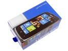
Unboxing the Lumia 610
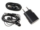
The plain cardboard box of the Nokia Lumia 610 is fairly big but it doesn't carry much more than the basics. There's a charger head to be used with the supplied microUSB cable, a headset of reasonably good quality and several printed guides.
Nokia Lumia 610 360-degree spin
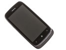
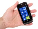
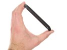
The Nokia Lumia 610 measures are almost identical to those of the Lumia 710 at 119 x 62 x 12 mm and its 133 g weight strikes a good balance between carrying comfort and nice solid feel. The shape and hand feel are quite similar too. The easiest way to tell them apart is the set of controls beneath the screen. The Lumia 710 has hardware buttons on a single rocker-styled piece, while the 610 goes for three separate capacitive keys.
Design and build quality
Based on the Lumia 710's body, the Nokia Lumia 610 uses a different finish and the asymmetrically fitting front and back create a hint of a chin below the screen. There are some differences in the location of controls and connectivity ports too. The Lumia 710 has the power/lock key at the top while in the Lumia 610 it's on a side, Symbian style.
Speaking of which, the Lumia 610 has a faint resemblance to Symbian smartphones, the Nokia C7 in particular should ring a bell. It's an all-plastic handset but, while it looks well put together, the quality of the finish could've been better. The rubbery plastic at the rear is easily smudged and fingerprints are a big issue up front on the screen too.
A glossy chrome-like frame runs along the sides and extends to the phone's top, housing all the controls and ports. The Lumia 610 is available in the traditional color versions for the series: cyan, magenta, white and black.
The Nokia Lumia 610 has a standard issue LCD screen of WVGA resolution. AMOLED is clearly out of the Lumia 610's league and even a Nokia ClearBlack display (Lumia 710) would've been way over budget. Overall, the Nokia 610 has to make do with a typical Widows Phone screen. The 3.7" diagonal translates into a pixel density of 252ppi, which is OK, considering WVGA is stretched quite thin on bigger screens.
Contrast could've been better though and the Metro UI that we quite like doesn't look its best. The poor sunlight legibility was an unpleasant surprise. The highly reflective display is nearly unusable outdoors on bright sunny days, so untypical of Nokia phones.
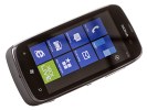
The LCD screen of the Nokia Lumia 610
Here's how the Lumia 610 stacks up against the competition. You can learn more about the testing process over here.
| Display test | 50% brightness | 100% brightness | ||||
| Black, cd/m2 | White, cd/m2 | Black, cd/m2 | White, cd/m2 | |||
| Nokia Lumia 610 | 0.25 | 203 | 828 | 0.61 | 454 | 746 |
| Nokia Lumia 710 | 0.39 | 426 | 1085 | 0.62 | 692 | 1115 |
| Nokia Lumia 800 | 0 | 108 | ∞ | 0 | 369 | ∞ |
| Sony Xperia U | 0.35 | 287 | 831 | 0.55 | 515 | 930 |
| Nokia 701 | 0.64 | 619 | 964 | 1.12 | 1022 | 905 |
| Sony Xperia sola | 0.28 | 295 | 1033 | 0.5 | 500 | 1002 |
Contrast ratio
-
Nokia Lumia 610
1.432 -
Sony Xperia U
1.758 -
Samsung Galaxy Pocket
1.180 -
LG Optimus L7
1.269 -
Samsung I9300 Galaxy S III
3.419 -
Nokia Asha 302
1.537 -
Apple iPhone 4
2.016 -
Apple iPhone 4S
2.269 -
Gigabyte GSmart G1355
1.361 -
HTC One S
2.901 -
HTC One X
2.158 -
HTC One V
1.685 -
LG Optimus 3D
1.542 -
Meizu MX
1.221 -
Nokia N8
2.144 -
Nokia N9
3.069 -
Samsung Galaxy Note
2.970 -
Samsung Galaxy S
3.155 -
Samsung Galaxy S II
2.832 -
Samsung Omnia W
3.301 -
Sony Ericsson Xperia ray
1.955
We zoomed into the display using our digital microscope so you can get a better idea of how the pixels are arranged, and how big they are. Check it out.
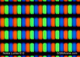
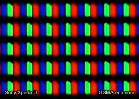
The Nokia Lumia 610 display matrix compared to the Xperia U matrix
The standard set of Windows Phone controls are below the screen and they're all capacitive this time around, compared to the regular press buttons of the Lumia 710. The Back, Home and Search keys, left to right, are well spaced and sufficiently far from the bottom edge to allow comfortable single-hand operation. The usual extra functionality upon a press-and-hold is enabled. A long press of the Back key launches the task switcher, while tapping and holding the Home key activates voice commands.
The mouthpiece is right on the border between the chrome frame and the rubbery chin, just below the capacitive keys.
Above the screen you'll spot the earpiece and a proximity sensor, just right of the Nokia logo. There is no front-facing camera on the Lumia 710, and no ambient light sensor either.
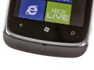
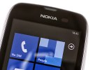
The hardware buttons and mouthpiece below the screen • the view above the display
The right side of the Lumia 610 features a volume rocker, a tiny lock/power button and a shutter key. The latter is soft and responsive, with distinct half-press for auto-focus, and will power up the camera upon a long press even when the phone is locked.
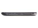
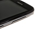
Volume rocker, power/Lock key and camera button on the right
The left side is completely bare. There is nothing at the bottom either.
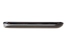
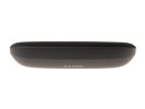
The empty left and bottom sides
The glossy top of the Lumia 610 has the 3.5mm audio jack, a microUSB port and a secondary microphone pinhole. There's a lanyard eyelet as well.
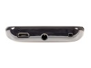
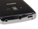
The view on top of the Lumia 610
The Nokia Lumia 610's battery cover has soft rubbery finish for extra grip. The 5MP camera lens and the LED flash are near the top, with the loudspeaker grille at the bottom, which is the same layout as the Lumia 710.
You may want to occasionally open the battery cover and clean the lens protection glass on the inside.
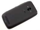
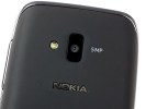
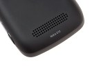
The back of the Nokia Lumia 610
Under the battery cover you'll see the microSIM card slot within the battery compartment.
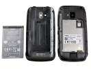
No surprises under the battery cover
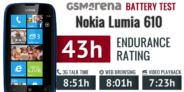
Despite its modest 1300 mAh battery, the Nokia Lumia 610 achieved an endurance rating of 43 hours in our battery test, which surprised us nicely. It managed some pretty impressive scores in the individual tests too, suggesting that Windows Phone 7.5 Refresh has brought some tweaks to battery life.
The Lumia 610 handles nicely and single-hand operation is trouble-free. Using the 710 blueprints, Nokia have done a good job of giving the Lumia 610 its own distinct look and character. It's a well-built phone with a grippy back and a solid feel in the hand. There're no massive gaps between joining parts and nothing that looks particularly vulnerable. The finish could've been of higher quality - and we mostly mean it should have been less fingerprint-prone.
Reader comments
- Anonymous
- 15 Jan 2022
- NuP
It is very bad phone because it not used for download
- jimi
- 18 Dec 2021
- fsF
Nice cool
- niska
- 09 Aug 2020
- Nu6
Please talk me how you make it work please
