Nokia Lumia 800 review: New beginnings
New beginnings
Unboxing the Nokia Lumia 800
The Lumia 800 comes in a box similar to that of the N9 and with similar contents. There's a rubber case in the same color as your phone. Once you put it on, the look of the handset barely changes (it gets thicker though). The good news is protection from scratches doesn't compromise the good looks of the phone.
Other than that, there are no surprises. Under the usual set of manuals, you'll find a compact, oddly shaped (though still good looking) charger that connects to the microUSB cable to charge the phone. The single piece headset looks quality too.
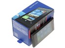
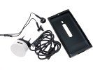
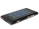
The sales package of the Nokia Lumia 800 • The Lumia 800 with the rubber case on
Nokia Lumia 800 360-degree spin
Design and build quality
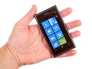
The Nokia Lumia 800 is easy to spot in a crowd - the polycarbonate unibody with a distinctive combination of curves and straight lines can only be mistaken for the Nokia N9, though sadly there probably aren’t many of those around.
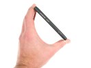
It is not the slimmest Windows Phone, but it makes a claim to be the most beautiful. It measures 116.5 x 61.2 x 12.1 mm (exactly the same as the N9) and weighs 142g (7g heavier than its MeeGo counterpart).
Here's the Lumia 800 flanked by the N9 and the Samsung Omnia W. The Lumia 800 and the Omnia W have the same screen size (3.7"), the same resolution (WVGA) and both are PenTile AMOLED units. We'll be having a closer look at them in a moment.
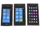
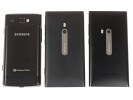
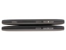
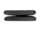
Size (and looks) comparison: Samsung Omnia W vs. Nokia Lumia 800 vs. Nokia N9
The body seems very sturdy, it can take a few knocks and not show it. The polycarbonate is colored itself rather than painted, so no peeling paint issues and even a deep scratch won't reveal anything but the same color as the rest of the body. Speaking of which, the Nokia Lumia 800 comes in black, cyan or magenta.
The Corning Gorilla glass makes sure the display won't get scratched either. Under that tough cover hides a polarizing filter that reduces reflections and improves the image quality.
The screen itself is a 3.7" AMOLED unit of WVGA resolution (480 x 800 pixels). Yes, it is a PenTile matrix - meaning each pixel has two subpixels instead of three - but the high 251ppi pixel density means that most people won’t notice it.
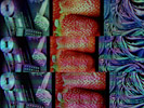
The Lumia's closest competitor, the Samsung Omnia W also uses a PenTile matrix for its 3.7" WVGA screen, so we decided to put them under the magnifying glass. The Nokia N9 is also along for the ride. Here are the close-up shots where you can see the PenTile arrangement clearly.
As you can see, both look practically identical. There are slight differences due to different color processing (so some pixels light up brighter), but that's it.
Indoors, the viewing experience is great - the display is basically glued to the Gorilla Glass on top, which makes it look almost as if the icons are painted on the surface of the handset when you look at an extreme angle.
The screen continues to impress outdoors in the sun too - it remains perfectly visible, while the colors keep most of their punch too. The anti-glare polarizer is certainly making a difference, as the Lumia 800 probably has the least-reflective screen we have seen.
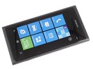
The Lumia 800's screen is great
The Nokia Lumia 800's touchscreen is very responsive and the edges of the scratch-resistant glass that cover it are convex (the display itself is flat). This means your finger glides easily from side to side - and using Windows Phone involves a lot of sideways swipes.
We measured the maximum brightness of the Lumia 800's screen to see how it stacks up against other AMOLEDs and the LCDs. As usual, contrast is theoretically infinite though reflections mean it's practically some really high number. The low reflectivity of this particular screen makes it that much more impressive.
As for the brightness, the Nokia N9 had one of the brightest AMOLED screens we've seen, easily topping SuperAMOLED in this regard. We expected the same from the Lumia 800, but we were disappointed - at the brightest setting, the 800 was only as bright as the N9 at 50% brightness.
It's comparable to the SuperAMOLED on the Omnia W, for what that's worth, but it doesn’t defeat it soundly as we expected based on the N9's performance.
Here's a list showing how the Lumia compares to the competition:
| Display test | 50% brightness | 100% brightness | ||||
| Black, cd/m2 | White, cd/m2 | Black, cd/m2 | White, cd/m2 | |||
| Nokia N9 | 0 | 349 | ∞ | 0 | 596 | ∞ |
| Nokia Lumia 800 | 0 | 108 | ∞ | 0 | 369 | ∞ |
| HTC Radar | 0.26 | 204 | 794 | 0.59 | 471 | 797 |
| HTC Titan | 0.26 | 233 | 891 | 0.56 | 567 | 1007 |
| HTC Sensation | 0.21 | 173 | 809 | 0.61 | 438 | 720 |
| Motorola Atrix 4G | 0.48 | 314 | 652 | 0.60 | 598 | 991 |
| LG Optimus 2X | 0.23 | 228 | 982 | 0.35 | 347 | 1001 |
| Samsung I9100 Galaxy S II | 0 | 231 | ∞ | 0 | 362 | ∞ |
| HTC Incredible S | 0.18 | 162 | 908 | 0.31 | 275 | 880 |
One trick that the Nokia N9 does that leverages on its AMOLED screen is that the clock is visible even when the screen is off. The Lumia 800 doesn’t do that, most likely because Windows Phone can't. We miss that feature, a cool and easy way to tell the time with a single glance.
Once you shift your gaze away from the screen, you'll see the earpiece above the screen and if you look closely, you'll spot the proximity and ambient light sensors.
Below the screen are the three Windows Phone keys - Back, Menu and Search - which are touch-sensitive and light up in white when the screen is on. Thanks to the deep blacks of the AMOLED screen, the three keys almost look like a part of the screen itself.
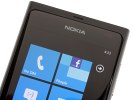
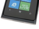
Earpiece, proximity and ambient light sensors on top • Three Windows Phone keys below the screen
We move on to the Nokia Lumia 800's right side to find the three hardware controls. You get a flat volume rocker that's not the easiest thing to use and a Power/Lock key just underneath it.
A little further down is the two-step shutter key. It's raised higher than the other keys and fairly comfortable to use. Because of the lower positioning of the camera lens on the back, you can hold the Lumia 800 much like a standard point-and-shoot.
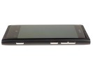
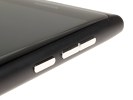
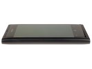
The only two hardware keys on the Nokia 800
The left side of the Nokia Lumia 800 is completely bare, while the bottom features the loudspeaker grill. The microphone pinhole is also supposed to be at the bottom, though we couldn't spot it so it might be under the same grill as the speaker.
The loudspeaker won't get muffled when you place the phone down on a table but the grill quickly gathers dust.
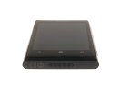
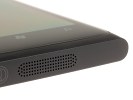
The loudspeaker is on the bottom of the handset
The top of the Nokia 800 features the 3.5mm audio jack and also the microSIM compartment and microUSB port.
The microUSB port is covered by a plastic lid that has a small nub to swing it open. It's a clever design but has a downside - L-shaped USB cables won't work as the lid gets in the way.
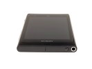
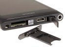
The microUSB port, the microSIM card slot and the 3.5mm jack
After you open that door, you can use your nail on the small notch to slide the microSIM card compartment to the left slightly (or you can just push it down and slide left). The microSIM card tray pops out and you can pull it out.
We said "microSIM" a few times but it bears repeating - it's a new, relatively rare standard that the Nokia Lumia 800 shares with the N9, iPhone 4 and 4S. If you get the Lumia 800, you'll either have to ask your carrier to swap your regular SIM card (possibly at a certain price) or cut it down to size yourself.
We complete our tour at the back of the Nokia 800, which has its edges tapered very similarly to the front. It fits the shape of the hand perfectly.
The 8 megapixel camera lens is on the back, placed lower than on most phones. As we already mentioned, this makes holding the phone while taking a photo quite comfortable as you don't need to worry about your hand covering the lens.
Speaking of the lens, it's Carl Zeiss-certified, as the strip of metal that accommodates it is proud to announce. It has an f/2.2 aperture, which according to Nokia lets in 75% more light.
The sensor is pretty special too - it has 8.7 million pixels and works in two modes. You can choose between 4:3 8MP and 16:9 7.1MP photos. Other 8MP shooters typically drop down to 6MP when shooting 16:9, so a loss of less than a megapixel in widescreen mode is quite an achievement.
It’s worth saying that the Lumia 800 has exactly the same camera unit as of that on the N9, however allegedly they are tuned slightly different.
There's a dual-LED flash next to the camera and it promises to be 20% brighter than previous LED units by Nokia despite being smaller. It won't glow red during video recording like the N9's flash does.
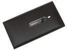
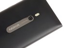
The 8 megapixel camera and its LED companion
The non-removable battery has a 1450mAh capacity and Nokia say it's good for 265 hours of standby in 2G (335 hours in 3G). Talk times are respectively 13 hours and 9 hours and 30 minutes.
The Nokia Lumia 800 should last for 55 hours of music playback or 7 hours of video. We'll post our own numbers when the test completes.
The curved sides of the Nokia Lumia 800 make it very comfortable to wrap your hands around it. The polycarbonate shell is pleasant to the touch (though quick to gather fingerprints) and all the controls are easy to reach.
The phone feels solid but not too heavy and even though it's not the slimmest handset around, its beveled edges should make it easy to slip into pockets.
Okay, so this part felt rather familiar. The software part will have equal measures of deja vu, but several Nokia add-ons (like the free SatNav app, Drive) should be enough of a plot twist.
Reader comments
- Mcdee
- 06 Feb 2021
- 0wq
I can't believe you are still using this phone to this day. I loved it so much!!! I respect you for that.
- Perry
- 16 Feb 2020
- rv5
My Nokia lumia 800 does download :'(
- Anonymous
- 09 Nov 2019
- 7Xd
I can't connect to wifi
