Nokia Lumia 900 review: Europass
Europass
The usual retail package
The Lumia 900 comes in a box similar to what the Lumia 800 and N9 were packaged in. We found a basic set of accessories inside. There is a wall charger - the same stylish round piece of the N9 and the Lumia 800. It comes in matching white color and uses the supplied USB cable. There's a set of earphones too this time (a single-piece headset with a Call button) - AT&T's Lumia 900 had none in the bundle. The last thing to find inside the box is the microSIM eject tool.
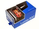
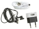
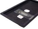
Nokia Lumia 900 retail package
Nokia Lumia 900 360-degree view
The Lumia 900 looks exactly the same as the Lumia 800 but duly scaled up to accommodate the bigger 4.3" screen. The most notable difference is the added front camera, if you don't count the fact that the Lumia 900 is taller, wider and heavier. At 127.8 x 68.5 x 11.5 mm, single-handed operation is trouble-free. This is by no means the biggest phone out there. The new Android flagships and the HTC Titan II have considerably larger screens. None of them weighs as much as the Lumia 900 though - at 160g it has a solid feel in hand, which is much appreciated.
Design and build quality
The design of the Nokia Lumia 900 should be quite familiar by now, which is not to say boring. It couldn't have had better inspiration than the Nokia Lumia 800 and, ultimately, the N9. The simple but compelling aesthetics are purely driven by function for a package that's beautiful to both look at and use.
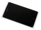
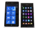
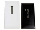
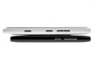
Nokia Lumia 900 next to the MeeGo-happy N9
The Nokia Lumia 900 is being offered with four color schemes - the traditional black, white, magenta and cyan. The white version we're testing stands out with its glossy ceramic surface. The matte finish of the rest is more practical perhaps - in terms of both grip and durability, but a matte white body would've been almost impossible to keep clean.
Build quality is flawless as always, it's just that the white Nokia Lumia 900 doesn't have the heavy-duty looks of its siblings using other paintjobs. It trades them for an extra bit of sophistication. The phone still appears ready to take a lot of abuse, as it is a blend of polycarbonate and Corning Gorilla Glass. The body is not painted the old fashioned way but it's rather made of plastic that has the same color in depth, scratches and marks from accidental drops won't stand out as much.
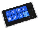
The screen is a major improvement over Lumia 800's unit
We've always said that AMOLED screens and Windows Phone OS are a perfect match. The Nokia Lumia 900's display is yet another proof. The 4.3" unit impresses with infinite contrast and deep blacks. In a manner befitting a Windows Phone flagship, Nokia Lumia 900's screen has dropped the PenTile matrix, found in the unit of the Lumia 800, so, despite its lower pixel density on paper, it is nicer to look at from up close.
Here go the Nokia Lumia 900 results from our display tests. You can find more about the testing procedures over here.
| Display test | 50% brightness | 100% brightness | ||||
| Black, cd/m2 | White, cd/m2 | Black, cd/m2 | White, cd/m2 | |||
| Nokia Lumia 900 | 0 | 347 | ∞ | 0 | 425 | ∞ |
| Nokia N9 | 0 | 349 | ∞ | 0 | 596 | ∞ |
| Nokia Lumia 800 | 0 | 108 | ∞ | 0 | 369 | ∞ |
| LG Optimus 4X HD | 0.34 | 369 | 1077 | 0.68 | 750 | 1102 |
| HTC One X | 0.15 | 200 | 1375 | 0.39 | 550 | 1410 |
| Samsung I9300 Galaxy S III | 0 | 174 | ∞ | 0 | 330 | ∞ |
| HTC One S | 0 | 177 | ∞ | 0 | 386 | ∞ |
| Sony Xperia S | - | - | - | 0.48 | 495 | 1038 |
Contrast ratio
-
Nokia 808 PureView
4.698 -
Samsung I9300 Galaxy S III
3.419 -
Samsung Omnia W
3.301 -
Samsung Galaxy S
3.155 -
Nokia N9
3.069 -
Samsung Galaxy Note
2.970 -
HTC One S
2.901 -
Samsung Galaxy S II
2.832 -
Huawei Ascend P1
2.655 -
Nokia Lumia 900
2.562 -
Apple iPhone 4S
2.269 -
HTC One X
2.158 -
Nokia N8
2.144 -
Apple iPhone 4
2.016 -
Sony Ericsson Xperia ray
1.955 -
Sony Xperia U
1.758 -
LG Optimus 4X HD
1.691 -
HTC One V
1.685 -
LG Optimus 3D
1.542 -
Nokia Asha 302
1.537 -
Nokia Lumia 610
1.432 -
Gigabyte GSmart G1355
1.361 -
LG Optimus L7
1.269 -
Meizu MX
1.221 -
Samsung Galaxy Pocket
1.180 -
Samsung Galaxy mini 2
1.114
Above the screen you will find a discreet earpiece, the ambient light and proximity sensors, as well as the front-facing camera. Below the screen are the three touch-sensitive buttons for getting around the beautiful Metro UI.
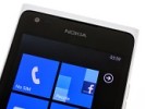
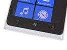
The view above and below the screen
There is absolutely nothing on the phone's left side but things get a lot busier on the right. The volume rocker is there, along with the power/lock key and a dedicated camera button. The Lock button feels somehow less solid than the rest of the phone's body but it's definitely not as flimsy as the same control on a Nokia N9. The half press of the shutter key could've been a lot more distinct and the stroke is too shallow for our liking.
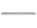
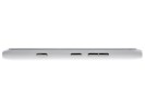
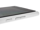
Nothing on the left • the buttons on the right feel flimsy
There is a lot going on at the top of the Nokia Lumia 900. The 3.5mm audio jack is there, along with the microUSB port and a secondary microphone for active noise cancellation. The microSIM tray is tucked in there as well. It feels gentle when handled, so use caution when dealing with it.
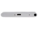
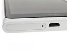
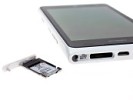
The view on top • the microSIM tray is quite gentle
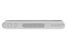
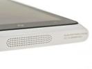
On the bottom, you have the loudspeaker grille machined into the polycarbonate body. The mouthpiece is hidden there as well.
The back of the device is where the 8MP camera and dual LED flash can be found. The Carl Zeiss-certified lens is placed on a trademark chrome plate set within the casing.
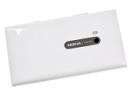
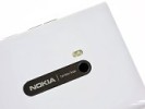
The camera and flash combo on the back
The battery on the Lumia 900 is non-removable. In terms of battery life, the same standby and talk times are quoted as on the US version of the phone. With the same 1830mAh on tap, the Nokia Lumia 900 has quite an edge over its AT&T sibling with that power-hungry LTE radio. You can find out more about our testing routine here.
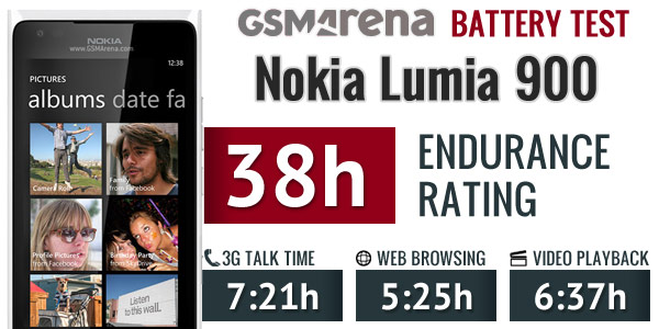
Nokia Lumia 900 battery test results
You should easily squeeze a full day out of the Lumia 900 on a single charge. If you are a power user though, you may want to have a charger at hand just in case. Thankfully, the one in the bundle is very compact.
The Nokia Lumia 900 is comfortable to use and single-handed operation is a breeze - having all the controls on one side certainly helps. The device's side curves allow it to fit perfectly in your hand. The glazed white finish cannot match the grip of a black Nokia N9 but there's little to be concerned about in terms of durability. Our biggest disappointment was the absolutely flat display. Granted, the Windows Phone interface doesn't need a curved screen like the swipe-driven MeeGo but feeling the (somewhat rough) edges of the screen isn't the most pleasant experience.
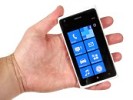
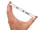
Handling the Nokia Lumia 900 feels great
Still, the Nokia Lumia 900 looks fantastic, and is well put together. The Lumia 800/900 design and build quality will be remembered as one of the rebels to break the boring cycle of uniform shapes reigning the last few years.
Reader comments
- Anonymous
- 01 Jan 2019
- PE3
The best........ everyone having quad core and it using single core . Announce with windows 7.5 when 8 is coming and confirmed not to get wp8 before even launch . although wp 8 is shit also .
- candy
- 10 Oct 2018
- E6x
nokia is the best i love the product.....
- Bliss
- 03 Jun 2016
- fuN
this phone is fantastic but we're having memory challenge here bcos it have in built memory. So how do we add extra memory or attach memory.
