Nokia Lumia 928 review: Guiding light
Guiding light
User interface
Windows Phone 8 is meant to look the same across all devices but makers still have a way to customize the experience and stand out against the competition. Nokia has more leeway than other makers thanks to its deal with Microsoft, but it also has the most riding on the platform - Nokia doesn't have Android to fall back on.
So, WP8 on a Nokia Lumia is noticeably different from what you get from competing makers thanks to a number of exclusive features. We'll cover them one by one, but first here's a quick look at the user interface.
While the primary interface looks mostly the same, there are a number of improvements.
A push on the unlock button reveals the lock screen, which displays the current time and date and shows calendar events, emails and missed calls. Pushing the volume rocker in either direction will bring the sound switch and music controls on top of the screen.
Swiping the lockscreen up unlocks the device or you can just press and hold the camera shutter key to unlock the phone and jump straight to the camera.

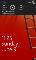
The lock screen • Music controls
Microsoft added a lot of flexibility and functionality to the lockscreen - the Live Apps service allows apps to add notifications and images on the lockscreen. You can set one app to display big notifications ("detailed status") and up to five more apps get to show more limited info ("quick status").
The lockscreen wallpaper can also be controlled by apps - one of the installed apps can be set to choose the image (e.g. Bing's beautiful background images or photos from your Facebook account) or you can let the music player change the lockscreen image to the album art of the currently playing track.
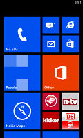
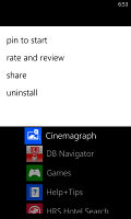
The Modern UI is a vertical grid of Live tiles, which can be reordered the way you like. Almost anything can be pinned to the homescreen - apps, contacts, web pages and more.
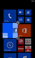
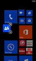
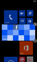
Windows Phone 8 introduces resizable live tiles - when you tap and hold on a tile, you'll get additional resize button to the unpin one. You can opt between quarter, normal and double size. If you select the smallest one though, the tile will be just a static icon (as is in the regular menu). In our mind, the process of resizing live tiles could've been better. In order to switch from big to normal and then small you have to hit the same toggle - it would've made more sense if there were separate ones to make a tile bigger and smaller or resize tiles by dragging like in Android.
Most Live tiles display relevant info such as the current date, pending calendar events, missed calls, unread emails and more (third party apps do it too). The Marketplace tile displays the number of updates available, while the Pictures tile is essentially a slideshow of your photos. It's nice to have all that info always available at-a-glance. You can look at them as homescreen widgets of sorts, but that's oversimplifying.
WP8 can do multitasking - well, not true multitasking, but an iOS-like approach instead. Apps not in the foreground are suspended, but the OS has ways to take over and carry out the task for them (e.g. continue playing music). But just like iOS, if an app needs to run in the background (navigation clients, messengers, etc.) it can. The WP offers both kind of multi-tasking and it's up to developers to choose how their apps operate.
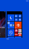
The multi-tasking interface is the same as in WP7 - to switch between apps you press and hold the Back key. You'll get thumbnail snapshots of the apps, ordered chronologically left to right.
You can scroll the list horizontally to select an app and a tap will bring you back to your running or suspended app. You can't "kill" any of those apps from here - to exit one you must bring it to front and use the Back key to close it.
If you start frantically hitting the back key it will start closing all of the open apps, which is very unnatural, especially when you've got an open Internet Explorer, which has to go all the way back to the first loaded page before it closes. Overall, it's best to let the OS manage the apps and not worry about which ones are opened or closed.
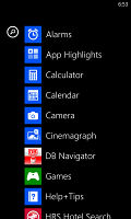
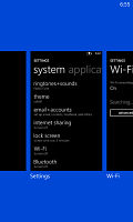
Opening the settings menu displays two sets of options: like on the start screen, you can swipe between System and Applications. System covers all the settings you can think of like sounds, color theme, Wi-Fi, Bluetooth, Accounts, etc. The Application settings let you configure each app you have on the device.
We would've liked to see some kind of quick toggles in Windows Phone 8 to spare you the need to go all the way to the settings menu to enable Wi-Fi, Bluetooth, GPS and the likes.
Another feature we feel is missing is a place where you can see all of your notifications from various apps. Live tiles manage to show notifications from each app to some extent, but they don't really have enough room for things like e-mail subject and such, while Android and iOS notification areas do. Microsoft has expressed that it's working on just such a feature and that we should see it in a future update to WP 8.
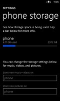
Settings for the phone's storage
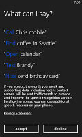
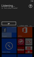
Windows Phone 8 also can be controlled through voice only - you can dictate or have the phone read text out, you can initiate searches and so on. Other OSes are doing it too - Android's got Google Voice Actions, Apple has Siri and there are a number of third party "virtual voice assistants" available. The Windows assistant though is still far behind the competition.
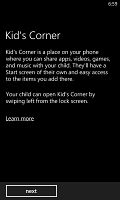
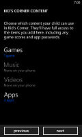
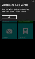
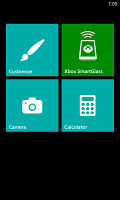
One of the new features brought by WP8 is the Kids corner. You can select the apps and the types of media content that goes in and password-protect it, so you can safely share your smartphone with your kids without worrying that they will mess up your settings or access inappropriate content. When activated, the Kids corner is accessible by swiping left of the lockscreen. If you've secured it, your kids won't be able to return to your standard lock and home screen without the password.
Of course, however you protect your phone, you can do nothing against accidental (or not) meetings with the floor.
Microsoft is trying to appeal to business users too - a company can create its own Hub where employees can find news, calendars and other info to help them with their work. Companies can also create their own apps that only employees can install.
Reader comments
- Cachete1966
- 01 Aug 2013
- 8Ix
Reading others posts... Some people repeat many sections from this review..! I think that this people never use a WP ( in the real world use) not for a quick test.!! Some post said.. Not multitasking... ,!! Please.... When you open several ...
- jp
- 01 Aug 2013
- vwe
what
- prem
- 01 Aug 2013
- vwe
nice look
