Nokia N8 preview: First look
First look
This article is outdated. We have already published a full review.
User interface
With the full-blown review already in the works, we are not going to focus much on the user interface for now. We will just give you a brief overview of the new stuff that Symbian^3 introduces to give an idea of what to expect and proceed to the show the highlight - the camera section.
So just as Anssi Vanjoki said at Nokia World this year, at first glance you won't see many changes when you first get a Symbian^3 device in your hand. Yet when you start to actually use the device, you realize that the Finnish engineers haven't been wasting their time.
With Symbian^1 (or S60 5th edition, if you will) Nokia left itself an escape path in case the whole touch-driven thing didn't work out and the world suddenly decided to return to regular keys. It's things like tap-to-select, second tap to activate and reverse scrolling we are talking about, which would allow the OS to be used with a D-pad if the company were to release such a device.
Since the touch phone demand showed no signs of slowing down, this turned out to be a huge mistake, as it proved rather detrimental to the user experience. Firmware updates to S^1 devices patched things here and there but we all knew Nokia was just buying time here.
Fortunately, Nokia is now done with the safety approach and are going all-in with the touch game. Symbian^3 scrolls the right way and activates any icon or list item with a single click (barring the camera interface where two clicks are still required at times). Scrolling animations are also smoother and offer some effects like the icons bumping against the end of the screen and coming back when you reach the end of the list.
Here's a short video demo of the user interface in action.
The new OS also brings some nice UI layout and functionality changes. The homescreen is the most evident of those, its size now expanded to three panes worth of space. You are then free to fill them up with widgets and then rearrange them as you see fit. If three panels are too much for you and you hate the extra scrolling you can also delete some of them.

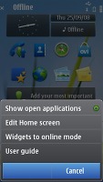

The new homescreen brought by Symbian^3
The main menu structure is unchanged, retaining the folders format. This comes in contrast to Android, and mostly iOS, where you get a flat menu structure with all icons located on side-scrollable panes.
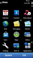
The main menu has retained its structure
Getting on top of the food chain is a slow process, requiring lots of effort and time but Symbian^3 definitely looks like a step in the right direction. We'll be able to tell how big a step it is exactly only when the full review is completed but fortunately this shouldn't take too long now.
Reader comments
- jamsedalam
- 12 Jan 2014
- U@0
good.phone.jamsed.comment
- shiv
- 14 Nov 2013
- KFQ
my n8 camera is not soot clear picture? Wy
- kawsar
- 19 Sep 2013
- PEq
servicrmanual