Nokia N9 review: Once in a lifetime
Once in a lifetime
User interface
We said it at the beginning of our review, MeeGo is such an important part of the Nokia N9 that it even determines the phone's design and shape. The novel platform developed by Nokia and Intel isthe only one that can do without any hardware buttons.
All the navigation happens on the touchscreen and the only buttons are a volume rocker and a lock key. There're very nice on-screen volume controls, making the Lock button the only must-have hardware key. And you only need it for locking - a double tap on the screen will unlock the device.
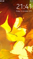
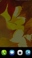
Then you swipe the lock screen out the way (any direction works) and you get to the homescreen. Alternatively, you can slide the lockscreen up a bit and hold for a second for four shortcuts to appear. Those let you to open the dialer, messages, web browser and the camera without having to go to the main menu.
Notification icons on both the screen-saver and the lockscreen alert you of new events - emails, messages, missed calls. By simply brushing the notification away from the lockscreen, you will unlock the phone and launch the respective app. Though the implementation is slightly different, this is every bit as impressively efficient as the Samsung TouchWiz lockscreen on Android and Bada.
Once you are past the lockscreen you are faced with the three main screens that compose the Nokia N9 UI. The status bar is docked on top of those and if you click it, it expands to give you a quick profile switch and a volume bar. Below them you get shortcuts to Wi-Fi and Bluetooth, as well as a summary of your recent data transfers.
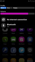
Profile and radio toggles are at hand in the notification area
If you have setup Skype or Facebook, you can also change your chat status in the notification area.
The app launcher is the central screen. It contains all the applications installed on your Nokia N9 in a flat vertically-scrollable list. There are no folders and the icons come by default ordered by installation date. However, you can just press and hold one of them to enter edit mode and rearrange them as you see fit.
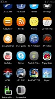
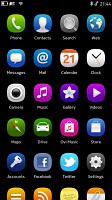
The app launcher is the central of the three screens of the N9 main UI
A right swipe will take you to the Feed, which has a reserved bar on top for the current date and weather. Below that is your feed of tweets, Facebook events and news. You are free to remove any of those from your feed if you don't want them to be getting in the way.
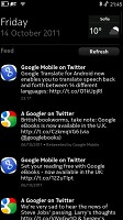
The Feed brings you tweets, Facebook updates and news
Sweep to the left to get to the task manager with thumbnails of all your running applications. The screen fits 9 thumbnails at a time (or four, if you pinch zoom in), but the list is scrollable if you have more apps running. And with 1GB of RAM on board, the Nokia N9 will often have way more thumbnails to display on its multitasking screen.
Plus, MeeGo is really good at juggling apps so it would be a shame not to fully use its potential. When you are running an app, all you have to do is swipe from any edge of the screen to push the app to the background and moves to the top of that card interface. Click its thumbnail and it resumes where you left it. Optionally, you can set the downwards swipe to terminate an app, rather than send it to background.
Upon a press and hold on the task manager screen, little close buttons appear next to each thumbnail so you can terminate apps one by one. There’s also a Close All button.
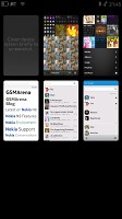
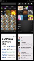
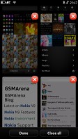
The task manager is one of the best parts of MeeGo
You need to be careful when scrolling content within the app itself. If you start your gesture at the edge of the screen you might accidentally minimize it instead. You quickly get used to using the gestures properly though. It's a simple logic: navigation swipes should start off the edge of the screen, while scrolling lists works exactly like on any other touchscreen.
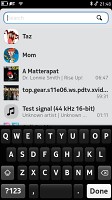
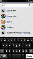
Another cool feature of the MeeGo platform comes in the shape of a preinstalled app. The search app works across the entire contents of your device, including contacts, multimedia, documents and what not. You can also start a Google search from there.
The general performance of the Nokia N9 is silky smooth, even with all the eye candy that MeeGo offers. Animations are fluid, everything opens quickly and there are no hiccups even with over 15 apps in the background.
And by the way, if any of this seems complicated to you (unlikely, but still) there’s a User Guide app that will walk you through the interface feature by feature.
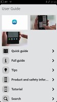
The user guide will show you how to get out the best of your MeeGo smartphone
We’re left extremely impressed with what Nokia and Intel have done with MeeGo. Snappy and smooth, the Nokia N9 is also really intuitive and original. It’s rare for a new platform to get so many things right from the first go, but MeeGo does really well.
Now let’s see if the core preinstalled apps will reinforce the good impressions.
Reader comments
- Anonymous
- 09 Apr 2025
- 7XY
and it did.
- Waqar Masood
- 29 Oct 2020
- KIJ
You can't download it because whats app doesn't support its small screen.Facebook and yout be will surely work. You can use Nokia messages.
- Waqar Masood
- 29 Oct 2020
- KIJ
Think you should update the software if available or should do factory reset.
