Nokia N900 review: A new hope
A new hope
Maemo OS takes on the big guys
The Maemo OS 5th was hardly considered too serious as a smartphone platform at first. It was only when the world met it in flesh when we realized that it might actually be doing a better job than the Nokia mainstream S60 5th edition OS. There's none of the S60 one-click-here-two-clicks-there inconsistency to be witnessed with the Linux-based platform.
The first thing that you'll notice about the Maemo OS is that unlike most other smartphone OSes it is only works in landscape mode. The telephony and the Blocks game are the only parts of the UI that can work in portrait mode.
The good news is that Nokia are already working on a firmware upgrade that should enable portrait mode throughout the interface. It should be coming to the market before the end of the year and we'll do everything we can to update our review once it becomes available.
The Maemo OS only works in landscape mode right now
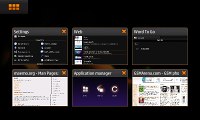
Maemo 5.0 is organized in three levels rather than two. The extra step added between the homescreen and the main menu is reserved for the task manager and it's skipped if there are no applications running in background. What that means is the only way to open the main menu from the homescreen is to open up the Task manager first and then hit the menu shortcut.
We certainly get the logic behind that solution as you always have your open applications at hand. And it's not only different applications that go there - the browser windows are listed there as well for easy tab switching.
Perhaps the developers were afraid that the applications, which always stay open, will fill up the available memory quite soon so they preferred to remind you of them every time you reach for the main menu to start a new application. Yet somehow we feel that giving the user the options for opening the main menu and the task manager separately would have been quite wiser - it certainly makes more sense for the advanced user.
Here's a quick video demoing the Nokia N900 user interface in action:
We first meet the homescreen
The homescreen consists of four side-scrollable screens that you can fill with widgets. There aren't too many widgets preinstalled on the Nokia N900 but all the basics are covered and you can easily download new ones.
In addition to widgets you can also add bookmarks and contacts to your homescreen. Clicking one of the bookmarks opens it in a new window in the web browser, while clicking a contact icon brings up shortcuts for initiating a call or an SMS.


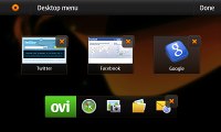
You can also add bookmarks, applications and contacts shortcuts to the homescreen
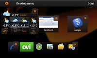
Tapping at the top right corner brings up the set-up key and upon pressing it you get to rearrange the widgets and add new ones as you please. You can even disable some of the screens to make the rotation quicker.
Tapping on the status icons in the top right corner brings up shortcuts to the clocks and alarms, profiles, internet connections and Bluetooth. There is also a slider for adjusting the ringing volume directly form here.
Next up is the Task Switcher
The task switcher allows you to quickly get back to an already open application or close unneeded ones.


The task switcher is the Maemo OS cornerstone
As we already pointed out Maemo OS and N900 in particular is highly pitched for its multi-tasking capabilities. You get reminded of that every time you go for the main menu as you always have to go through the Task Switcher as one extra step. We surely hope that Maemo developers will soon offer a way around that (a main menu widget would do we guess) so at least users have a choice.
Now about that main menu
The main menu has two-tier structure unlike the flat menus that seem to be the trend nowadays. That means that you need to make an extra step to reach for the applications that Nokia deemed not important enough to sit on the main screen. Those sit in a scrollable list under the "More…" icon. And every app you would install after that also goes there.
That's another thing we found to be a bugger at times. We couldn't find an option for manual rearranging of the menu items either. It's true that some apps automatically install a homescreen widget and you can place a shortcut to the others so maybe Nokia expected the users to use the main menu quite rare.
If you have been keeping track you would find many of the icons familiar - they are the same as in Nokia's latest S60 smartphones. The settings location is pretty similar so if you know your way around Symbian devices you will find it easier to get used to Maemo.
The Nokia N900 also packs the kinetic scrolling throughout its UI, which greatly facilitates work with moderately long lists.
Exiting the main menu or going back a step is done by clicking somewhere outside the icons. This gets most people pretty confused at first but it's actually pretty comfortable once you get the hang of it. No need to reach for this or that corner - just press next to an icon and you are out.
On the downside if you didn't aim accurately for an icon the unpleasant result might be exiting the menu altogether.
A thing we find really comfortable is the integration of the hardware keys in the UI navigation. Nokia N900 has a full hardware QWERTY at hand and has made good use of it. For instance, pressing control and backspace simultaneously takes you back to the task manager, while the familiar PC shortcuts like Ctrl+C, Ctrl+V, Ctrl+Z all work just as you would expect them to starting the Copy, Paste and Undo commands.
Finally, we would like to mention a few things about the N900 graphics and the performance. The Nokia N900 offers a decent amount of eye-candy with the main screen getting out of focus when a dialog pops-up. Even the wallpaper goes out of focus much the same way when you open the menu. Apps also disappear with nice effect when closed from the task bar and the automatic rotation in the phonebook is pretty nice.
The homescreen behaves in a way similar to the Android handsets where the icons and the wallpaper move at different speeds to simulate great distance between them.
The best part is that the Nokia N900 runs pretty smoothly with no lags or hold-ups. There is some waiting when opening data-intensive applications like Ovi Maps or traffic-intensive web pages but that is to be expected. In general the handset is another great display of the great power of the 600 Mhz Cortex A8 CPU. Well, the 256 MB RAM memory don't do much harm either.
The fast processor also benefits the responsiveness of the screen from a user's point of view. There are very rare cases when Nokia N900 won't react immediately to your click.
Reader comments
- Drayne
- 12 Dec 2019
- r3a
Nokia N900 is not for regular phone users at least even in 2019 I am still running my nokia N900. I manage all my servers from this phone both Linux and Windows servers alike. I have written apps for my own use alone for the N900. The phone is a linu...
- Roxkster
- 09 Mar 2018
- 6sE
Hi Guys can i have to go with this phone in 2018?for buying pls help me if u can
- AnonD-130377
- 29 Mar 2013
- gJn
i have a lot of phones but n900 is different the others !
