Nokia X3 review: Music X-three-M
Music X-three-M
User interface has a go at multi-tasking, but fails
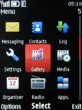
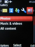
The Nokia X3 employs the Series 40 6th edition user interface, but it was updated since we saw it in the Nokia 6700 classic with some very welcome surprises. The environment is still well familiar - on the surface, the only things that seem to have changed are the revamped Messaging section, the greatly improved Gallery and some tweaks to the menus.
There was also a little surprise. Lack of multitasking has been the bane of S40 for a while now – all the Sony Ericsson, LG and Samsung feature phones just make the S40 “dumb”-phones look bad.
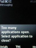
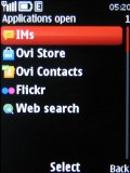
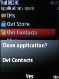
For a short moment, our hearts fluttered with excitement when we were prompted to close an application, as there were too many of those already running. We were presented with a task manager of sorts – it could only close apps, not switch between.
But after five minutes of pressing every button on the phone, trying to figure out how to bring up the real task manager (and failing), we noticed something. All the apps that appeared to run in the background shared one thing – they keep an Internet connection open to check for updates: a new email arriving, a new IM, Ovi Store getting updates in the background and so on.
So, that was it. Small components of those apps are running in the background sharing the phone’s Internet connection. Apparently, there’s a limited number of apps that can use the connection simultaneously. Launching the full app takes as long as usual and they don’t resume where you left off. In other words, it’s as if you’re starting them for the first time. So there’s no real multi-tasking on the X3.
The built-in browser and Ovi Maps are the only ones that exhibit signs of multi-tasking (though rudimentary), but more on that later.
User interface – the basics
Going back on topic, the standby screen of the Nokia X3 features the pre-selected wallpaper with the usual status readings such as signal strength, battery status, ringing profile icon and time.
The center of the navigation key opens the main menu, while the context keys can be assigned a function of your choice. The D-pad directions can be set up as shortcuts - by default, left brings up the new message menu and right the Calendar. Font color on the main display can be customized too.
Active standby mode is available. It consists of four sections that can be edited or relocated as users see fit.
In the most common case, the top area is reserved for instant access to favorite functions denoted by their respective icons. The second section displays the currently playing track or radio channel info, with shortcuts to the players if nothing is playing at the moment. Next is the Ovi Contacts application and then a shortcut to the Ovi Store, promoting the dedicated application.
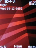
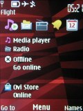
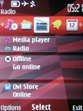
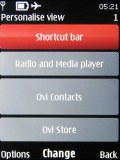
Regular homescreen • Active standby mode • Each section can be user customized
The 3D animation of the menu icons has been dropped in favor of the S60 look. They can also be freely reordered within the grid, should the user find their original order inconvenient.
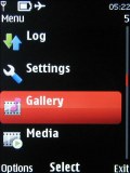
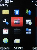
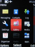
The four main menu views: Grid, grid with labels, tab, list
There are seven predefined ringing profiles on the Nokia X3, which should be enough to cover virtually any scenario. They can be set to expire at a given time, returning the phone to the previous profile.
Flight mode is on hand too, turning off all transceivers and allowing to use the phone without a SIM card inserted.
The software is a mixed bag. The interface is quick and responsive, however there were several occasions where an application would terminate unexpectedly (it happened to the browser mostly). There are several other issues we had with the software (e.g. Flickr refused to work with the preinstalled app, Ovi Share had problems too).
On the other hand, the changes to the Gallery are excellent and the multitasking – even if basic – is a welcome update.
A super fit phonebook
The phonebook of the Nokia X3 stores up to 2000 contacts and that should be more than enough. Each contact can be assigned a variety of fields but the phone numbers are limited to 5.
First names are stored separately from last names, eliminating problems which may occur with synchronization.
You can assign ringtones to each contact. There’s also an option for a video ringtone, which will run on an incoming call.
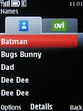
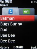
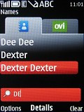
The difference between normal and large font • searching the phonebook
There are three available view modes for your contact list: regular Name List, Name-and-Number and Name-and-Image. It can display the SIM card contacts, the phone memory contacts or both at once. Contacts can be ordered by either first or last name.

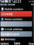
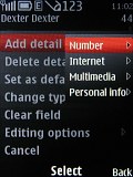
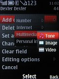
Some of the available fields when editing a contact
The phonebook font size can be either normal or large - that option that will definitely be appreciated. The bigger font fits just as many contacts on the screen by leaving a smaller gap between the lines.
And lastly, the well-known grouping option is also present. This means that contacts can also be organized in groups and these can subsequently be used as call filters.
Another application to mention here is the voice dial: no pre-recording of voice labels is necessary.
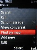
A nice extra is the Find-on-Map option, which locates the contact's address on the new Ovi Maps app for S40 if it’s been entered correctly.
Reader comments
- Anonymous
- 18 May 2020
- rJq
Yea me too. It was smooth
- Jameden
- 08 Mar 2019
- 3aY
I never experienced any "plastic-on-plastic friction" when using the slider on my Nokia X3. That is very weird, actually.
