Nokia X6 review: Going up the ladder
Going up the ladder
User interface is the same, despite the new touchscreen
As far as touchscreens go, the Nokia X6 is a first for Nokia -it's their first capacitive touchscreen phone. The S60 5th edition hoever hasn't changed at all. So, by now you should have seen plenty touch Symbian OS reviews and nothing here should come as a big surprise.
New touch technology, old software
The first thing to note is kinetic scrolling which, in fact, works quite well and is available almost throughout the user interface - from file browser through gallery to contacts (and even web browser, though with quite spotty implementation). Unfortunately, it won't work in icon menus, like the main menu.
In those icon-centric menus you push the selection to the edge of the screen, which will scroll things in the opposite direction. It's very unintuitive and confusing, since everything else works the other way around. You can use the scroll bar for icon menus, but scrollbars are so 1990s.
Still, the good news is that finger scrolling has been improved everywhere as far as lists of items are concerned. You can scroll with the same ease as with the Apple iPhone - you push it one way and it moves in the oppsite direction as if you are pushing the actual list off the screen.
On the homescreen, the Contacts bar is side-scrollable and thus accommodates a lot more phonebook shortcuts.
Turning the handset landscape in text-input mode automatically brings a full QWERTY keypad up on the screen. Of course, there's still a long way to go. We'd still have to wait for auto-rotation of the homescreen, smart dial and a more elaborate Active Standby - with room for the WLAN scanner plugin, for instance.
Widgets are NSeries stuff so don't expect any of those here. And if you were expecting thumb-scrollable multiple homescreen panes, then you are out of luck as well, despite the fact that the touchscreen competition has had these for a long time.
S60 5th is in essence a direct translation of D-pad and soft-key action into touch. Although it has its benefits, the result is hardly the most fluent and intuitive touchscreen interface there is. Scrolling and accessing items across the interface is nothing like other touch platforms we've tried. On the other hand, soft-keys work just fine and enhance usability compared to other touch phones.
So, the user experience with S60 5th is a mixed bag and what you think of it will entirely depend on your background. If you know your way around S60, you'll be quite at home with the X6 interface. But if you come from an alternative touchscreen platform you'll find yourself climbing a fairly steep learning curve.
Opening an item in any of the listed submenus requires not one, but two presses - one to select, and another one to confirm the action. Now that's something that you don't normally see in other touch phones. You get used to it with time, but the main issue here is that the interface logic is different when you deal with icons instead of lists.When the opened menu uses icons to represent items as opposed to lists, then a single click usually does the job.
The scrolling as described earlier is equally confusing due to the two contradictory approaches. At least kinetic scrolling will make you feel way more comfortable than those first 5800 XpressMusic users. Plus, it does at least show Nokia are serious about polishing the Symbian touch platform.
Homescreen and main menu
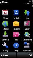
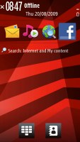
The main menu structure leaves no doubt you're on Symbian turf. Icons are set in a 3 x 4 grid or a list and you can freely reorder. Screen orientation can be set to change automatically thanks to the accelerometer.
The homescreen, however, is one spot where auto-rotation is badly missed as the extra screen estate would've made it much more usable. For one, more shortcuts would've been visible on the Contacts bar. It's scrollable anyway - that's true - but if the 5730 XpressMusic can do it, why can't the touchscreen version?
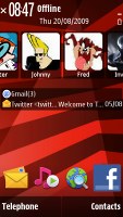
Otherwise, the homescreen layout of the X6 is typical Symbian and looks exactly the same as it did on the Nokia 5530.
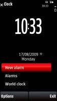
A single press on the clock starts the clock application (with an option for setting up an alarm) while tapping on the date opens a drop-down menu where you can either launch the calendar application or change the currently active profile, which does make using the the Power key for that purpose redundant.
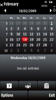
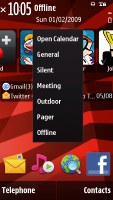
Calendar, profiles and clock just a touch away
You can also access the connectivity menu from here by tapping around the battery status indicator, which is the quickest way to initiate a WLAN search. It is not quite as quick as the 3rd edition plug-in where you only needed a single click for that purpose but it is better than nothing.
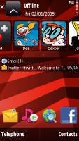
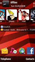
The Contacts bar follows right beneath: each contact is represented by the contact photo and their first name - and it's possible to have three contacts displayed at a time but the list is scrollable left or right.
For each contact you can add an RSS feed, so we guess it is a nice trick to add a contact that isn't a person just so that you'll have quick access to your favorite feeds on the homescreen.
Selecting a contact from the Contact bar brings up a screen with info on the contact (different from you get if you select the contact from the Contacts list). It has the contact photo, name and phone number. Underneath are four buttons - call, send message, update feed and settings.
Further down is an area that shows the communication history for that contact - both calls and messages. And finally, at the bottom there are the top two lines from an RSS feed.
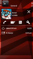
The new Contacts bar • viewing a contact from the Contacts bar
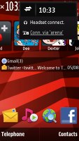
Under the Contacts list, it's pretty much standard Active Standby but with fewer slots. You only get email notification showing the number of unread messages, along with the sender and subject of the most recent message. The blank area beneath is reserved for the music player and radio mini apps - they get displayed when either is set to play in the background.
At the very bottom of the homescreen is the Shortcuts bar. Both the Contacts and the Shortcuts tab are optional and can be hidden.
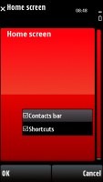
Contacts bar theme, the Contacts bar and the shortcuts tab are optional • Shortcuts bar • Basic
The Media key, placed above the screen on the right, is a shortcut to the Music player, Gallery, Ovi Share, Videos, and the web browser. It's an excellent control that offers quick access to the handset's multimedia features. It's haptic-enabled too with a slight vibration confirming each touch on screen.
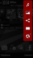
With the Media key some of most frequently used features are only a tap away
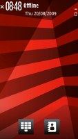
The Nokia X6 features a task manager which is launched by a press-and-hold on the menu key. The task manager itself is identical to what you get on Symbian S60 3.2 devices. Much like in the previous version of the UI, it appears on top of every pop-up menu. There's no C key to close running applications - instead you press and hold the app's icon to display two virtual buttons: Open and Exit.
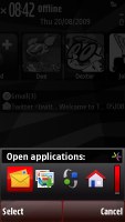
The task-manager
Reader comments
- Rikesh
- 16 Sep 2023
- Frn
Hi Did you sort this out? I have the same problem
- areza9735
- 01 Feb 2020
- a3d
Root
- Sophy
- 12 Oct 2016
- r3H
My Nokia x6 can not start , it says I should contact my phone retailer what can I do.