Nothing phone (1) long-term review
Design, looks
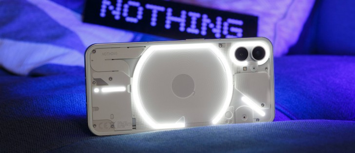
"It looks like an iPhone". That's the comment we've heard from nine out of ten people seeing this device while we had it for this long-term review. Especially its back seems to prompt that reaction, which is funny since the only thing on the Nothing Phone's rear that clearly resembles an iPhone are the two camera protrusions. Otherwise, unless Apple's done a transparent-backed handset we aren't aware of, these can't be more different.
And yet. You can't deny it. Just look at it. Can you explain exactly why it feels like that? Can we? We're not sure but we'll do our best: cameras plus flat sides plus the radius of the curvature of the corners plus the circle-inside-a-circle in the middle where the Apple logo would be, and if we flip it to the front, then we'll add the symmetrical bezels to the mix. But it's also obviously not an iPhone, it's just a device that's meant to remind you of an iPhone.
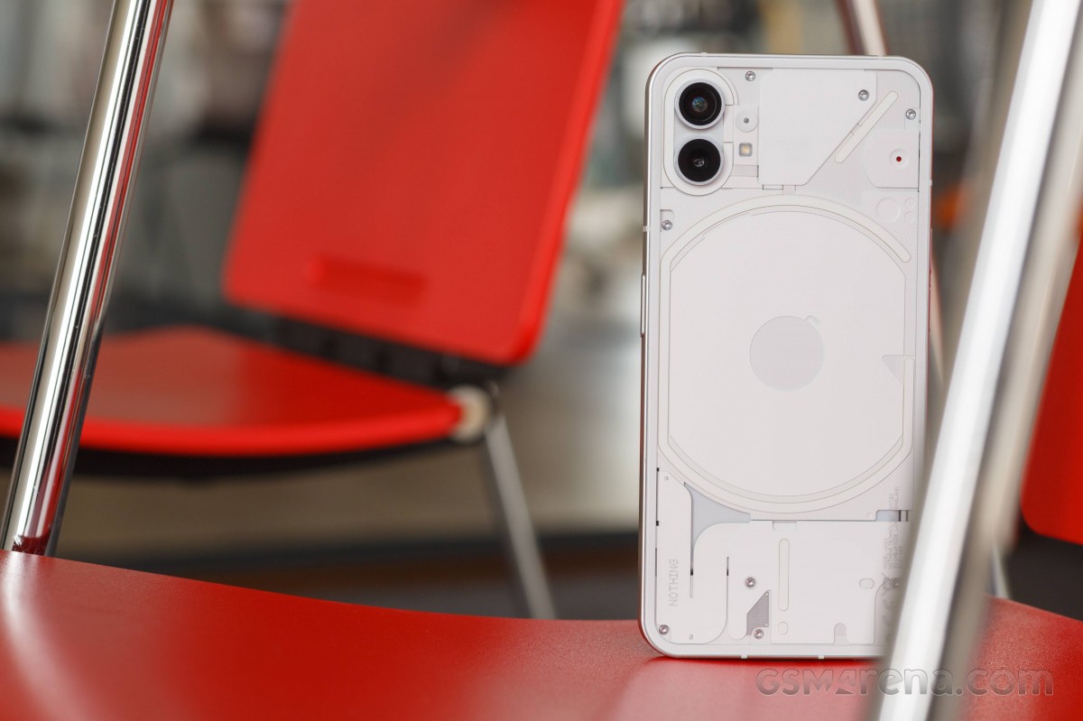
This feels very intentional, design-wise. In fact, if at some point it was revealed that the original design brief for this device was "iPhone vibe, transparent back with LEDs", we wouldn't be surprised at all. Because it's so clearly iPhone-inspired, it's unlikely this design language is going to offend anyone, since iPhones are so iconic and well-known all over.
We're in the same boat. We can't say it's the best looking thing we've ever seen, but it's certainly not ugly from any angle. It has a cohesion that's very welcome, although the ill-intentioned out there might chalk that up as a win for Apple, not Nothing.
The transparent look of the rear was clearly Nothing's only chance to stand out with this product in a sea of very similar-looking phones. And judging by the amount of questions we got while using it, the company has very much succeeded. People are intrigued by it, they get curious, and then they're interested.
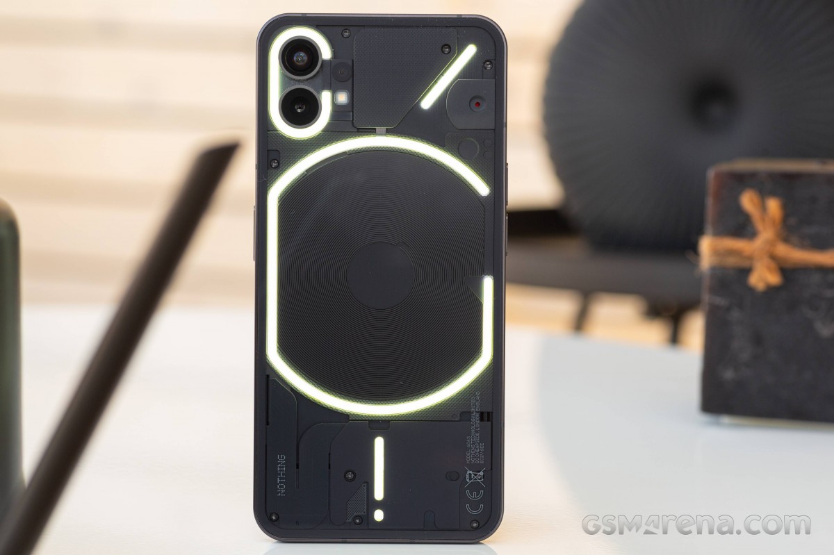
Sure, they may not run and buy one immediately, but they now know what Nothing is. And that's something. Call it the art of advertising without advertising. Building brand recognition without plastering your name on billboards across the world (or having it on your phone's back in huge letters, Poco). It's a different way of achieving (at least some) fame and possibly the only way to do it if you're a startup that doesn't have a ton of cash to throw around.
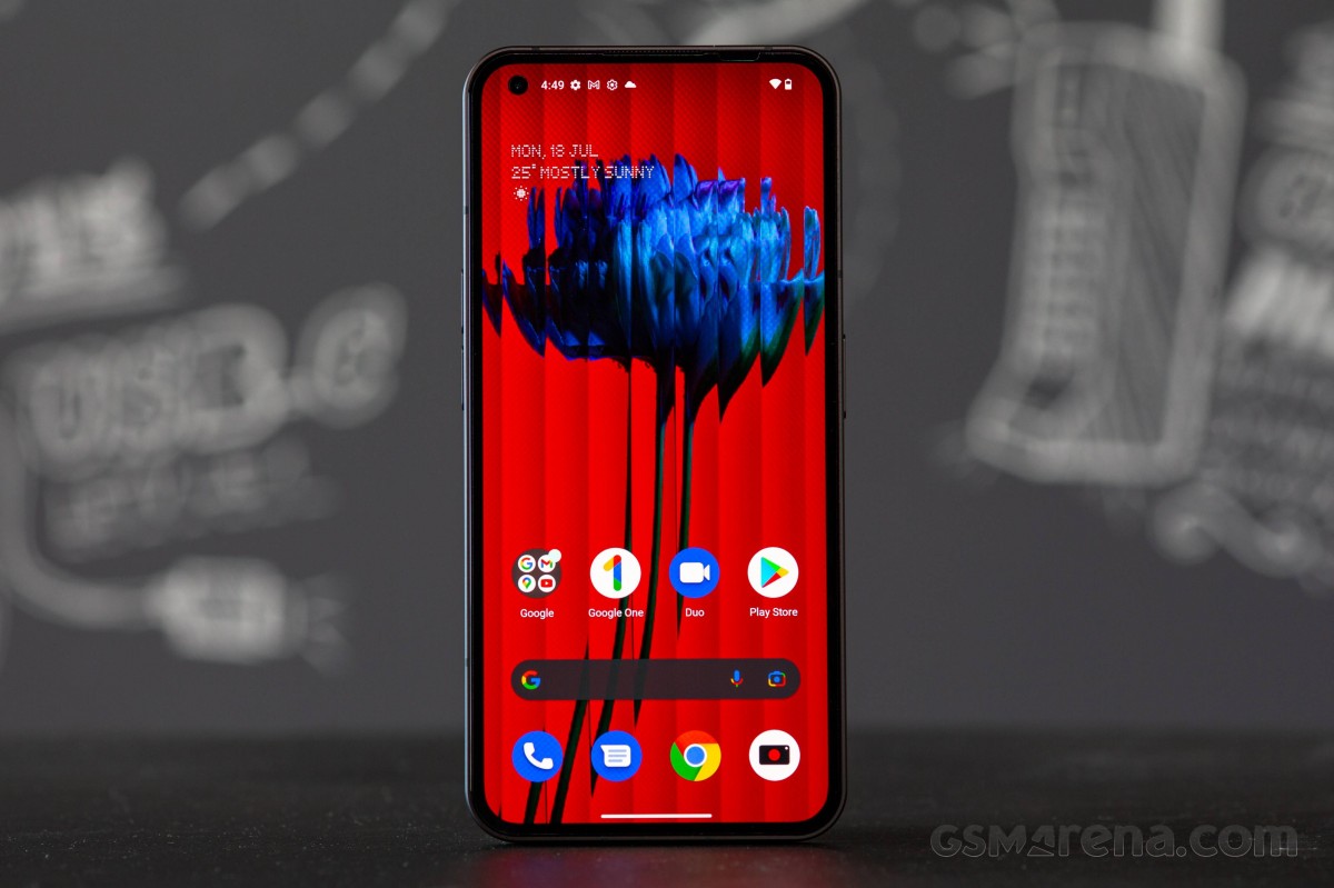
Now if we're talking rear design and nothing else, yes it's pretty, and pretty unique too since transparent looks have only been done a few times so far. Intriguingly, it's among the least slippery phone backs we've handled in recent times.
It's still mildly slippery, but in a different league compared to any device with a matte or frosted glass back. We're also huge fans of the symmetrical bezels on all sides of the screen. It's still a pretty rare sight, and especially at this price point, it's very welcome. In fact, from the front, this is probably the best-looking mid-ranger there is right now.
Frame, handling
As we've mentioned a few times before in other long-term reviews, we don't mind a flat frame. We don't love it; we don't hate it; we don't mind it, it's fine. Thanks to Apple, it 'feels' more modern than non-flat ones, but this may just be a fad that goes away once Apple itself settles on something else.
The frame is matte metal, and by now, you probably know what that means: slippery. The slipperiness negates the handling advantage that the flatness introduces, so in the end, we don't find this one to be particularly easier or harder to handle than any of its competitors with non-flat sides. One exception: trying to pick it up from a desk is often a frustrating experience as your fingers are prone to just slide over the frame without grabbing the phone.
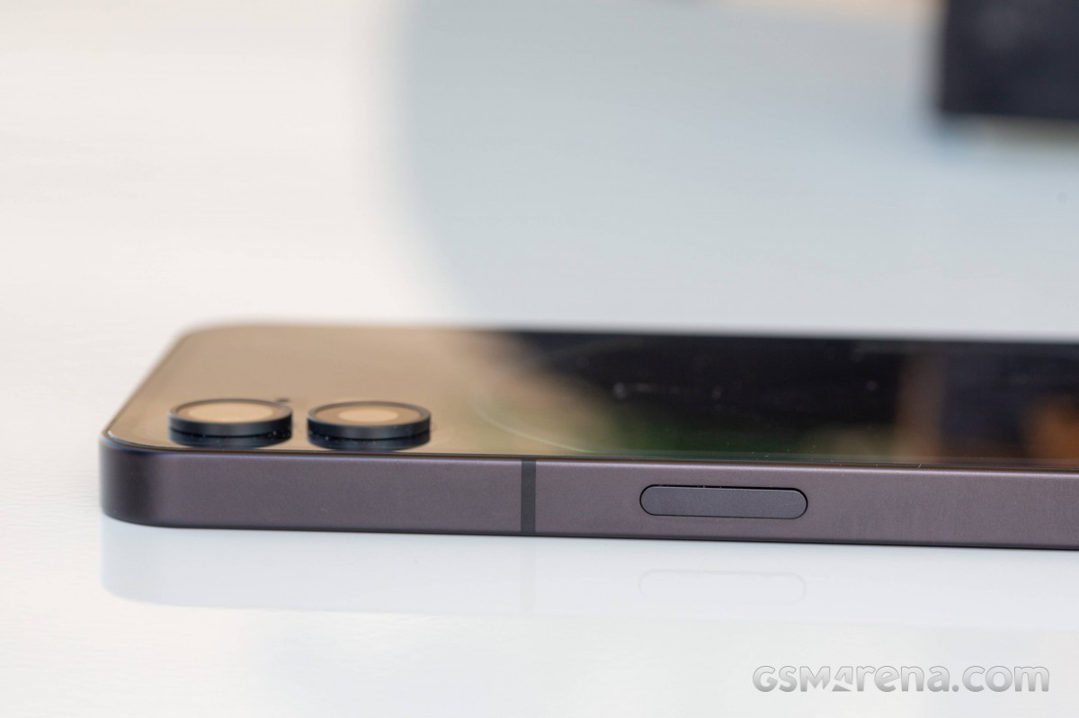
All of that does, however, change if you slap a case on it, and find one that isn't slippery itself. In that glorious hypothetical scenario, you'll get the upside of the flatness with none of the slippery downside.
The problem is that Nothing was inspired by Apple in other areas too, not just design. The contents of the box, for example. Or rather, lack thereof. There's no case and no charger. Although at this price, it might be easier to overlook these omissions for some, the weird irony is that most of this phone's competitors do actually ship with both. We live in strange, hard-to-decipher times.
Size-wise, it's very mainstream modern and what you'd expect, so aside from the aforementioned notes about slipperiness, handling is also unsurprising for this day and age. People with big hands won't have any issues, those with medium-size hands will probably deal fine, while those with small hands are stuck with the non-Plus iPhones, Zenfones, and Galaxy S non-Plus non-Ultras of the world. The weight is fine, it's not so much that it feels like it's too much, but it's also not so light that it feels cheap.
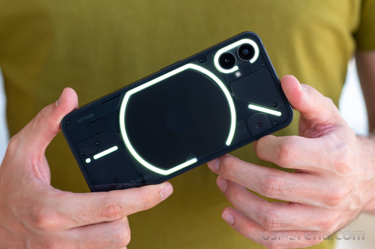
The camera bumps on the rear do make the phone slightly wobble on a table, although it's by no means as bad as many others, since the camera circles don't really protrude too much. A case helps with this too.
Buttons, USB-C port
We don't generally talk about buttons unless there's something wrong with them, and well, let's just say we have to talk about the Nothing Phone (1)'s buttons. They're simply too easy to press in. That might sound like a weird thing to complain about but believe us when we say we've had hundreds of accidental presses, and we've taken dozens, if not hundreds, of unwanted screenshots during our time with the device for this review.
And before you say anything about positioning, that's not the culprit since we've used plenty of Oppo / Realme / OnePlus phones with the same arrangement with the volume buttons on the left side symmetrically aligned at their center with the center of the power button on the right.
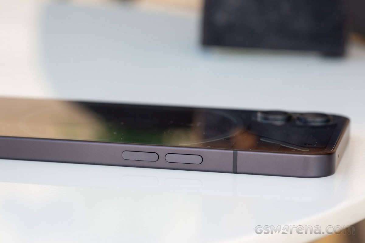
It's not the position; it's the buttons themselves. They're so easy to press that if they didn't look like real buttons we'd assume they're fake ones using a capacitive sensor - like Apple is rumored to do in the future. But no, these are real, they're just at the exact opposite end of "too clicky". There's almost no click at all here, so be warned - you will press these a lot without intending to.
Let's now move from buttons, which we rarely speak of, to the USB-C port, which as far as we can remember we never spoke of before in a long-term review. And that's because a USB-C port is a USB-C port, right? They're all the same. That's what we used to think too. Until we met this one.
There's no nicer way to put this, so we'll just say it: it's too loose. A thicker (and thus heavier) cable, like the ones that come bundled with very fast charging smartphones, will just fall out of the port if you lift the phone when it's plugged in, or even move it horizontally. We've never encountered this on any other device before, so we definitely thought it was worth mentioning. Slimmer cables do have less of a tendency to fall off, but they will still do it. Needless to say, we don't think this should be happening.
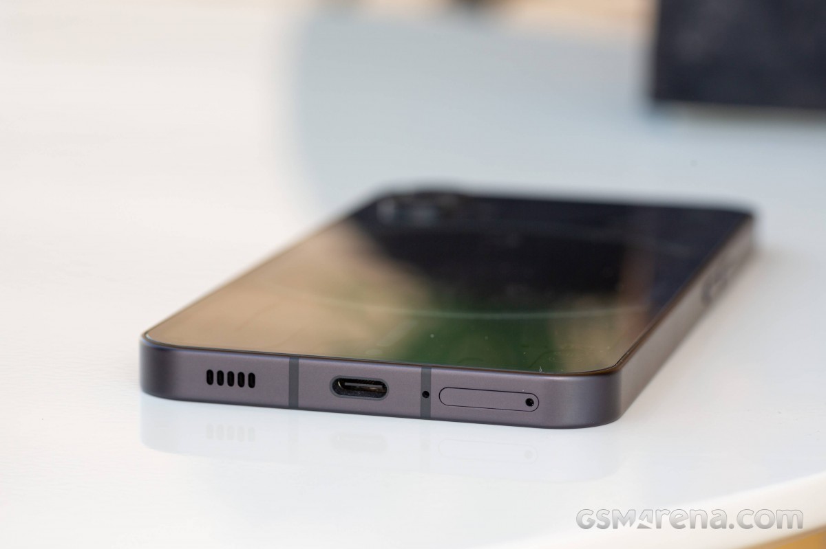
It's definitely not a good user experience, but, a final note - these may not be widespread issues. Perhaps it's our review unit only. As for the buttons, that's more a personal preference, so while your mileage may or may not vary, your perception of the experience could be very different from ours.
Reader comments
- Gameronfire
- 01 Apr 2025
- 3S{
Well, using this phone as my daily phone, and almost since launch. Positive: Simple Always received updates and still going. Now has android 15. Nothing company always hear you and respond your feedback. You have a dedicated form to do that...
- Anonymous
- 07 Jan 2025
- 8rj
It's one of the worst smartphones I've ever had. There are a lot of bugs!
- John
- 02 Feb 2024
- 7kn
Good phone