Nothing phone (1) long-term review

Current software, updates
The Nothing Phone (1) runs Nothing OS, a very light, stock-like skin atop Android. Currently, it's Android 13 we're talking about, as the device finally received the update in February. In mid-March, a new update apparently went out to Nothing Phone (1) units, but we didn't receive it by the time this review was ready.
This is promised to fix some minor bugs, like the screen flashing when transitioning into the always-on display. The changelog also mentions speedier app opening times, though truth be told we never found that action to be slow even on the prior version. It's very much on par with what you'd expect from a mid-ranger powered by a Snapdragon 7 series chipset.

This update would also bring the security patch level to February 2023 in March. Before this, the update that brought Android 13 to the Nothing Phone (1) was released in February with the January patches. Spot a trend here? When it comes to security updates, Nothing so far seems to be issuing them monthly, which is great, but it's always one month behind for whatever reason. That's worse performance than Google and Samsung, but still much better than what you can expect from the likes of Xiaomi.
In terms of big Android updates, Nothing has only one on its track record, and it was definitely among the slowest companies to come out with Android 13, many months after Google initially released it. We don't know what you should expect from the future, though, whether things will improve on this front or not is hard to tell since we're talking about a very young company that's still only released one phone so far.
So if you get the Nothing Phone (1), you are inevitably taking a gamble in terms of future software support, as this isn't an established player we're talking about. We're not saying you should steer clear of the device for this reason, far from it, in fact - but you do need to take that into account nevertheless.
Nothing OS 1.5
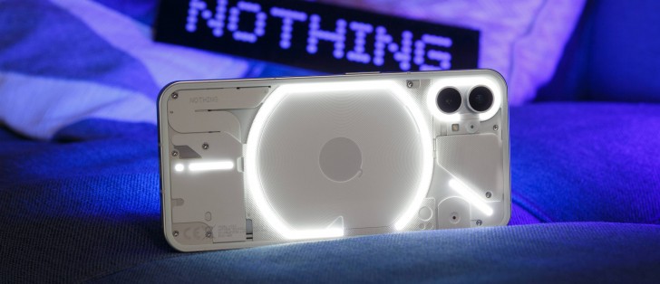
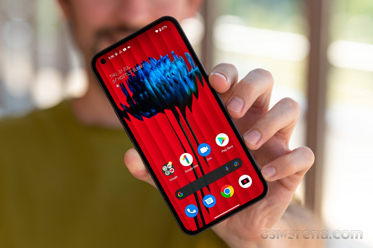
As we've already mentioned, Nothing OS is a light skin sitting on top Android 13, and it's currently in its 1.5.x iteration. You get stock vibes all over, and a few Nothing things sprinkled on top, here and there. The Nothing-specific font that's used to headline the second-level Settings items, for example. Also, of course, settings related to unique functionality like the Glyph lights, which we've already covered in a previous section.

As this is very much stock-ish, oddities Google is into have been carried over. Like, for example, the unnecessarily huge oval-shaped Quick Settings icons that look way too bulbous for our taste, and in most cases have no true usability benefits by being that large. At least not the intended ones - there is an unintended benefit, namely pushing down the notifications so they're easier to reach without finger gymnastics when you're using the phone with the same hand you're holding it with. But quicker access to things? Not so much.
Take the Bluetooth tile. Tapping on it gives you a clunky window in the middle of the screen, and if that doesn't serve your purpose, there's now an additional tap standing between you and the Bluetooth section in Settings. Utterly pointless, as with small Quick Settings tiles, you could long press the icon and be taken straight into Settings. No intermediary, confusing extra UI window necessary. You might love these huge tiles, and if so, more power to you. Since this is a stock-like skin, there's no way to change their size, so you'd better, as you're stuck with them.
The Settings menu has incredibly large spacing between the items, at least with our preferred font size, and this just makes it look strange. We understand the need for spacing, but this is definitely going overboard in our book. Again, you may enjoy it, and again, you probably should since there's no way to do anything about it.
The Settings themselves can be very confusingly arranged if you're coming from a device that wasn't running stock or stock-like Android, since a few things aren't where you might expect them to be, and others, like the always-on display, are very weirdly named. Still, you're likely to get the hang of things pretty quickly, and even if you don't, there's always the search box, lingering above everything else, just standing there, quietly, waiting to be noticed and used.
Launcher, Customization, Recents
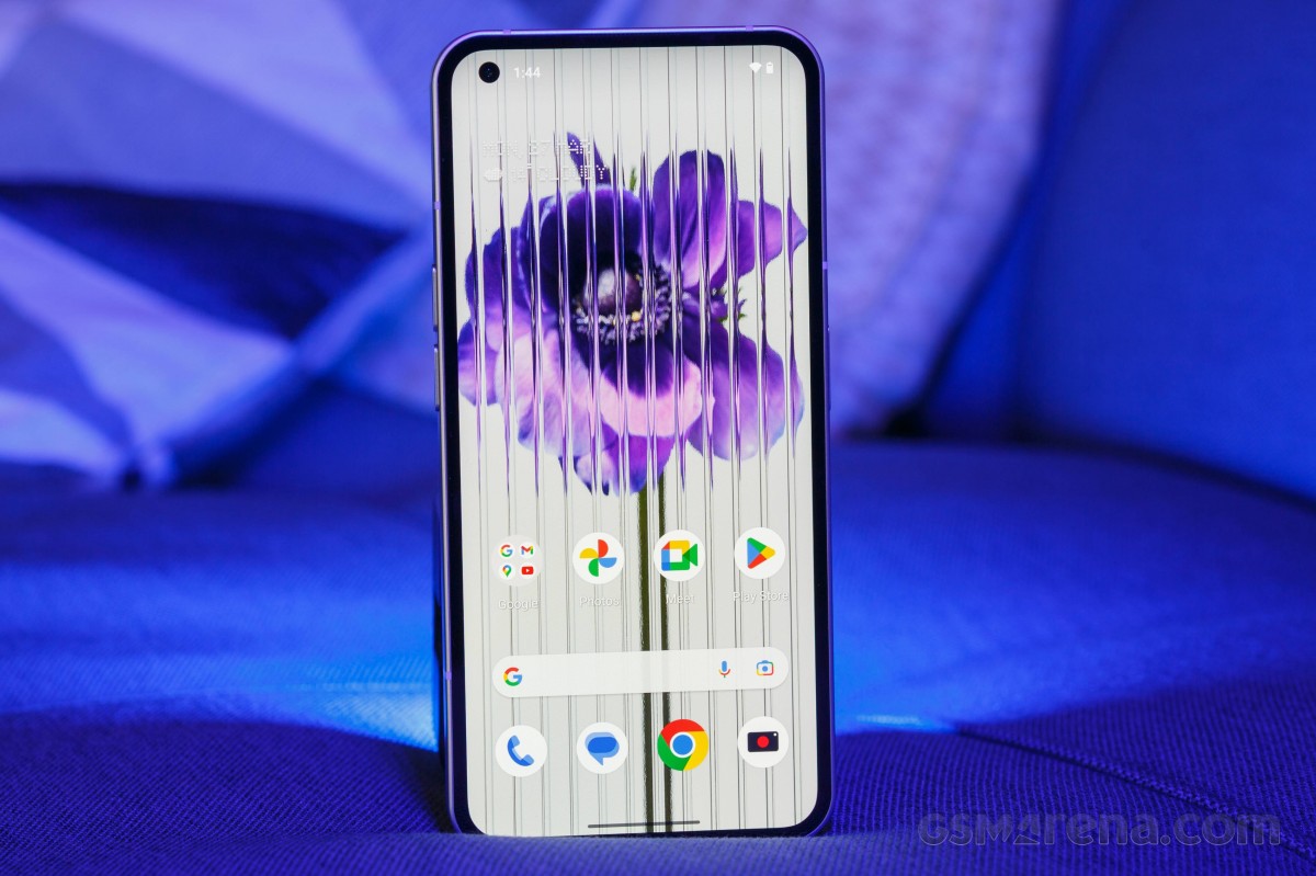
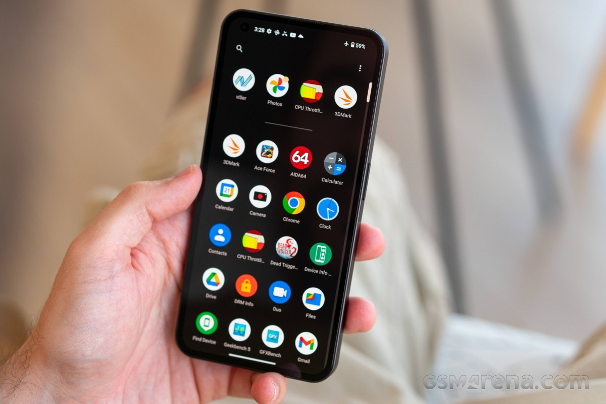
The launcher is as bare bones as they come. There are absolutely no settings aside from picking a wallpaper and whether you'd like it to be scrolling horizontally while you move from one home screen to another, selecting an icon pack to use (if you installed third party ones), and choosing the app grid layout. That's it.
We're not ones to praise overly padded Settings menus, but this one is slim to the point of giving off a too simplistic vibe. These settings also aren't where you'd expect, as there's no Home screen section or anything like that. Instead, look in Customization, and note that the app grid setting is actually in the Wallpaper & style subsection.

Lack of options aside, the launcher functioned very well during our time with the Nothing Phone (1), with no bugs, hiccups, lags, or freezes whatsoever. However, we can't say we enjoyed the fact that, like on some (but not all) modern Android phones, the "Add app icons to home screen" setting is on by default. This means that, when you restore 200+ apps like we do when first setting up the phone, if you forget to quickly search for this setting and turn it off, you'll end up with 200+ app icons on your home screens, iPhone style.
Even that wouldn't be a huge issue if the software would let you batch delete icons from home screens, or simply delete entire home screens, but Nothing OS doesn't let you do either of those things. The solution we used to this decidedly niche problem was to clear the data for the launcher app, which resets its home screen arrangement, but we're not sure how many 'normal users' would have any idea that's possible - they may just have to deal with the frustrating experience of removing tens, or dozens, or hundreds of apps from home screens individually.
As this is Android 13, the built-in system for extracting theme colors from wallpapers is present, and you can customize the colors and pick from a few wallpaper-based options, as well as "Basic colors" that aren't wallpaper-specific.


Launcher, Customization options
The wallpaper engine itself seems to be a slightly modified version of Google's Wallpapers app, since you can pick a category and then have it automatically change your wallpaper on a daily basis from within that category. It's a neat function that we've been using on all the phones we've reviewed long-term, and it's nice to see it built into the skin here, since it's not always a given that the Google Wallpapers app will actually work as intended on all third party skins.
Recent apps are displayed in a horizontally-scrolling list of screenshots, which is nowadays the norm in the entire mobile world (aside from MIUI where there's a different default, but you can switch to this if you want). Under each screenshot there's a redundant Screenshot icon that you can tap to, well, take a screenshot of what's going on inside that app.
You can, of course, achieve the same effect by pressing the power and volume down buttons, so maybe something more useful could have been taking up this space in Recents? We'll never know since there's no way to change what shows up there.
Dark theme, gesture navigation, experimental features
The Nothing Phone (1), like all modern smartphones, has a Dark theme. It's either on or off, with no way to customize its darkness level a la ColorOS. You can, however, schedule it to go on at sunset and off at sunrise, or use a custom period of your choosing. And that's the only setting there is.
The Dark theme works and is dark, but as we described at length in the Display section of this review, its functionality is severely hindered by the very obvious and very vivid green tint taking up the bottom 30% of our review unit's screen. We love dark themes on phones, but if we'd bought this exact unit, had we not returned it, we would probably have used it with the light theme, where the tint is less noticeable. Still there, but not as much of an eyesore.
Gesture navigation is present too, naturally, but unfortunately, as this is a stock-based skin, you can not get rid of the pointless white pill bar thingy at the bottom. It's always there, always with you, constantly reminding you that you can quickly switch between apps by swiping across the bottom of the screen. Of course, that functionality itself needn't be tied to a white bar, there are plenty of skins that let you get rid of the bar while keeping the quick switching intact, but Google wants it to be in your face, and so it is.
You can adjust the sensitivity of the Back gesture on both edges, which is very nice to have, but we didn't have to touch the default settings since they worked perfectly for us. That said, if they don't work for you, then there's something you can do about that.
The Nothing Phone (1) also has two "experimental features" baked in. One lets you control your Tesla EV, and the other, if enabled, adds support for Apple's AirPods, complete with icon and battery information in your Settings. The presence of these makes us think that Nothing assumes many of its customers buying the Phone (1) would be Tesla owners switching from an iPhone, and that's a very interesting assumption to make, undoubtedly.
Reader comments
- Gameronfire
- 01 Apr 2025
- 3S{
Well, using this phone as my daily phone, and almost since launch. Positive: Simple Always received updates and still going. Now has android 15. Nothing company always hear you and respond your feedback. You have a dedicated form to do that...
- Anonymous
- 07 Jan 2025
- 8rj
It's one of the worst smartphones I've ever had. There are a lot of bugs!
- John
- 02 Feb 2024
- 7kn
Good phone


