Nothing Phone (2a) Plus review
Design, build quality, handling
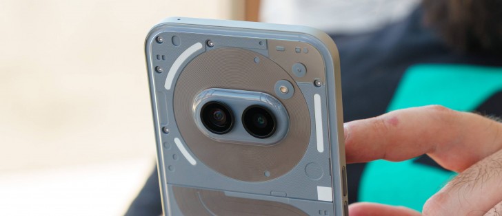
The Nothing Phone (2a) Plus continues in the footsteps of the Nothing Phone (2a) design-wise. The dual horizontal camera arrangement is still both retro, in a way, and rather unique in today's mobile landscape.
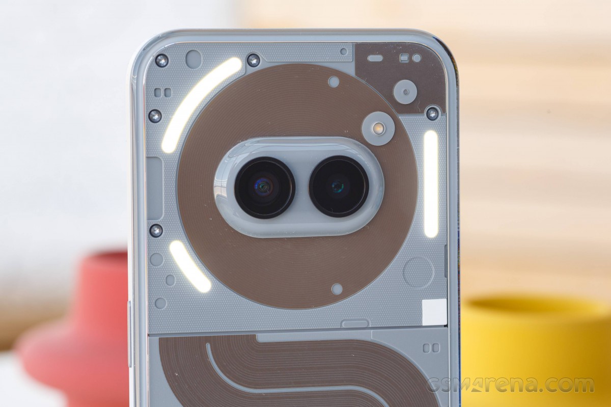
Nothing calls its design anthropomorphic, with the two cameras looking like eyes inside the large NFC coil surrounding it that looks like "a brain-like hub of intelligence and communication," as per the press release.
Of course, the main visual attraction of the Nothing Phone (2a) is undoubtedly its backside. It is see-through, which has become sort of a signature touch for Nothing. Unfortunately, Nothing doesn't outright say what the rear panel is made of. It just calls it a "90-degree infinity back cover" and says that a special "dual compression and injection" process is used in its construction to achieve a 2.2:0.8 thickness ratio from the thickest to the thinnest part of the surface.
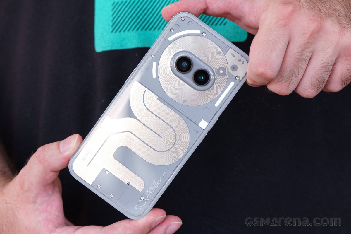
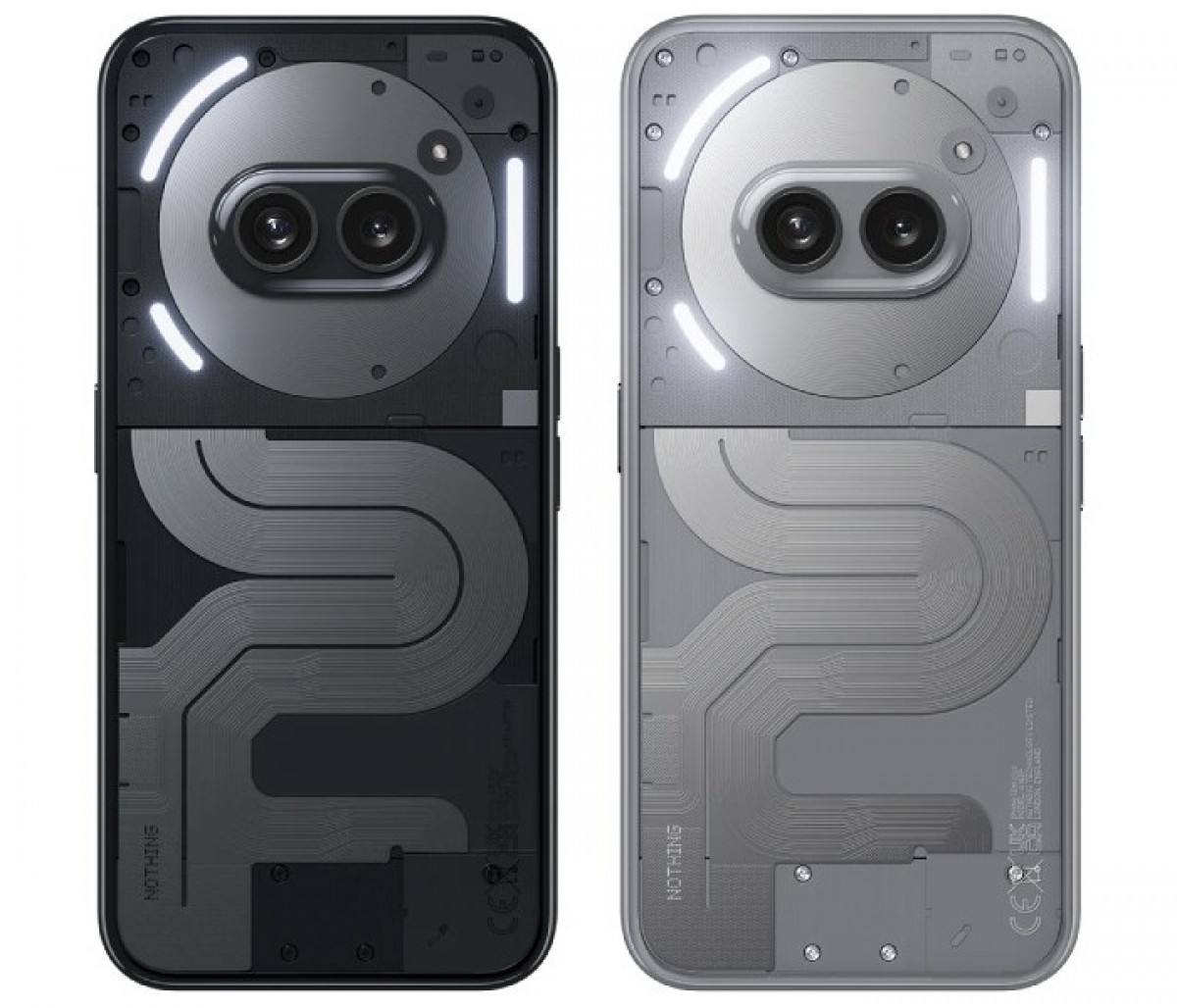
Nothing has two new metallic colors for the Nothing Phone (2a) Plus. These are a new metallic Grey and an updated Black. Both look great and work well with the transparency of the back panel.
In practical terms, we can say that the back panel looks and feels a bit plasticky to us, but not in a bad way. We like the slightly grippier feel that it offers. What we don't appreciate, however, are all of the fingerprints that it gathers and dust. Lots and lots of dust. For some reason, this surface gets incredibly electrostatically charged and will always inevitably be dusty unless you cover it up with a case.
But what a shame that would be since you will also be covering up the signature Glyph interface. It consists of three light strips, all flanking the rear camera. There are a total of 26 individually addressable zones within the Glyph Interface, which enables all sorts of functionality, such as Glyph Timer and Glyph Progress. The latter is pretty cool since it allows you to track the progress of certain third-party apps like delivery or ride-sharing services.
Of course, you can also use the Glyph lights for notifications. The lights are also big enough to be useful as a soft "ring light" of sorts for the rear camera. You can also use the lights as a countdown indicator for the camera timer. Things like volume and battery percentage can also be visualized.
Nothing markets the Glyph Interface as an innovative way to interact with the phone instead of just an aesthetic feature with 15 advertised functions.
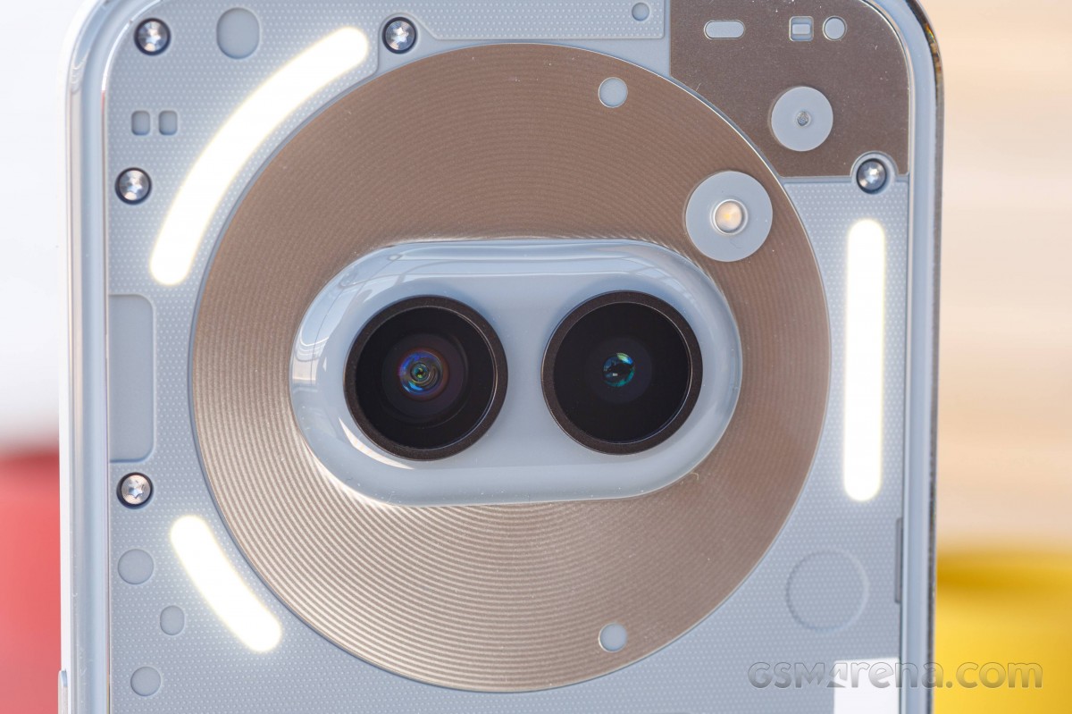
Speaking of the Glyph Interface, it is worth noting that while both the Nothing Phone (1) and Nothing Phone (2) have a blinking red light on the back in addition to the Glyph Interface to indicate video capture and it is absent from the Nothing Phone (2a) Plus. Unlike the Nothing Phone (2a), which has a red dot as just part of the design, the dot on the Nothing Phone (2a) Plus isn't even red anymore. Honestly, we kind of like it a bit better this way.
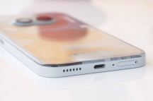
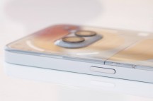
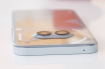
The rest of the Nothing Phone (2a) Plus design is identical to the Nothing Phone (2a) and is pretty unassuming. You get a nice rounded frame, which is probably plastic, judging from the look, feel, and lack of antenna lines. It has a nice matte finish.
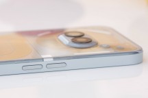
The buttons are well laid out and comfortable to use. But it is worth noting that this is one of those phones that have the volume rockers on the left and the power button on the right separated.
The front of the Nothing Phone (2a) Plus is a flat piece of Gorilla Glass 5. It also comes with a pre-applied thin screen protector, which is a nice little touch. It is made of plastic, so you might want to swap it out for a nicer glass protector if you are into that sort of thing. Speaking of protection, the Nothing Phone (2a) Plus has an IP54 ingress rating, just like the Nothing Phone (2a) and Nothing Phone (2). Nothing too fancy, but it's still better than no rating.
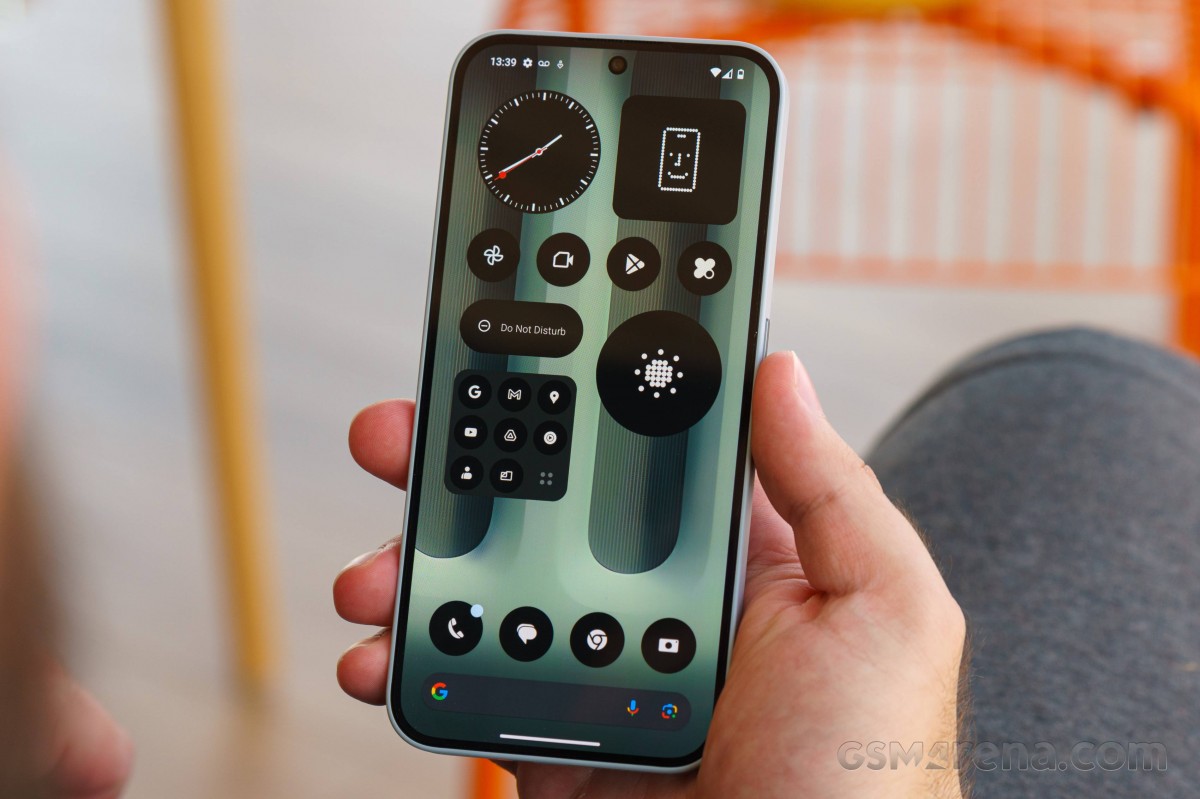
The bezels around the display are quite sizeable. So much so that, in fact, there was enough room to fit the proximity and light sensors above the display alongside the earpiece. In many modern phones, these sensors are tucked away underneath the panel. Still, we don't think the Nothing Phone (2a) Plus looks cheap or retro or anything of the sort. The bezels are symmetrical, which does give off a nice vibe.
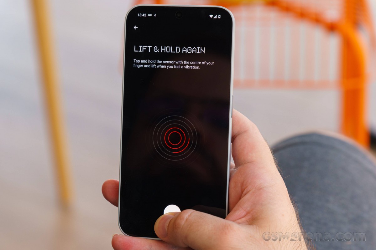
The Nothing Phone (2a) Plus has an under-display optical fingerprint reader. It is both snappy and reliable. We have no complaints about it.
Finally, a few words on handling. As we mentioned, the rear surface on the Nothing Phone (2a) Plus offers a surprising amount of friction and grip. Its sides are nice and rounded for a comfortable in-hand feel. Some might find the volume controls to be a bit too low on the frame, but that will be highly subjective and not a major deal in our book.
Besides that, despite having a bit of hollowness to the back, the phone itself feels solid, with pretty much no flex in the chassis. Despite packing a pretty large 6.7-inch display and a larger 5,000 mAh battery, it also manages to be notably lighter than the Nothing Phone (2).
Unsurprisingly, the Nothing Phone (2a) Plus weighs the same 190 grams as the Nothing Phone (2a). However, it is worth noting that the Plus model is ever so slightly thinner than its sibling at 8.5 mm compared to 8.6 mm. It is not noticeable in practice, but it will likely make cases not interchangeable between the two models.
Reader comments
- BRENDA K
- 10 Mar 2025
- fnI
how is the picture quality for thus phone
- otakufrank
- 10 Feb 2025
- pwv
Because Xiaomi sucks. Hyperos is bad and you get a system full with ads.
