OnePlus 3 review: Confidence booster
Confidence booster

Unboxing the OnePlus 3
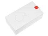
OnePlus definitely has its own signature when it comes to packaging and presentation. In a way, it is very clean and streamlined, like what you would expect form Apple or Xiaomi, with lots of white and uniform surfaces.
You do get that with the OnePlus 3 and its white rectangular two piece box. But, at the same time, the signature red color accents are still prevalent throughout. There is the big red OnePlus logo on the front as well as a thin red data cable. In fact, the whole bottom half of the box is painted in bright red.
It is also worth noting that OnePlus has spared no expense when it comes to the packaging. It is all done with a soft finish cardboard with a few neatly arranged compartments sliding effortlessly in place. The OnePlus 3 itself actually sits inside a plastic cradle instead of plain cardboard.
As part of the standard package, you get the aforementioned USB Type-C cable, as well as the company's new Dash charger. It is an extremely compact 4A unit that actually uses a custom version of Oppo's VOOC technology, which we still believe is the industry leader when it comes to fast charging.
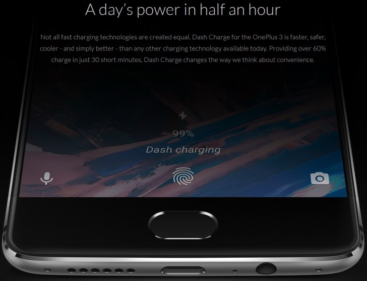
OnePlus advertises a zero to 60% charge of the 3000mAh battery in just 30 minutes and to our surprise, we actually managed to get pretty close to those numbers. You definitely have to see it to believe it and it is all done without overheating. That being said, OnePlus also offers a car Dash charger. We got to test it out as well and it is equally amazing. Currently selling at EUR 29.95, it is a bit pricey, but well worth the money if you are on the road a lot.
Hardware
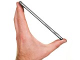
It is hard to find any obvious flaws in the appearance of the OnePlus 3. There is no denying it - number 3 is a gorgeous device. It is molded out of a single piece of space-grade aluminum, which combines strength with elegance and is just so great to the touch. Measuring only 7.3mm in depth, it ranks among the thinnest flagships out there and with a weight of 158 g, it is both surprisingly thin and light for a metal-clad phone.
The complete body measurements are 152.7 x 74.7 x 7.35mm and, thanks to the combination of smooth, rounded shapes and some sharp well defined edges, it is both easy to handle and elegant. It is offered in two finishes, Graphite and Soft Gold, both quite subtle in their appearance.
Remember when we said the OnePlus 3 is a pragmatic choice? Consider the overall design language of the device and you will quickly see what we mean. There is not much really novel or too flashy about the phone's exterior and that is probably its biggest strength. Amid a sea of devices, desperately trying to stand out with things like detachable modules, case add-ons and, arguably, unnecessary curves and accents on all sides, OnePlus has decided to stick to a very restrained approach.
We have no doubt that the appeal of such a design is very dependent on personal taste and some have already described the OnePlus 3 as a bit boring. However, we tend to view it as a mixture of carefully adopted elements, like the back, which is airily similar to he HTC One M9 or the Huawei Mate S, and the bottom, which could easily be mistaken for an iPhone 6s.
The only beef we really have with the OnePlus 3 and again, we doubt it is universally shared, is the camera bump. It sticks out quite a bit, which is a natural side-effect of having a 7.35mm body. Had OnePlus kept to its traditional approach and smoothened out the rear, like on the original flagship killer and the OnePlus 2, the OnePlus 3 would have definitely benefited from a bit of extra battery.
While we are on the topic, the back of the unit is very clean. It has the camera bump in question and a single LED flash below it. The only other thing there is the neatly engraved OnePlus logo and a couple of antenna lines, the top of which hides a secondary noise-canceling mic.
The front of the OnePlus 3 is also about as clean as it can be. When the display is off it blends in with the surrounding almost perfectly. Side-bezels around the 5.5-inch panel are so thin at just 0.755mm, that the picture appears to almost float above the base. So, the wow factor is still there despite the lack of a curved display.
Despite its clean front panel, the OnePlus 3 actually has quite a few controls at the user's disposal, but they are hidden away quite well. In the typical company fashion, users are offered a full range of navigation customization options, including the choice between on-screen controls and the capacitive touch buttons. The latter are practically invisible when not lit and otherwise show up as single white dots.
As for the Home key, just like on the OnePlus 2, it is not really a button. It is a fingerprint reader that also recognizes a tap gesture. Performance-wise, it can only be described as blazing fast. It is one of the quickest and most accurate readers we have experienced to date, if not the very best. OnePlus has done such an amazing job in this department that we actually suspected some cheating, along the lines of not verifying the print and skipping the security. But we were wrong. The whole thing just works and does so blazing fast.
On the left side of the OnePlus 3 we find a standard volume rocker, with the same metal finish as the rest of the unit. Right above it, however, is a rather uncommon control that you don't see that often in the Android realm. It is the Alert Slider, which can quickly toggle between the three basic notification states - Silent, Priority and All. The feature is also customizable and is something fans should already be familiar with from the OnePlus 2.
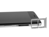
Moving on to the right of the unit, we see the power button, done in exactly the same fashion as the volume rocker. Then there is the SIM tray. The OnePlus 3 is a Dual-SIM device, so the tray actually takes two nano cards. Sadly, neither of them is a hybrid and it is sad to see OnePlus skimping on expandable storage altogether.
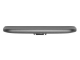
To wrap our tour up, the top of the OnePlus 3 is absolutely empty, not even a secondary mic, which is on the back.
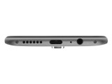
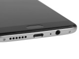
The bottom, on the other hand, is quite busy. Here we find the USB Type-C connector, which, sadly, only offers a USB 2.0 connection. We also have a single speaker grille, the main microphone and next to it, the 3.5mm jack. It is good to see that OnePlus hasn't given in to an emerging trend of late and kept this vital feature.
Reader comments
- Anonymous
- 30 Oct 2019
- DkV
You can change it in settings
- walid
- 08 Aug 2018
- 6u2
the worst thing of one plus 3 is the back touch on the left side
- Roman
- 20 Dec 2017
- X{X
I am confusing which mobile I want to buy either mi a1 or one pluse 3 pls say something anyone
