OnePlus 3 review: Confidence booster
Confidence booster

Oxygen 3.1.2 on top of Android 6.0.1 Marshmallow
The original OnePlus One came running on CyanogenMod but in the end OnePlus had to come up with an original launcher and drop the Cyanogen entirely. This is how the Oxygen OS was born and although the ambitious ROM has come a long way now that it is on version 3.1.2, little has changed on the surface and most improvements are behind the scenes.
The Oxygen launcher aims to bring a nearly vanilla Android experience enhanced only by few, but useful software tricks. Last year, when the OnePlus 2 was released android Marshmallow was still a project in development. However, the active Oxygen community had already managed to port a lot of its new features to Lollipop, like app permission management and drivers for the fingerprint reader and USB Type-C port. Now that all this comes standard in Android, we can only imagine the Oxygen team had a few things less on its plate.
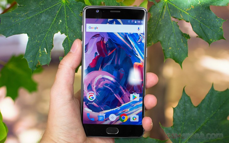
Most of the Android interface is intact - it's the Material design and icons we first met in Android Lollipop. All vanilla Android fans will be pleased to find out OnePlus touched almost nothing as far as homescreens and menu visuals are concerned.
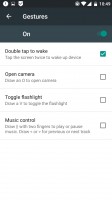
OnePlus added four very useful gestures, which are available on a turned off screen. You can double tap to wake it up, draw O to open the camera, draw V to toggle the flashlight on/off, or draw < > for previous/next track. Current OnePlus users will already be familiar with these and pleased to see they are untouched.
This time around, the fingerprint reader is better than ever. It is still always-on and can be used for unlocking the phone without waking it up and as already mentioned, it is fast. In fact, it is so fast and precise that you could easily forget its there, which is a great achievement.
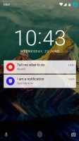
The lockscreen is the usual affair - it shows missed notifications. Swiping left or right will fire up the dialer or the camera.
The Oxygen launcher is incredibly clean and very close to vanilla Android indeed. There are, however, a few notable tweaks. For instance, the launcher has a feature called Shelf, which takes the form of your leftmost homescreen. Here you can see the weather, your most used apps, and frequent contacts. You can also add widgets here and change the header image. When you first setup the phone it asks if you want to use Shelf. You can also disable or enable it later through the homescreen settings menu.


The homescreen • Shelf and custom widgets
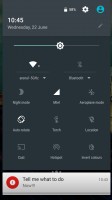
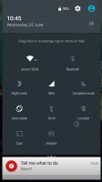
The notification shade is standard as well. You can lower it with a single swipe from anywhere in the UI and an additional one will reveal the quick toggles. You can also use two fingers to bring down the whole thing in a single swipe. As for the toggles, they include Wi-Fi, Bluetooth, Night Mode, Airplane mode, screen auto-rotate, flashlight, location on/off, the option to cast the screen, Hotspot toggle and now also a color invert quick shortcut. These can all be rearranged and hidden easily. Of course, you can also adjust the brightness of the screen and go into the settings menu too.
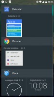
The app switcher has a neat card interface that allows you to select the app you need by swiping up or down. You can close apps by swiping left or right, or by hitting the dedicated button on the top right corner of each card. Google Chrome, which is the default browser, no longer presents each tab as a view in this interface, but it can still be enabled in Chrome settings. The bottom of the tab switcher also has three convenient toggles - one to clean resources, one to empty the list and the last one to quickly go to the app manager and edit things like permissions and notification privileges.
Finally, Google Now is summoned by tap and hold on the Home key on any interface.


The task switcher • Google Now
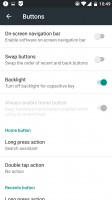
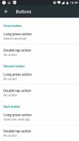
OnePlus has always put great emphasis on customizability and like previous models, it is still woven right into the device from hardware, all the way to software. We already mentioned that Oxygen OS lets you easily chose between using the phone's capacitive keys or on-screen controls for navigation. Not only that, but you can also remap and rearrange said controls respectively - the Menu and App Switcher keys can be reversed, plus you can assign them custom actions upon tap&hold.
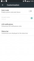
The notification LED colors are also configurable. OnePlus has even included an alternative theme - Dark mode, which changes the color scheme of the entire UI to a more power-efficient dark shade. Besides battery improvements, opting for Dark mode also has the added benefit of accent color customization - an otherwise unavailable option.
Reader comments
- Anonymous
- 30 Oct 2019
- DkV
You can change it in settings
- walid
- 08 Aug 2018
- 6u2
the worst thing of one plus 3 is the back touch on the left side
- Roman
- 20 Dec 2017
- X{X
I am confusing which mobile I want to buy either mi a1 or one pluse 3 pls say something anyone
