OnePlus 8 Pro hands-on review
Design
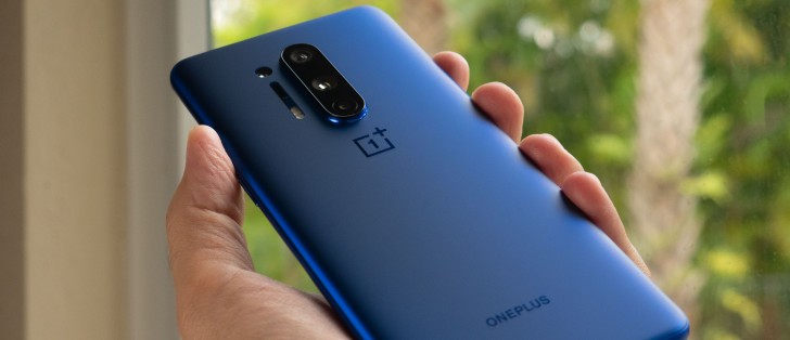
The OnePlus 8 Pro is, overall, strikingly similar to the OnePlus 7 Pro and 7T Pro. If you were expecting a drastic design change, this isn't it. Although it looks identical on the surface, there are some key differences in the design of the phone. There are several new updates and features that could make the 8 Pro worth considering, let's check out the visual differences first.
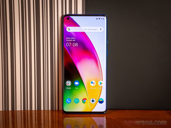
To start, the most significant visual updates are: the punch-hole camera, the fourth camera on the back, and a display with tighter curved edges than the 7 Pro. There are also subtle changes to the 1+ logo and the ONEPLUS branding at the bottom. Honestly, we were expecting something totally fresh and new, and although this design isn't terrible, it's... quite familiar.
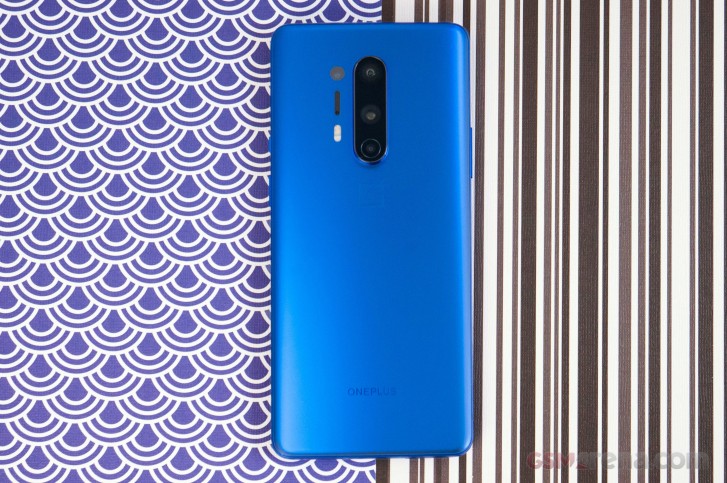
Still, we give OnePlus credit for being able to define a design element that makes its brand recognizable. In this case, the centered, vertically-stacked triple cameras are unique to OnePlus phones these days.
The 8 Pro is slightly longer (165.3 mm) than the 7 Pro (162.6 mm), and the 8 Pro's width (74.35 mm) is just shy of the 7 Pro's (75.9mm). Meanwhile, the 8 Pro is slightly thinner (8.5 mm) than the 7 Pro (8.8 mm). Of course, the thickness doesn't account for the camera hump, which protrudes even more on the 8 Pro. The 8 Pro's 199g weight is lighter than the 7 Pro's 206g, which is impressive considering the larger 4510 mAh battery, but justified with the lack of the motorized pop-up camera hardware.
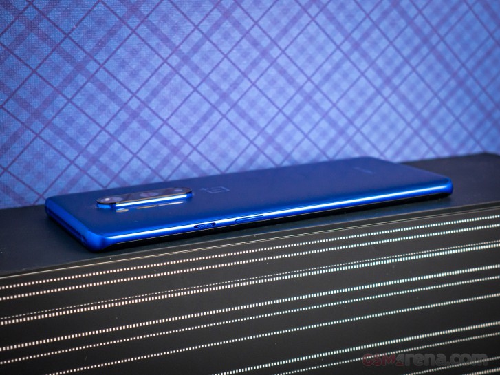
The top of the phone also has a new indented bumper and the frame wraps all the way around the phone. The finish on the metal frame is matte, and it matches the finish on the rest of this Ultramarine Blue model - which is soft to the touch.
The ultramarine paint job on the OnePlus 8 Pro is so deep and is the most hypnotizing blue that we've ever seen on a phone.
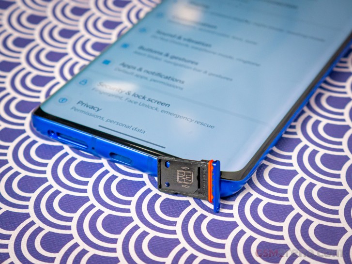
Also, at the top is an in-call noise-reducing microphone, at the bottom: the USB-C charging port, in-call microphone, a redesigned loudspeaker grille, and the dual nanoSIM tray.
On the left is the volume rocker, and the right side is home to the power key, and the updated Alert slider. Its function is the same, but it's been made even smaller, and the clicking action between positions sounds almost like flicking a Bic lighter. Switching between the profiles also reminded us that the 8 Pro has a firmer, crispier vibrate motor.
Now that there are two 48MP modules on the back, the camera bump is fatter, longer, and protrudes even more. The camera hump causes a significant wobble on a desk or table. Throwing it into a case should remedy that.
One issue that we had with the 7 Pro was how thin its frame was. The 8 Pro feels like it's been filled in all the right places. Still, the frame on the 8 Pro is quite thin, but it has rounder tapers around the edges, which make it easier to hold. On a similar note, the curved corners on the 8 Pro have tighter radiuses all over, which result in a bolder, and more masculine appearance.
In terms of functional ergonomics, the in-display scanner is placed higher than the one on the 7 Pro. This position makes it more comfortable to reach the power key with the thumb, and then move it over to the scanner.
Display
Before delving in the internals of the 8 Pro, let's look at some of the changes advertised for this new phone. The first and most major change is the bump in refresh rate to 120Hz from 90Hz on its predecessors, and this one supports 120Hz in the display's full QHD+ resolution (the Galaxy S20 lineup only does it at FHD+). Then, OnePlus claims up to 1,300 nits of brightness. We certainly won't see readings that high in the testing parameters we use in our display readings, but we are expecting to see peak readings around the mid-900s.
With the 8 Pro, OnePlus once again sources the AMOLED panel from Samsung Display and OnePlus promises "The most authentic color on any smartphone".
The 8 Pro's display can reproduce over 1 billion colors and a color-accuracy of under 0.55 JNCD (Just noticeable color difference). Oppo has made similar claims with the display on the Find X2 Pro - which is also a 120Hz QHD+ AMOLED screen - so we wonder whether these displays are identical.
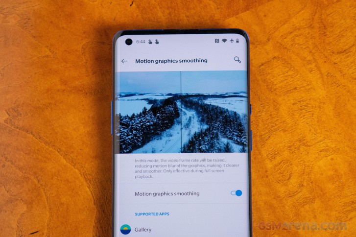
OnePlus first teased its MEMC (Motion Estimation, Motion Compensation) feature back in January and it does the same thing that many high-end TVs do with a feature sometimes called "motion smoothening". What it does is analyzes footage of at least 24 frames-per-second and interpolate frames to make the footage playback in what looks to be a higher frame rate.
The feature works with supported apps and games. In our brief time with MEMC, we watched some of our own videos on YouTube. Talking-head footage is smoothened just fine, but it's not consistent with footage of anything else. It would work well for any TV show during exhibition scenes (conversations between characters) but we weren't able to get it to work with Netflix, despite its apparent support.
When it does kick in, the downside to MEMC is a noticeable increase in fuzziness that were caused by the interpolation of frames. This is generally a side-effect of MEMC, and the same thing can be seen on expensive TV sets where it's often called "smooth motion".
Filmmakers have always argued that TV manufacturers use this feature to upsell their TVs in big box stores and many manufacturers leave this feature enabled by default. Hollywood actors and directors even launched a campaign in recent years, encouraging movie fans to turn this feature off with the argument is that this isn't the way that film makers and movie directors intend their movies to be watched - done out of love for the art of film making. It's like getting a gourmet meal at a fancy restaurant only to pour salt all over it, thus changing the intended essence of the meal.
So OnePlus's decision to include that feature has questionable benefits to the end user.
Let's talk about the curved edges of this display. Since the radius of the curves are tighter, it results in some edge distortion along the edge of both curves that wasn't present on the 7 Pro. This was something that some complained about on the Samsung Galaxy S6 edge and S7 edge because it distracted from the display. We know some of you may be sensitive to this, but it didn't bother us.
Reader comments
- Nick.B
- 23 Apr 2020
- Fmx
Please do dxomark for oneplus 8 pro. There is only preview in dxomark. Also please GSMArena do full review of oneplus 8 pro.
- hamed
- 22 Apr 2020
- stA
yesss