OnePlus 8 Pro review
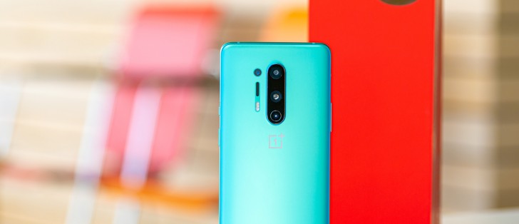
Deepest blue yet
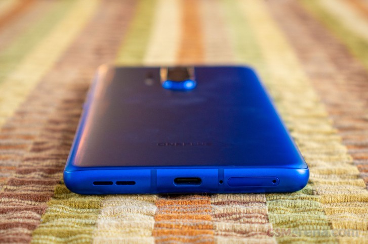
OnePlus has previously offered blue colored smartphones. The 7 Pro's Nebula Blue was matte blue with indigo and black accents, the 7T's Glacier Blue was a little like Nebula Blue, without the black accents and an overall brighter blue color. The 8 Pro's Ultramarine blue is the purest and deepest, 'most cant-take-your-eyes-away' blue that we've ever seen on a smartphone.
We admit, we do miss the gradient color schemes that the 7 Pro and 7T's frames had, the 8 Pro's frame is simply blue all over, with matte, anodized metal finish.
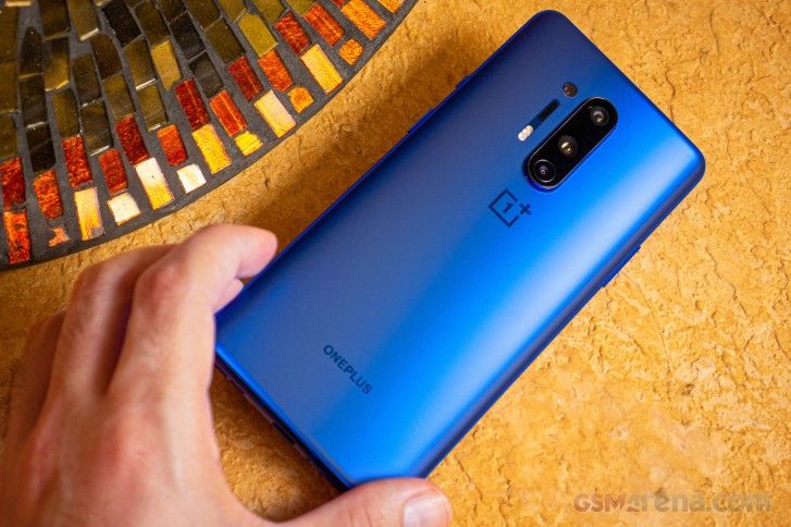
The overall design of the 8 Pro is very similar to the 7 Pro's, it's about the same width, but certainly taller, and OnePlus managed to keep the same thickness, even with the added battery capacity and wireless charging hardware. The 8 Pro measures 165.3 x 74.35 x 8.5 mm. The protruding camera hump is much more apparent than the 7 Pro and 7T, though, due to the larger sensors used in the main and ultrawide cameras.
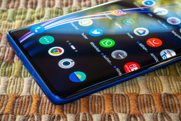
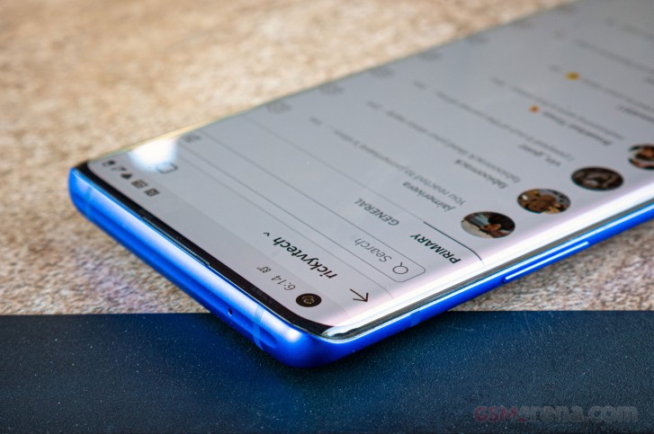
The corners of the frame and display have slightly smaller radii. Not only this, but the smaller radius of the curve glass on the display and the new ridge at the top of the phone give the OnePlus 8 Pro a less-curvy appearance and a bolder, somewhat boxier feel to it. Holding the phone is more comfortable now that the edges aren't as angular as on the 7 Pro.
The overall layout of the buttons and ports remains the same. On the right side is the power key and a physical alert slider (volume switch) right above it. Here's where we note that OnePlus has been including this hardware feature since the very first OnePlus One. The switch is smaller and feels satisfyingly clickier than ever when switching between silent, vibrate, and ring settings.
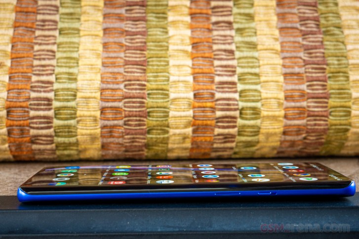
On the left side is the volume rocker, and you'll notice this new ridge that divots along the top edge of the phone. While this is a new design feature for OnePlus, its purely aesthetic. The in-call speaker is slit right at the top of the edge-to-edge screen, with a punch-hole cutout housing the 16MP selfie camera.
The dual nanoSIM tray pops out of the bottom of the phone to the left of the USB-C port. The down-firing speaker sees a slight change from speaker holes to dual-slotted speaker ports.
In the hand, the phone feels quite large. It's certainly a hefty piece of technology with a really nice screen-to-body ratio. The hole-punch camera eliminates the need for a pop-up selfie camera. We loved the pop-up on the 7 Pro, so it's a shame to see it go away. Still, the official immersion protection (IP) rating is a welcome addition.
Overall, the design of the OnePlus 8 Pro isn't anything drastically new. Although it's certainly familiar, it is also well refined from last year. The vertically stacked camera setup is now distinctly OnePlus.
The one downside to the design we could think of is the distortion of the display that occurs right at the edges of the curved glass, but it will be up to each person to decide whether its distracting enough to let it bother you.
With that, let's take a closer look at the display and battery life of the OnePlus 8 Pro.
Reader comments
- akib bd
- 24 Jul 2024
- XWs
8pro better
- Moazzam
- 14 Dec 2023
- 6QV
8pro is best
- Asad
- 21 Jun 2023
- UUK
Please suggest me I should buy OnePlus 8pro or OnePlus 9R or OnePlus 7pro.which is the best in these models