Oppo ColorOS 13 hands-on review
Introduction
Oppo stuck to its promise and unveiled its latest ColorOS 13 at an event today. As its name suggests, ColorOS 13 is based on Google's Android 13 under the hood. That, in itself, entails some interesting changes, mainly having to do with personal data and security. Oppo hasn't adopted every bit of Android 13 directly, particularly on the visual side of things, where the company has put its own spin on things. The "under the hood" improvements are present, though. You can read more about those here.
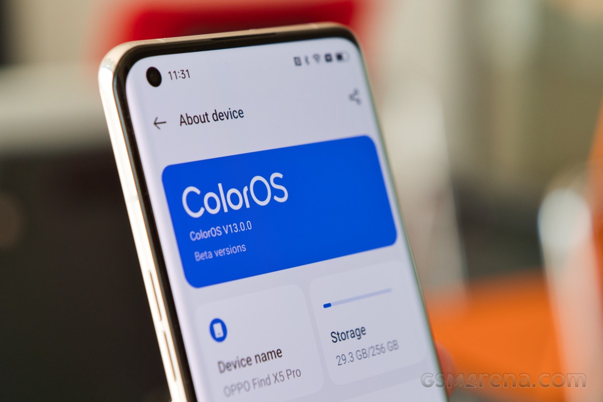
There is plenty to focus on in ColorOS 13 beyond Google's Android 13 bits, though. As you can imagine, ColorOS 13 has been in testing for some time now. Mostly in internal circles, followed by limited public testing. Now that the global version is ColorOS 13 is official we expect a much wider release to follow shortly. In the meantime, we are happy to report that Oppo afforded us the opportunity to give Color OS 13 an early try prior to the official release.
Follow along as we detail what's new and what's changed and our general experience with ColorOS 13 and Android 13 on Oppo's flagship Find X5 Pro handset. We apologize if we miss any particular detail since there is a lot of ground to cover.
Visual changes - Aquamorphic design
Let's kick things off with the visual changes in ColorOS 13. There is a distinct shift in the overall look and feel of the UX. As one would expect, it is more refined, and this time around, Oppo has a whole new consistent visual style that permeates most parts of the UI. Oppo is calling it Aquamorphic design, which entails plenty of rounded shapes, like pebbles, with soft lines and smooth transitions and animations inspired by the motion of water.
Most of the layouts incorporate cards for good visual separation. Icons are highly recognizable, with contrasting colors and rounded shapes inspired by nature. Speaking of icons, you can really see the level of close collaboration between Oppo and Google since the new Material You AOSP design subsystem is clearly integrated into ColorOS 13.
Oppo has given it a spin of its own, but the basics are clearly courtesy of Google. Customization goes really deep. You can edit shapes, curvature, text size and color. There are nifty presets as well. One thing worth noting is that third-party app icons can now be styled to a certain degree as well through the same interface for a cohesive look and feel. Font legibility has been improved accross many languages. Animations throughout the UI come courtesy of a special Quantum Animation Engine, which even includes behavioral prediction for user actions.
The core Android color palettes functionality is part of ColorOS 13 as well. You can either go with one of the preset palettes or make one entirely on your own. In keeping with its aquatic theme, by default, ColorOS 13 has a selection of colors inspired mostly by color schemes at sunrise and sunset near the sea, which means lots of deep blues and orange to yellow accents akin to the sun.
Always-on display
Always on display has some work done as well, both visually and functionally. In terms of functionality, there is a brand new currently playing widget. Spotify, in particular, gets special treatment here. Oppo has also developed a new style of notifications for keeping track of things like delivery status updates and ride-sharing updates from various supported apps.
There is plenty of customization to be done to the always-on display in general. You can have a different set of items present or absent from the screen. There are also a whole bunch of behavioral settings, like putting the always-on display on a schedule to save battery.


Always-on display behavioral options
ColorOS 13 provides a few interesting custom bits of its own, like the Insight always-on display. It visualizes a timeline with data on every time you unlocked and used your phone throughout the day. It's something of an addition to the Android Digital Wellbeing system of sorts, so you can track how much you use your phone.
Another interesting ColorOS 13 addition is Bitmoji integration on the always-on display. It is a personalized little avatar that can hang out on the lock screen. It won't be static either, since it can react to the time of day, the weather and certain activities on the phone.
There is also a series of Homeland always-on display animations which showcase the changes to natural habitats of some creatures as a result of climate change and change throughout the day based on daily temperature fluctuations.
Control center
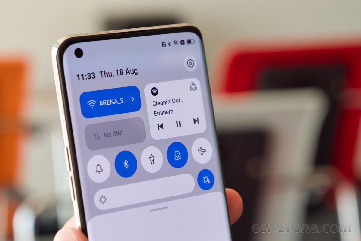
The Control center has also been revamped. Toggles are easier to differentiate and operate. There is a universal playback control widget that allows you to quickly switch between audio sources as well as playback devices.


Control center and Playback control widget
The Control center has a nifty new horizontal layout in ColorOS 13. It has quick toggles on the left and notifications on the right.


Control center horizontal layout
Folders
ColorOS 13 has a new type of enlarged folder interface for your desktop.
These folders allow you to navigate within them, like scrolling through pages of apps and launching the apps themselves without opening the actual folder up. The iOS inspiration is clearly visible, but that's not bad since these fit in great with the overall look and feel of the UX.
ColorOS 13 functional changes
As already mentioned, one huge selling point for ColorOS 13 is the fact that it is based on Google's latest Android 13 OS. That means that phones running ColorOS 13 automatically get all of the underlying benefits from the new core OS.
Many of the new features and improvements in Android 13 have to do with privacy and security. Apps don't get access to your entire media library just to be able to share one item. Your clipboard history gets automatically cleared "after a period of time" if you copy sensitive data like your email, phone number, or login credentials, and apps have to explicitly ask you to allow them to send notifications, rather than having that ability by default. All of this is present in ColorOS 13 alongside all of the accompanying settings and the security dashboard interface.


Privacy and security settings and dashboard
Oppo has added some custom privacy systems on top of the Android core as well. One nifty thing ColorOS 13 can do is automatically pixelate avatars and names in chat screenshots.


Pixelate names and avatars in screenshots
The feature works surprisingly well. You even get to choose between a trio of pixelation/blur options. Detection of avatars and names is done entirely on-device for the best possible privacy and is fully automatic thanks to image recognition technology. It's a relatively small feature for sure, but one that has massive potential to save a particular subset of users a lot of time and effort.
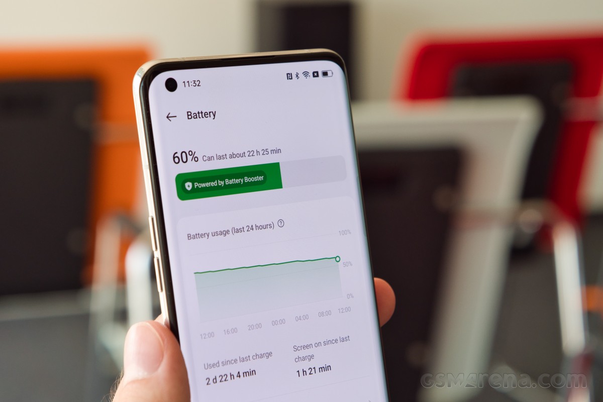
Oppo also claims that thanks to its software work and the new Android 13 core, too battery efficiency is now better with ColorOS 13. Also, more apps can remain active in the background, thanks to better memory management, which Oppo calls "Always-alive apps". Both of these improvements are part of something Oppo calls its Dynamic Computing Engine.
Oppo's own cross-device collaboration feature, called Multi-screen connect has gotten more powerful in ColorOS 13 too.
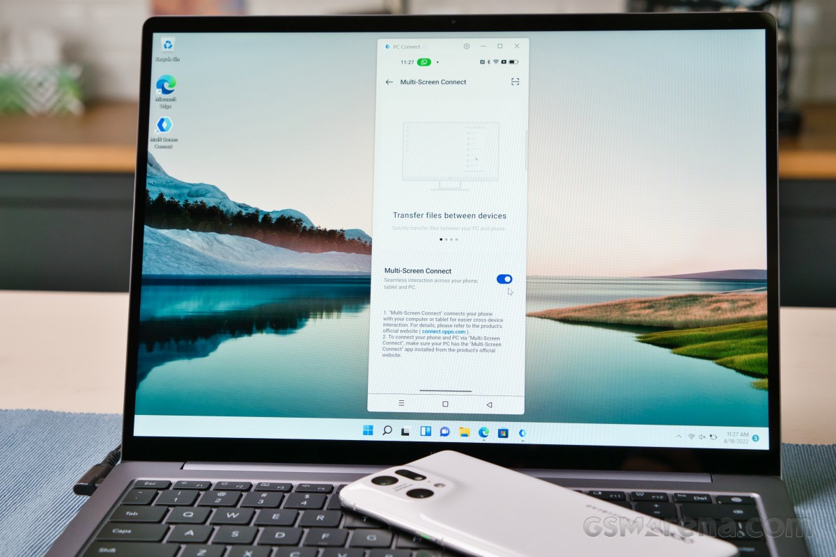
The feature allows you to seamlessly transfer files between your phone and another connected device, now with more supported file types, or directly edit files stored on your phone from a PC. You also get all of your notifications synced and can even fully remotely control your phone. That last feature appears to be a new addition to the mix and offers a whole new level of flexibility.
Multi-screen connect is available via a Windows app or, as Oppo points out, it also works great if you also own an Oppo tablet, like the Oppo Pad Air alongside an Oppo phone.
Another interesting new features is the Meeting Assistant. It includes a few features including simplified banner notifications during online meetings for minimal distractions, the ability to quickly take notes in a pop-up window as well as background network optimization to prioritize data packets related to meeting and video chat apps.
ColorOS 13 rollout schedule
Oppo continues to work closely with Google on the Android OS front. This partnership frequently results in earlier and more timely builds and updates for Oppo devices. This time around, Oppo delivered on its promise to bring Android 13 first and quite early on the Oppo Find X5 series and the foldable Oppo Find N. The full global rollout plans for Color OS 13 are much more ambitious and include around 35 smartphone models.
| First round (2 models) | August | Find X5 Pro, Find X5 |
| Second round (33 models) | September | Find X3 Pro |
| Reno8 Pro 5G | ||
| October | Reno8 5G, Reno7 Pro 5G, Reno7 5G, Reno7, Reno6 5G | |
| F21 Pro, K10 5G, A77 5G, A76 | ||
| November | Reno7 Z 5G, Reno6 Pro 5G, Reno6 Pro 5G Diwali Edition, Reno6 Z 5G, Reno5 Pro 5G, Reno5 Pro | |
| F21 Pro 5G, F19 Pro+, K10, A96 | ||
| December | Find X5 Lite 5G, Find X3 Neo 5G, Find X3 lite 5G, Find X2 Pro, OPPO Find X2 Pro Automobili Lamborghini Edition, Find X2 | |
| Reno8, Reno8 Z 5G, Reno5 5G, Reno5 Z 5G | ||
| A94 5G (Elsa), A74 5G | ||
| Third round (25 models) | 2023 H1 | Oppo Pad Air |
| Reno8 Lite 5G, Reno7 Lite 5G, Reno7 A, Reno6, Reno6 Lite, Reno5, Reno5 Marvel Edition, Reno5 F, Reno5 Lite, Reno5 A | ||
| F19 Pro, F19, F19s, A95, A94, A77, A74, A57, A57s, A55, A54 5G, A54s, A53s 5G, A16s |
Keep in mind that Oppo says this rollout schedule is "tentative" and potentially subject to change. Even so, it offers a nice overview of the company's ongoing ambitious update plans. It is also quite important to note that Oppo says all of these upcoming ColorOS 13 update ROMs will also be based on Android 13, which is truly great to hear.
Final thoughts
ColorOS 13 is pretty much the embodiment of Oppo's close collaboration with Google and its commitment to timely Android adoption and updates. It is truly great to see timely delivery and dissipation of important Android core updates to things like security and privacy. Oppo's custom work on top of Android for ColorOS 13 is also meaningful and impactful. The refined Aquamorphic design language and its accompanying animations and colors are easily noticeable throughout the UI and offer a nice modern touch to keep things fresh. The promises of better battery and memory management, vague as they are also welcome.
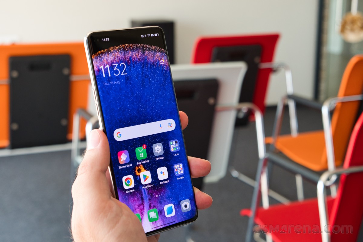
There is nothing truly groundbreaking or massively different about ColorOS 13, though. For better or worse, that much should be made clear. We were kind of hoping Oppo would finally address some of its big longstanding issues, like the inability to pull off high refresh rate gaming even on its high-end devices. Unfortunately, that was apparently not a priority. Still, we appreciate and enjoy the changes that are present in ColorOS 13 and believe you will too.
Reader comments
- ColorOS 14
- 17 Mar 2025
- CbJ
ColorOS 14
- Atanu
- 26 Apr 2024
- Cb8
My oppo K10 not updated in last 1 year
- Owengfzl
- 24 Oct 2023
- wrj
yes, I have the same problem till now. have you found the solution?


 Samsung
 Xiaomi
 Sony
Sony Samsung
 Samsung

