Oppo F1 Plus review: Selfie-propelled
Selfie-propelled
Unboxing the Oppo F1 Plus
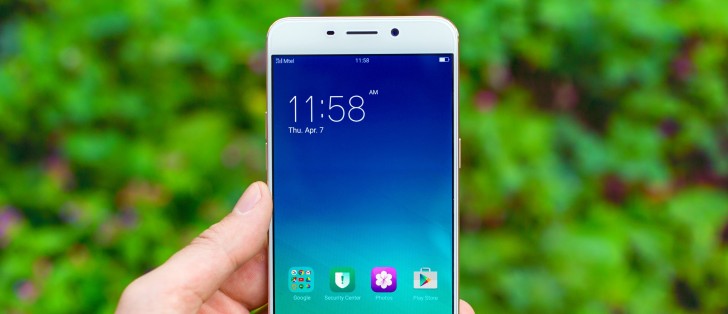
Oppo isn't cutting any corners when it comes to presentation. The F1 Plus comes in a pretty solid two piece cardboard box, with an extra sleeve on top. Inside the box, we find a plastic tray for the unit and underneath it, a sturdy cardboard box, containing some leaflets and a bonus transparent soft plastic handset case.
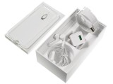
Package contains a VOOC charger
Underneath it, a piece of plastic is designed to hold a pair of nice-looking Oppo earbuds. You get all you need to take advantage of the company's awesome fast charging solution as well: a micro VOOC A/C adapter and a sturdy USB cable. The cable is specifically designed for the VOOC charger, and features seven pins as opposed to five pins on most other microUSB cables, and it is also marked with a green color. The cable remains fully compatible with the microUSB standard and can work with any other device. You can also use any other cable with the phone but you'll have to make do without the VOOC charging.
Oppo F1 Plus 360-degree spin
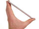
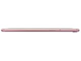
The Oppo F1 Plus measures 151.8 x 74.3 x 6.6mm, keeping its metal shell surprisingly thin. It tips the scales at 145g, which is a tad more than the original F1, but definitely an acceptable increase relative to the extra screen size. Oppo has also made pretty good use of the available space with the 5.5" display stretching almost edge to edge.
Design and build quality
If there is one thing that instantly stands out when looking at the Oppo F1 Plus, it is undoubtedly the stunning display. With a total side bezel width of only 1.66mm (mind you, that includes the inner black patches as well) and the 2.5D glass on top, the F1 Plus is about as close as you are going to get to an edge to edge experience without shelling out for something like a curved high-end device.
Materials and build quality are also immaculate.
Controls
The front side really looks gorgeous with no manufacturer text or logos, a total of three visible hardware modules above the screen and only a nicely-rounded home button underneath. It should also be fairly sturdy, thanks to a Gorilla Glass 4 finish, but Oppo also went ahead and shipped the phone with a pre-applied screen protector, just in case, although it could have been aligned a bit better.
The Home button is also the fingerprint scanner. The F1 Plus packs one of the fastest fingerprint sensors we have seen. Clicking the button near instantaneously lands you on the homescreen, which feels more like the backlight just turned on than what really happens, where the phone scans your print and then unlocks the phone.
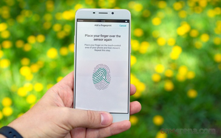
Oppo has also cleverly eliminated any homescreen animation so the icons don't waste any time and the homescreen just appears instantly as soon as you press the home button. And the sensor is not just fast but also accurate, with next to no failed attempts despite the lightning fast scanning rate. Like the iPhone, you do have to press the button for it to scan your finger and can't just place it on the button. Along with unlocking the phone, Oppo also uses the fingerprint sensor to secure apps and folders in your storage.
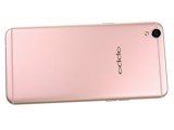
The back is also very well looking. It is made out of a single piece of metal, which wraps around the sides of the F1 Plus as well - broken down by the plastic antenna strips top and bottom. Oppo says the material in question has a 98.02% metallic ratio and has undergone a 68-round polishing process to be as non-slippery and comfortable as possible. We can definitely agree on the latter, as the phone feels really great to the touch, but the rounded sides don't really provide enough grip. Overall, a brilliant looking slim handset but one you have to try hard to not let slip off your hand.
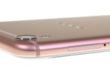
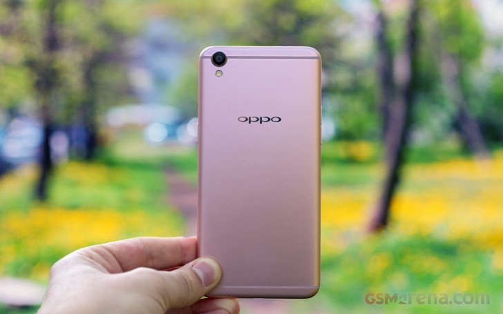
Looking at it from the back side reveals an equally clean and uncluttered composition. Unlike the original F1, with its dual-color design, the F1 Plus comes with an almost uniform finish, disturbed only by the pair of antenna lines. The top one is curved around the rear camera and sits between it and the single LED flash, providing a subtle color accent.
Even on the back Oppo impresses with minimal Oppo branding that doesn't take too much visual space on the roomy metal back, leaving you to appreciate some of the finer detailing, such as the polished ring around the camera lens that is ever so slightly raised but not enough to cause the phone to wobble on a flat surface.
The back gently curves upwards and then turns flat along the sides, ending in a mirror-finish chamfer. But the sides don't quite blend into the display; instead the display is slightly raised, which gives the glass a slight edge that can be felt easily.
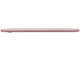
The sides of the Oppo F1 Plus are quite clutter-free. There is nothing on top, beside a small secondary noise-canceling microphone.
Nothing but a secondary mic on top
The bottom is a bit busier and houses, in order of appearance: a round-design single speaker, a microUSB port flanked by a pair of screws, then the main microphone and 3.5mm audio jack.
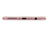
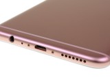
Both the microUSB and the headphone jack are on the bottom, and so are the mic and loudspeaker
The left side only features a pair of volume buttons, near the very top of the frame. The buttons are conveniently located while holding the phone in hand but accessing them while the phone is lying flat on a table is a bit difficult due to their shape and location.
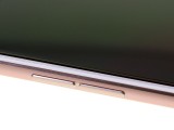
Discrete volume buttons on the left
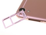
On the opposite side, we find the power button, positioned within perfect reach of your index finger or thumb. The only other thing present is the hybrid Dual-SIM plus microSD card tray. It sits perfectly flush with the surrounding surface.
Reader comments
- Joe
- 06 Jul 2021
- NuP
Please help me with the settings and there's no google play store, google drive, google on it and the language to is chinese.
- J 神
- 24 Jan 2020
- vV5
High cost with lower specifications. Battery size is way smaller than the other models available in the market. The phone itself drains battery like it consumes 30%+ with just around 2 hours of non-consecutive usage. 4GB RAM is just not tempting that...
- Rajendra
- 22 Jan 2018
- X{e
I have using f1+ from Last One Year and three Months this phones camera quality is very good but Android version 5.1 Still version not change its very Bad what is colour os I don't know I think it's Chinese Android version I am facing so many networ...


