Oppo F1 Plus review: Selfie-propelled
Selfie-propelled
User interface
In typical Oppo fashion, the Oppo F1 Plus is running the company's deeply customized ColorOS. Like the majority of platforms out of China, ColorOS is based on Android (in this case 5.1 Lollipop), which allows it to take full advantage of Google's ever-growing ecosystem of apps and services. The international version of the phone also has Google Play services pre-loaded, along with the full set of the search giant's apps,.
Yet this is about where any similarities with AOSP end. ColorOS has always had its own approach to Android, which more often than not is the iOS approach to things. This is now probably truer than ever with the new ColorOS V3.0.0i, powering the Oppo F1 Plus. Its visuals are notably different than those of v2.1.0i, that the original Oppo F1 was running when we reviewed it.
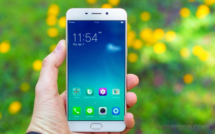
The UI seems to have gotten even flatter, more vibrant and colorful. It's a playful look that we find fitting, but that certainly won't be to everyone's tastes.
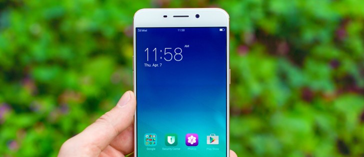
The first thing that greats you when you pick up the Oppo F1 Plus is the stylish lock screen interface, which is never boring thanks to what Oppo calls Lockscreen magazine. It is enabled by default and basically cycles through various images every time you turn on the display. It sources the photos form an online database automatically and you can your favorite categories from a list.
Scrolling left or right on the lock screen cycles through your current image feed, so you can always find that one you dismissed a bit too quick. You can also pin images so they will stay there until further notice. Now if you want to actually unlock the phone you have to swipe up.
The fingerprint reader, integrated in the home button, provides an easy to use extra layer of security. It can be employed to limit access to certain apps or even files, but most people are typically going to use it for unlocking the phone. Sadly, the hardware in the Oppo F1 Plus is not always on, so you have to tap the button before you can use the reader. Other than that, it works impressively fast and is quite accurate.
Moving on to the Launcher we see once again Oppo has skipped the app drawer. You get a home screen with digital date and time near the top and a variable number of other screens to the right of it. In an effort to get some form of organization going, there are at least folders available.


Default launcher with no app locker
And, if you fancy a new look, Oppo has included a powerful theming engine, that can tweak most any part of the interface for you with a number of styles already available through an online repository.
A swipe from the top shows the notification shade, which has two sideswipe-able tabs. The first showing the actual notifications, along a per-app notification management option, while the second is reserved for quick toggles.
There really isn't much else going on in the home interface and probably for the better. ColorOS V3.0.0i offers a hassle-free and very de-cluttered experience, which the majority of people will appreciate.
However, things get a bit weirder in the Settings menu. Perhaps, is an effort to over-simplify things, Oppo might have made them rather chaotic. The thing we are referring to in particular is a large section of the settings menu dedicated to the stock Oppo apps. While having access to these settings is a good thing, most of them arguably belong within the settings of their corresponding apps. It is not convenient at all to lack access to things like viewer grids or location tags from withing the camera app and have to go to the setting menu to change it.
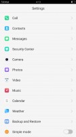


Settings interface and rather chaotic app settings placement
As with many other Oppo devices, the F1 Plus is big on gestures. There is a vast array of things to choose from, including some industry standards, like taking screenshots, enabling one-handed mode or auto answer and flip to mute.
However, there is also a whole other section of gestures that work when the screen is off. Here you can even define your own, so you are only limited by your imagination. Oppo has found a way to keep gestures going while the phone is asleep, which makes the fact that the fingerprint reader got no such treatment even more disappointing.


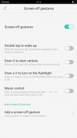
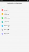
Extensive gesture functionality
The final thing worth mentioning is a power saving feature in this version of ColorOS, which works somewhat similarly to Doze. Unfortunately, it is far too aggressive and tends to suspend apps in the background, including messaging apps, which means you often miss your messages. It's not uncommon to open Hangouts or WhatsApp and get all your messages at once. There is an option in the Settings to freeze individual apps in the background but even with it disabled the OS still heavily controls app activity in the background. This does help the phone in the battery life department but the tradeoff is not worth it.
Circling back to where we started, Oppo seems to have taken inspiration from iOS. It's not uncommon to see Chinese OEMs go down this route, but there's usually some originality whereas Oppo has chosen to copy quite slavishly and rather brazenly. The iOS influence can be seen everywhere in the UI, whether it is the iOS style homescreen layout, the default app icons, the multitasking app screen, the way you can swipe down on the homescreen to bring search (Google Search, in this case), the volume popups, the Settings app, the Camera app, the power off dialogue, and even the wallpapers.
For Oppo's sake, however, the user experience with the redesign is vastly improved over its previous versions of ColorOS and the new version is significantly cleaner and easier to use, so from a user's perspective things are looking good.
Reader comments
- Joe
- 06 Jul 2021
- NuP
Please help me with the settings and there's no google play store, google drive, google on it and the language to is chinese.
- J 神
- 24 Jan 2020
- vV5
High cost with lower specifications. Battery size is way smaller than the other models available in the market. The phone itself drains battery like it consumes 30%+ with just around 2 hours of non-consecutive usage. 4GB RAM is just not tempting that...
- Rajendra
- 22 Jan 2018
- X{e
I have using f1+ from Last One Year and three Months this phones camera quality is very good but Android version 5.1 Still version not change its very Bad what is colour os I don't know I think it's Chinese Android version I am facing so many networ...


