Oppo F3 review: Selfielicious
Selfielicious
Unboxing
The similarities between the Oppo F3 Plus and F3 run deep, and even extend to the retail box. There is nothing really special about that two-piece container or Oppo's choice of color and gloss for the packaging. At the end of the day, that box is just going to end up in a closet - if not recycled straight away.
Although the box is entirely made of cardboard, it is pretty sturdy and comes with a pleasant, soft-touch finish.
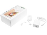
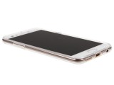
Oppo F3 retail box • Using the included rubber case
Inside, you get mostly cardboard as well. Only the cradle that actually holds the F3 is made of plastic. There is a box underneath containing a few leaflets, an ejector pin and a complementary rubber case.
You also get a pretty standard 5V@2A wall charger and a simple micro USB cable. VOOC fast charging was clearly way out of budget. And we don't just mean the quick charger itself - unlike the Plus version, the regular Oppo F3 lacks support for VOOC altogether.
Stacked away underneath the data cable, there is also a pair of earbuds, fairly decent ones at that.
Oppo F3 360-degree spin
Oppo hasn't really changed the design for the "F" series lately. Things have been consistent since the F1 Plus embraced the rounded corner aesthetic.
That's not too bad though - the matte metal finish with polished chamfers along the edges gives the device a near-premium feel. It's becoming the default formula these days, so the F3 Plus has a bit of a generic look. The iPhone inspiration is pretty apparent, but it's by no means cheap or cheesy.
The Oppo F3 Plus did show a little extra bit of creativity with a "six-string" antenna design on the back. The regular F3 is back to the more generic single grooves and large plastic inlays.
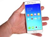
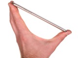
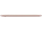
An arguably more important part of the overall looks, the slim screen bezels keep the F3 within a reasonable 153.3 x 75.2 x 7.3mm. The 5.5-inch screen (as opposed to the F3 Plus's 6-inch screen) allows for easier single-handed use.
The weight comes in at 153 grams - perfectly reasonable, considering the display size and battery capacity.
Hardware overview
Despite having a far less impressive screen to body ratio of 72.3%, compared to the F3 Plus' 75.1%, the 5.5" F3 is a far more manageable device. Like we already said, Oppo did a fine job slimming down the side bezels. For the sake of a comparison we already started though, the AMOLED unit from the R9s would have been better appreciated instead of the plain IPS LCD.
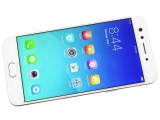
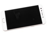
Pretty nice bezels on the Oppo F3
Above the screen it's quite busy. That's where Oppo fitted not one, but two selfie cams: an 8MP and a 16MP camera right next to the earpiece, on the left.
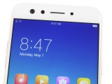
Two cameras aimed right at you
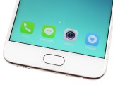
Below the screen, the F3 Plus has a capacitive Home key. You can't actually press it, but you can use it to unlock your phone as it has an embedded always-on fingerprint reader.
We had quite a few reliability and speed complaints back when we tested the F3 Plus, and we expected the F3 to deliver a similar experience. However, its reader surprised us pleasantly on both fronts. Perhaps it has something to do with the MediaTek chipset, though we can't really say for sure.
The Home key is flanked by two more capacitive keys, the App switcher and Back. They are dimly backlit - so much so that they can be hard to see on the white front (used in both the Gold and Rose Gold editions). Eventually muscle memory takes over and you don't even look at them, but it can be confusing at first if you're coming from a phone where these keys are reversed.
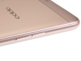
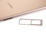
Moving to the sides of the phone, we find the volume rocker on the left, and the right is shared by the power button and the dual nanoSIM card tray. Now, the very same tray actually has a dedicated slot for a micro SD card as well, which is great. That being said however, we can't help but recall the substantially bigger F3 Plus employs a hybrid slot system. Bonus points for the Oppo F3 here.
The top of the F3 Plus is pretty clean, only housing a secondary noise-cancelling microphone.
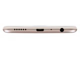
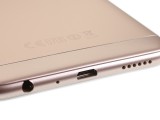
The bottom, on the other hand, is quite busy. There is the main microphone and the microUSB 2.0 port, flanked by a 3.5mm headphone jack and the loudspeaker grille. Sadly, there's no upgrade to Type-C or USB 3.0 this time around, and no fancy stereo setup either. We are quite disappointed with the lack of VOOC support as well.
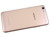
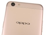
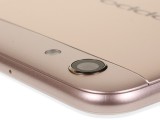
On to the back, then. It houses the 13MP camera, slightly different from the tried and tested 16MP imager on the F3 Plus and other Oppo models, like the R9s. The Sony IMX398 sensor has been swapped for a Samsung S5K3L8 sensor, which lacks the snappy Dual Pixel autofocus. From a purely physical perspective, the 13MP camera does appear to bulge a bit more from the back, making for a noticeable wobble when the phone lies on flat surfaces.
We've seen worse, though. The metal ring actually leaves some clearance so that the lens won't get scratched - a nice touch. Right next to the camera is a single LED flash - another downgrade from the F3 Plus and its dual-tone setup.
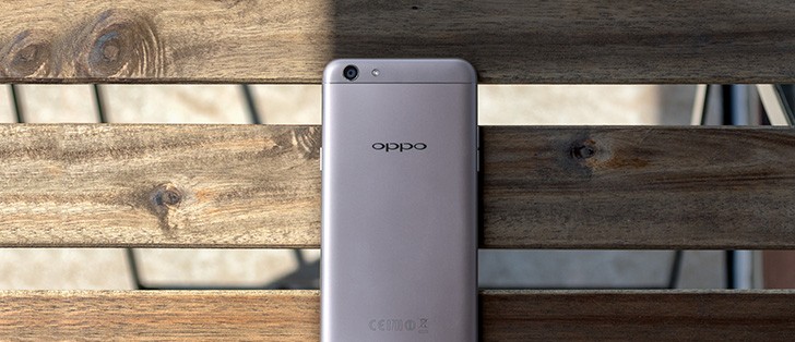
As for the rest of the back, in the absence of the new "Six-String" antenna design, Oppo has reverted back to using two rather large plastic inlays at the top and bottom. These are there to facilitate signal reception, but due to the different material used, the color here is just a bit off compared to the rest of the body. Still, Oppo has done its best to mask it.
Overall, the Oppo F3 has a bland design - from a distance, it can be confused for a number of other smartphones (not just Android ones, if you know what we mean). However, the built quality is great and the in-hand feel is commendable. This is not a stand-out phone, just a very well-made one, and we think this will be enough for most of you.
Reader comments
- eiyam
- 20 Jan 2023
- 2Ap
Been using this since June 2017 and still working fine but some of the apps cannot be install since its not updated anymore. I drop this already many times even drop in the toilet bowl (clean of course lol).
- Vishakha
- 18 Oct 2022
- 7k9
I'm using this phone since Oct 2017 and it is still working but only the problem is battery n the speed and also some apps are not supporting now ....but often dropping the phone the display is very durable, no scratches no broken glass ...nothi...
- Anonymous
- 01 Jun 2020
- UNA
I would like to ask if you have broke oppo f3 phone or a display IC for oppo f3 phone. Thank you
