Oppo F3 Plus review: Double take
Double take

Unboxing
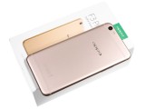
The Oppo F3 Plus ships in a fairly sizable, mostly white box. Besides the size, necessitated by the large phone itself, there is nothing really lavish or excessive about the packaging, which is probably smart. At the end of the day, it's just going to end up in a closet somewhere.
The box itself uses a two-piece assembly. Though it is entirely made out of cardboard, it is pretty sturdy and comes complete with a soft-touch finish.
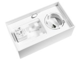
Inside, you get mostly cardboard as well. Only the cradle that actually holds the F3 Plus is made of plastic. It actually doubles as one of the sides of a box, housing a few leaflets, an ejector pin and a complementary rubber case.
You also get a VOOC fast wall chargers It is rated at 5V@2A and 5V@4A. The VOOC charging is arguably the best around, but it uses a few extra pins on top of the standard USB layout, so you need the green-colored cable for it to work.
Last but not least, hidden away underneath the cable are a pair of earbuds, fairly decent ones at that.
Oppo F3 Plus 360-degree spin
Oppo hasn't really changed about the design for the "F" series lately. Things have been mostly the same since the F1 Plus brought in the rounded corners aesthetic.
That's not necessarily a bad thing - matte metal finish with an unibody construction and polished champhers along the edges give the device plenty of premium feel. It's becoming the default formula these days, so the F3 Plus has a bit of a generic look, but we certainly wouldn't blame it for being ugly or cheap-looking.
Oppo went a little more creative on the back, with its new "Six-String" antenna design. It doesn't necessarily blend in more than the plastic inlays of most competitors, but it certainly looks better.
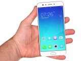
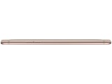
An arguably more important part of the overall looks, the reasonably slim bezels around the display, keep the F3 Plus within the reasonable 163.6 x 80.8 x 7.4mm. It's not a Galaxy S8 type of bezel-banishing but it's a good job for the price range.
The weight comes in at 185 grams - a hefty device for sure, but you can't expect much lighter with a 6-inch screen.
Hardware overview
With a screen to body ration of around 75.1%, the F3 Plus outshines both the F1s (71%) and F1 Plus (73.9%). Sadly, it's an LCD panel, rather than an AMOLED one in this case.
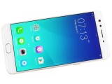
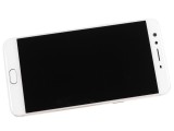
Nice thing bezels on the F3 Plus
The three phones have almost identical functional elements distribution except for the secondary front camera that the F3 Plys brings. Oppo fitted the 8MP + 16 MP modules right next to the earpiece, on the left.
Below the screen the F3 Plus has a touch sensitive home key. You can't actually press it, but you can use it to unlock your phone through the always-on fingerprint reader.
The reader seems a bit slower and less accurate than previous Oppo units we have reviewed. That is to say, it is dependable enough, but not really the best in the market. Oppo hypes up its "hydrophobic membrane" that should improve accuracy when your hands are moist, but we couldn't really detect any improvement over the R9s in that aspect.
The Home key is flanked by two more capacitive keys - the App switcher and Back keys. They are dimly backlit- so much so that they can be hard to see on the white front (used for both the Gold and Rose Gold editions). Eventually muscle memory takes over and you don't even look at them, but it can be confusing at first if you're coming from a phone where these keys are reversed.
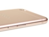
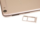
Moving to the sides of the phone, we find the volume rocker on the left, and the right is shared by the power button and dual nanoSIM card tray. It is hybrid, so you can opt for a microSD card instead of a second SIM.
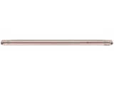
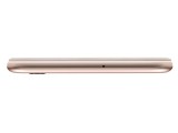
The top of the F3 Plus is pretty clean, only housing a secondary noise-cancelling microphone.
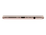
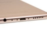
The bottom, on the other hand, is quite busy. There is the main microphone and the microUSB 2.0 port (with VOOC fast charge support), flanked by a 3.5mm headphone jack and the loudspeaker grill. Sadly, there's no upgrade to Type-C or USB 3.0 this time around, and no fancy stereo setup either.
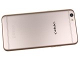
On the metal back of the F3 Plus there is another 16MP camera, but this one has a bigger sensor (1/2.8" vs. 1/3." for the front) and a much brighter aperture (f/1.7 vs. f/2.0). And this is no ordinary 16MP sensor either, but a Sony IMX398 with Dual Pixel autofocus. Just like the one on the Oppo R9s. We'll see how it does in the camera section.
The camera protrudes from the back - just a small circle around the main lens, less than you might expect on a phone this thin. Next to it is a dual-tone LED flash - an upgrade over the single LED on the R9s.
The Oppo F3 Plus suffers from a bland overall design - from a distance, it can be confused for a number of other smartphones (not just Android ones, if you know what we mean). However, the built quality is great and the in-hand feel is commendable. This is not a stand-out phone, just a very well made one, and we think this will be enough for many. Just remember- it's still a 6-inch phablet, so you need pretty big hands and the desire for some regular thumb stretching.
Reader comments
- Anonymous
- 01 Apr 2024
- Kxf
https://m.gsmarena.com/postreviewcomment.php3?idReview=1605&idComment=228364
- Satish
- 04 Dec 2018
- Dk0
No 8.0 Oreo update a long times.
- Anonymous
- 06 Jul 2018
- vgN
Nope

