Oppo F3 Plus review: Double take
Double take

ColorOS 3.0
The Oppo F3 Plus runs ColorOS 3.0, based on Android 6.0 Marshmallow, but its customizations run very deep and it doesn't follow closely the feature set of the Google-developed operating system. Units sold outside of China come with the full Google suite, which means plenty of doubled apps provided by Oppo and Google.
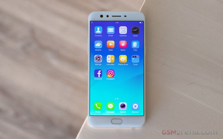
The OS isn't the most bloated, but we wouldn't call it a "lean installation" either. It comes pre-loaded with social networking apps, a document editor and few minor-footprint apps. Even Chrome is not alone; an Opera-powered app is the default web browser out of the box. In total, you have access to just under 48GB of the 64GB of built-in storage.
The user interface is the familiar mash-up of Android and iOS. There's no app drawer on the default launcher. Instead, every app you install gets dumped on the homescreen. That's fine most of the time until you start installing apps you rarely use or install apps just for their widgets. Then you may need to create a junk folder to drop off all the app shortcuts you don't need.


The homescreen houses all installed apps
The Lockscreen features a constantly changing slideshow of images. You can subscribe to several different channels (e.g. photos of nature or cars or others) or provide your own imagery. The set of photos will be updated periodically, but only over a Wi-Fi connection, so it doesn't eat into you mobile data plan.


Lockscreen settings • Subscribing to different photo streams • The lockscreen
Once you set up the fingerprint reader - and you'll want to do that as otherwise the Home button can't wake the phone - you'll rarely see the lockscreen anyway. You could wake the phone with the Home button when the fingerprint reader is not set up, but that requires a few consecutive taps and you might as well double tap the screen (a configurable option).
Oppo generally has a good track record when it comes to fingerprint readers. However, unlike the excellent implementation on other models such as the R9s, the sensor on the F3 Plus is a bit sluggish. It rarely fails to recognize the print, but it's not as instantaneous as the previous sensors on the company's phones. It can secure more than the lockscreen - the phone can encrypt individual files or even whole apps, and make them accessible only with the correct fingerprint (or a Pattern lock as a fallback).
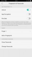


Setting up the fingerprint reader • You can launch apps with different finger
The wallpaper on the homescreen doesn't change as the lockscreen wallpaper does, but you can still spruce up the place with Themes. The Theme Store features whole themes and just wallpapers, sorted into categories (including free and paid ones). Themes change the icon pack, the lockscreen wallpaper and some even change the clock on the lockscreen.


Theme Store • Categories • A kid-friendly theme
You can even customize the system font. ColorOS appears to use FlipFont packages, which are available straight from the Google Play store. There are size adjustment options as well.
There are at least a few things wrong with the notification shade. When you pull it down, you always see the toggles first. If you want the notifications, you have to swipe right to get to them. We would have much preferred to have the notifications as the default view or at least have options for an alt-pull - either two-finger pull or pulling from the left/right side of the screen.
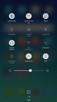

You get the toggles first • And have to swipe to see the notifications
Also, actionable notifications don't work at all. ColorOS just doesn't display the quick control options. And the quick toggles area has no automatic brightness toggle. The F3 Plus still supports the option, but it is buried under display settings, so you have to manually navigate to it.
Oppo drew inspiration from Apple, and so you have app-specific settings menus. However, that is no reason to make many options nearly inaccessible. And even if you do remember to look for certain things within the settings menu and not the app itself, there is no search option there to help you. You just have to remember where everything is by hard.
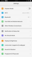
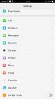
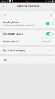
The settings structure in really inconvenient
On a more positive note, though, we do like the Screen-off gestures. They are simple commands done on a black screen - O to start the camera, V for the flashlight, several symbols to control the music player and a few custom options.

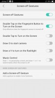
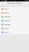

Screen-off gestures allow you to control the phone without waking it
Simple Mode is available, which distills the homescreen to the most basic features - one screen of contacts and one screen of apps.


Simple Mode has big, easy to hit buttons
With 4GB of RAM, the Oppo F3 Plus glides through the interface. The Snapdragon 653 chipset has enough oomph to switch between apps without breaking a sweat, but we're about to see how it handles more arduous tasks.
Reader comments
- Anonymous
- 01 Apr 2024
- Kxf
https://m.gsmarena.com/postreviewcomment.php3?idReview=1605&idComment=228364
- Satish
- 04 Dec 2018
- Dk0
No 8.0 Oreo update a long times.
- Anonymous
- 06 Jul 2018
- vgN
Nope

