Oppo Find 5 review: Oppo-lent screen
Oppo-lent screen
User interface with ups and downs
The Oppo Find 5 runs Android 4.1 Jelly Bean with plenty of custom touches to it. Everything is rendered at 1080p resolution but thanks to Project Butter and the powerful Adreno 320 GPU, the running is extra smooth.
Here's the Find 5 flaunting its UI on video:
Oppo has included high-resolution images to take full advantage of the pixel density and they look great. In terms of detail, that is, the candy-colored icons may not be to everyone's taste. Not all apps however, have icons optimized for such high resolution yet (even most tablets don't have that many pixels), so some get upscaled.
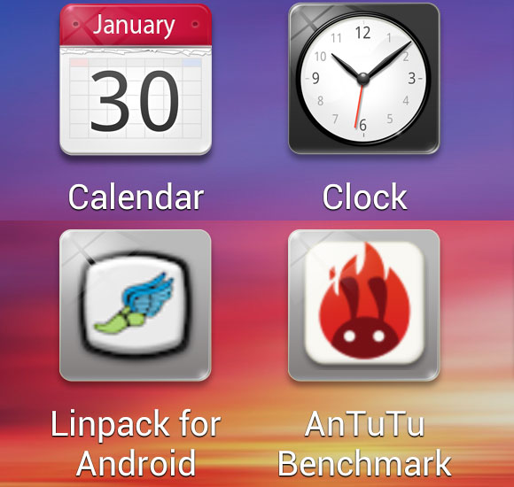
Native 1080p icons vs. upscaled (100% crop, they look a lot smaller on the phone)
That makes them look softer, but the pixel density is so high that they still look good, although clearly lacking the level of detail of the bespoke icons.
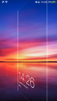
Moving on, Oppo has swapped out the lockscreen with its own. Actually there are two lockscreens out of box (each with an alternative view). The default one is the simple swipe-to-unlock kind and dedicates most of the screen real estate to the wallpaper. An optional charging status widget is all there is.
The second option is a reskinned Gingerbread lockscreen with two slides for unlock and mute. A battery charging widget can be enabled for this one too. There're no shortcuts on either lockscreen - just notifications such as missed calls or incoming messages. There're music controls available too.
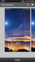
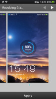
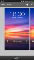
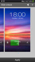
Two lockscreens, with and without battery charge indicator
The lockscreen has a hidden flashlight shortcut - a press and hold of the Home button turns on the dual-LED flash. It goes out when you let go of the Home button. Note that you have to wake the screen for this to work.
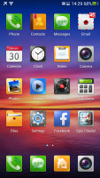
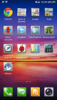
The homescreen too is a custom job. Oddly, Oppo has opted to use huge icons - the screen fits a 4x5 grid, only 20 icons total, which is less than some phones with smaller screens offer. Keep in mind that we're talking about a 5" screen here, so 5% of that going to a single icon is huge.
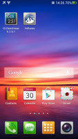
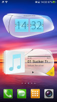
Not a lot of shortcuts fit on the huge screen
We installed the Nova launcher with its custom settings for the homescreen grid and we found that six icons on a row was a reasonably comfortable layout.
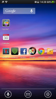
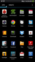

Nova Launcher fits a lot more icons • built-in launcher switcher
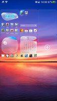
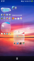
On the up side, you can add up to 9 homescreen panes, when most custom launchers top out at 7 (the stock Android one is fixed at 5). You can re-arrange them and delete the ones you don't need, through the popular overview mode you enter with a pinch out gesture.
The notification area has received a line of quick toggles. A tap on the edit button lets you hide/show toggles and rearrange them. If you have more than the screen can hold, the rest go offscreen and you need to scroll to reach them.


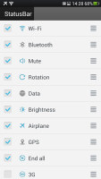
Notification area with toggles • picking which toggles are active
There's a brightness control that toggles low, half, full brightness and auto mode. There's also a Kill all apps button. A long press on a toggle will bring up its respective settings entry.
The bottom of the screen is a dock. You can have any shortcuts or folders you like here - you can even move the app drawer shortcut (but not remove it from the dock). The dock has four shortcuts (Dialer, Messaging, App drawer and Camera) by default, but you can actually fit a fifth one.
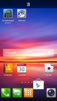
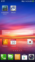
The dock at the bottom fits 5 shortcuts
The app drawer is pretty simple - it has horizontally scrollable pages of 16 shortcuts or folders. The dock at the bottom of the screen is visible in the drawer too. A small "NEW" tag marks newly installed apps that haven't been launched yet.
Dragging a shortcut to the homescreen doesn't work the way you're used to - the default action is to rearrange shortcuts, you have to drag it over the "Drag app to homescreen" area that appears at the bottom instead. This just slows down the most commonly used function - dragging shortcuts onto the homescreen.
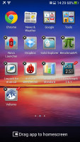
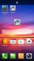
Rearranging shortcuts • dragging to the homescreen
There are no widgets in the drawer, those are pulled out of a separate drawer on the homescreen. This looks a lot like early versions of TouchWiz. Oppo has included a set of custom widgets, which look like deformed bubbles, and are not very attractive.
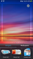
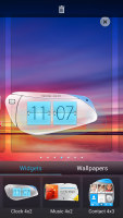
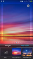

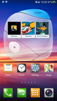
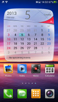
Dragging out widgets • a quick look at the custom Oppo widgets
The task switcher is yet another element of Android that Oppo has customized. As with the other customizations, this one isn't very space efficient. It shows thumbnails of the running apps, three at a time, and you can dismiss apps by swiping them away. The switcher uses only half the screen.
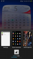
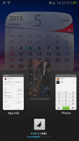
The custom task switcher is not very space efficient
Below the cards is an indicator of how much RAM is used and there's another button to kill running apps.
Even the Settings have been tweaked. They got a new paint job to match the rest of the UI and the various settings have been organized into tabs. Tabs have been used in several other places in the UI and once we got used to it, we found it to be a pretty nice solution for avoiding too long cluttered lists.
Overall, the interface on the Oppo Find 5 is fast and smooth. It's fairly functional too - the customizable toggles in the notification area are nice and the homescreen can be tweaked to your liking too.
The whole thing could have made better use of the available space though - it can fit very few icons on the huge screen and things like dragging a shortcut out of the app drawer are needlessly complicated. Oppo has included a launcher switcher in the settings, so you can easily try out third party launchers if this one isn't to your liking.
There were a few crashes, however. They didn't happen too often, but still more often than we are used to and Oppo should work on those. The Chinese assured us that these issues are due to the not completely finalized software and they will be resolved before the smartphone hits retail.
Reader comments
- babu
- 31 Jul 2021
- gNR
Oppo Reno 5pro is bed mobile Google dailar is very bed sarvice Call Recoding announcement disgusting
- Bikkash
- 02 Sep 2016
- YQ{
Totally hang mobile phone plz take it home
- Anant Pradhan
- 14 Jun 2015
- vGc
Find 5 Mini bcz its have advanced function.......

