Oppo N1 review: Head spin
Head spin
Color OS atop Android Jelly Bean
By default the Oppo N1 runs on Android 4.2 Jelly Bean skinned heavily and turned into what the company calls Color OS. The customizations runs very deep and while not removing any Google apps and services adds quite a few of its own, while replacing the lockscreen, homescreen, app drawer and the settings menu among others.
If you are not into custom launchers you also get the option to download the Cyanogen Mod ROM from the company's website. The company has even launched a dedicated CM version of the N1, which ships with the popular custom ROM preinstalled, but even if you missed on that one, you still have a chance to switch to it with a simple install.
Update, Dec 30: We flashed our review unit with the first stable CyanogenMod ROM available for the Oppo N1. It's CyanogenMod 10.2, which is based on Android 4.3. All features and hardware work just as well as under Color OS, so just so you know, you can always go down this route if you wish.
Here is a video hands-on of the CyanogenMod:Now that we covered the CyanogenMod ROM, read further down for our review of the Color OS that ships with the N1 by default.
Here's a quick Color OS rundown on video to get you started:
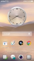
First off let's cover the Color OS lockscreen. It's almost identical to the stock Android one. There's an unlock ring, which you slide to get to the homescreen. You can have widgets on the lockscreen, which are located to the left of the main window, while on the right there's a camera shortcut.
The lockscreen has a hidden flashlight shortcut - a press and hold of the Home button turns on the dual-LED flash. It goes out when you let go of the Home button. Note that you have to wake the screen for this to work.
You can also have a password or pattern lockscreen, or none at all. A double tap on the screen will wake up the phone as well so you don't need to reach for the power key. On a device this big, this certainly makes a big difference.
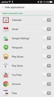
Similar to the LG G2, the Oppo N1 has a guest mode. It only gives access to apps that you've selected so you have no problem sharing your phone without worrying about your private data or your settings getting all messed up. In order to use Guest Mode you'll need to set up a pattern or password unlock for regular access and one for Guest Mode.
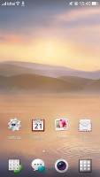
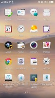
The homescreen of the Oppo N1 likes to keep things huge. Before with the Oppo Find 5 we argued that icons are too big on the 1080p 5" screen - they were organized in a grid of 4x5. Well the Oppo N1 is actually worse. You get a 5.9" screen but apps above the dock are organized in a grid of 4x4. Widgets could be optimized better for the large screen, too.
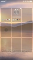
On the up side, you can add up to 9 homescreen panes, when most custom launchers top out at 7 (the stock Android one is fixed at 5). You can re-arrange them and delete the ones you don't need through the popular overview mode you enter with a pinch out gesture.
The bottom of the screen is reserved for the dock. You can have any shortcuts or folders you like here - you can even move the app drawer shortcut (but not remove it altogether as you won't be able to access it). The dock has four shortcuts (Dialer, Messaging, App drawer and Camera) by default, but you can actually fit a fifth one.
The app drawer is pretty simple - it has horizontally scrollable pages of 20 shortcuts or folders. A small green dot marks newly installed apps that haven't been launched yet.
Dragging a shortcut to the homescreen doesn't work the way you're used to - the default action is to rearrange shortcuts in the app drawer, you have to move it over the "Drag app to homescreen" area that appears at the bottom instead. This just slows down the most commonly used function - dragging shortcuts onto the homescreen.
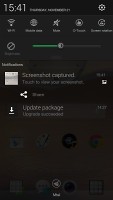
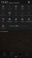
By default the notification area will show one row of quick toggles, a brightness slider and a shortcut for enabling auto brightness mode, the current notifications plus a shortcut to go into settings. If you do a drag gesture from the quick toggles row you get two more lines of toggles. There's also a Kill all apps button there. At the bottom of the notification area sits a clear button to remove all your notifications at once.
A long press on a toggle will bring up its respective settings entry. By the way you can access the notification area even if you slide down from any empty part of the homescreen (not just the top), which helps single-handed use a lot.
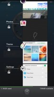
The task switcher is pretty close to stock Android. All your apps are shown in a vertically-scrollable grid of thumbnails, which you swipe either side to close or tap to open. Oppo has added a kill all toggle at the bottom.
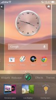
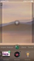
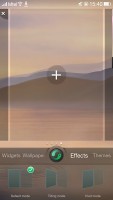
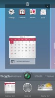
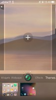
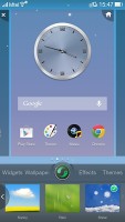
By holding a finger on an empty spot on the homescreen or performing a swipe up from the dock you open up the contextual menu. It lists widgets, wallpapers, effects and themes.You drag widgets upwards to place them on the homescreen.
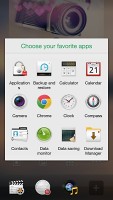
Exclusive space is Oppo's custom homescreen page. Currently there are only two available - Photo and Music. Photo space takes up a whole homescreen and features a live viewfinder so you can take shots straight from your homescreen plus a shortcut to the full camera app. On the bottom there are four shortcuts - camera, gallery, app drawer and favorite apps. Those are four app shortcuts which you can access from the Exclusive space. In between you get a timeline with all your recent photos.
The Music Exclusive space features a cool, if slightly intuitive design with a vinyl for changing the currently playing song and stopping/resuming playback. You can change songs, go directly to the music player or the Phone app. More Exclusive spaces are coming through soon.
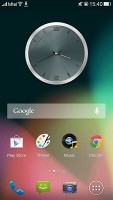
Themes currently has two available themes. The first one is the default Color OS one and the other one is a stock-looking one, which changes the homescreen, app icons and app drawer and basically looks like stock Android 4.2 Jelly Bean. It's not the CyanogenMod we mentioned earlier but it comes pretty close in terms of looks.
You can change the wallpaper with live or static ones and change the scrolling effect of the homescreens. There's one more option - Live Weather - it can flicker snow, rain, dandelions, etc. over the screen. The effect is very impressive - for instance snow would pile up on your dock icons.
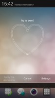
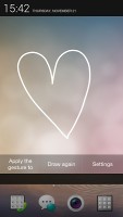
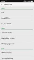
Then there's the Gesture panel. You access it just like you would open your notification area, but you need to start your swipe in the left quarter of the bar at the top, just as if you were pulling down the notification area. You can perform various gestures in the Gesture panel to open different apps. For instance drawing a circle would open the camera app but you can assign any apps to any gestures you want.
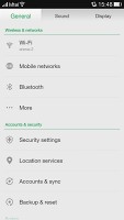
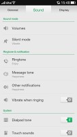
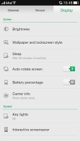
The settings menu is divided in three tabs - General, Sound and Display. Each category has a vertical list of settings and it all works pretty well.
Daydream is available through the Interactive screensaver. You can choose colors, Google photos, photo frame and photo table - each shuffling images as your screensaver. By default the screensaver appears while docked or charging.
The O-Touch menu lets you setup the touchpad on the back of the device. If enabled you can swipe left and right in the O-Touch area, double-tap to open an app (like camera or the flashlight), tap and hold to take photos in the camera, control music playback.
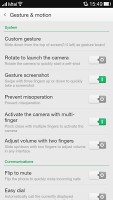
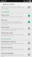
Finally there's the Gesture & motion menu - it holds all the various gesture and motion shortcuts, which can be enabled and disabled. For one you can rotate the camera module to launch it (or disable the feature), swipe with three fingers on the screen to capture a screenshot, pinch-close with multiple fingers to launch the camera and more. The motion options are very useful - flipping the device will mute the ringer, raising a ringing Oppo N1 to your ear will automatically answer the call and more.
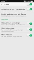
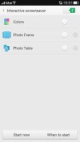
Screensaver • Gestures and motion • O-Touch
Overall Color OS strives to be more feature rich than Android and has deep-digging customizations but is still Android. Users familiar with the OS won't have trouble getting to learn the OS and we're glad Oppo added features that help using the device with one hand like O-Touch, swiping down from anywhere to reveal the notification area, launching apps with gestures, etc.
Reader comments
- janu
- 05 Nov 2015
- vwj
hows moto x play
- ishan
- 22 Sep 2014
- Hkt
owsome
- Sunil
- 08 Feb 2014
- n1H
Good atempt of rummer of OPPO N1


