Oppo R15 and R15 Pro hands-on review
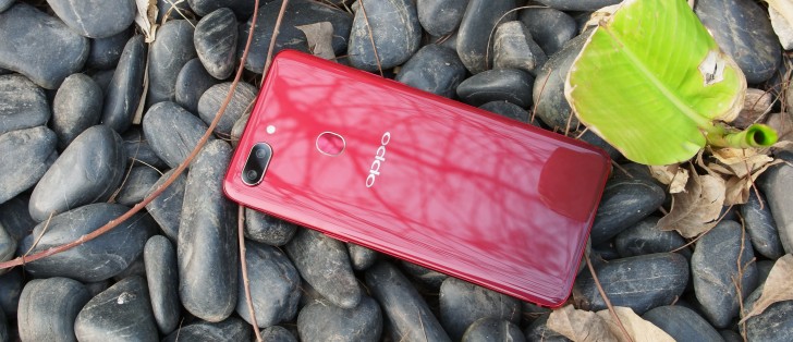
Hardware
Embrace the notch! It seems to be the trendy thing in the Android realm lately. Coincidentally, it became so after Apple found itself unable to fit the FaceID tech on the front of the iPhone X without cutting a bit of the screen. Since most current Android devices don't really have that much extra hardware around their front camera and still have chins below the display we are left with the feeling that a better solution might have been available but it is what it is.
And on the positive side the notch still gives you some screen around the earpiece and front camera which would have been completely wasted otherwise. So, for now, the notch is here to stay and present on both the R15 and R15 Pro.
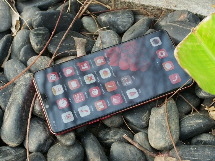
The pair also share an identical bottom chin, underneath the display. An argument can be made that it helps usability and Apple even had to leave it empty in most parts of the interface so the iPhone X would be easier to handle. Oppo's userbase might not have reacted kindly to such UI overhaul. The company did try its hand at some "iOS-inspired" gestures, also lets you opt of of them and stick with a regular Android navigation bar and some light thumb-stretching.
Continuing with the external similarities between the Oppo R15 and R15 Pro - both have identical 1080 x 2280 pixel displays. On that particular diagonal, that adds up to about 401ppi and looks very sharp in person. The picture quality, colors and contrast in particular also benefit from the AMOLED technology of the panels. It's a really refreshing sight to see the same punchy, vivid color space on the cheaper R15 as well.
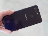
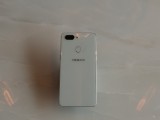
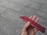
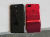
The R15 pair are so visually similar that they practically share the same body. The shapes and curves are absolutely identical. The weigh the same too, at 175 grams and you really have to dig deep into the official specs to see that one is just a hair taller and fatter, while the other, ever so slightly wider. In person, telling the two apart really is impossible.
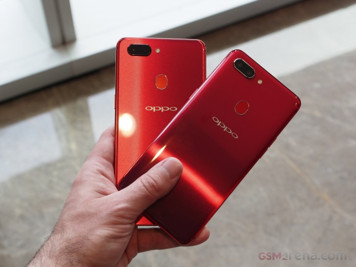
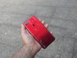
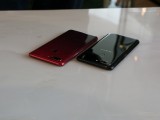
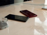
Well, almost impossible. If you do your homework, you will notice the two are available in slightly different finishes. The R15 has a glass back, while the Pro substitutes that for a classier and more exclusive ceramic. The finish feels slightly different to the touch. Choosing between the pair really in a matter of choice, but the ceramic should theoretically be a bit more scratch-resistant. On the other hand while both are real fingerprint magnets, the ceramic R15 Pro seems to collect even more grease than its glass sibling.
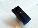
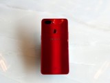
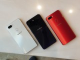
Oppo collaborated with famed designer Karim Rashid to create quite a few trendy color options for the two phones. The R15 gets Rouge/Hot Red, Frost/Snow White and Nebula/Star Purple, while the ceramic R15 Pro has another pair of paintjobs: Ruby/Dream Mirror Red and Infinity/Ceramic Black. The Nebula/Star Purple and Ruby/Dream Mirror Red stand out, in particular, thanks to their gradient design. It makes for an interesting look, especially under sunlight.
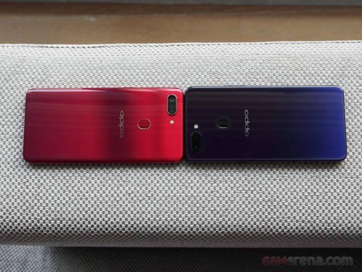
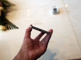
Back to listing similarities then - the camera setups look identical and so is the control layout. Clicky separate volume buttons on the left and and equally nice and tactile power button on the right. Height is well selected so the buttons sit comfortably under your fingers. The SIM card tray is also on the right side. It sits nice and flush with the rest of the frame and can house either 2 SIM cards or a single SIM and a microSD card slot. Both phones also have a 3.5mm audio jack - a welcome sight these days.
That's pretty good so far, but it is a little bit unfortunate both the R15 and R15 Pro only have a single speaker. Plus, both still use the slow and out of date microUSB 2.0 standard.
Reader comments
- Wandy
- 02 Jun 2020
- vV5
my oppo r15 pro screen is kinda faulty. I want to replace for a new one. Is it possile to use Oppo r15 lcd instead of r15 pro lcd?
- Predictive memorys
- 02 Jul 2018
- vV5
Notch design isn't great. Notch is a trends and it block the notification bar. If they making the 6 inch screen for a proper display without notch, it would be better.
- AnonD-751549
- 12 Apr 2018
- uSW
Micro USB. Great.
