Oppo R7s review: Filling the gaps
Filling the gaps
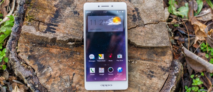
ColorOS 2.1 with Android 5.1.1 Lollipop underneath
The R7s is one of a growing number of Oppo handsets, which are running on a Lollipop-based Color OS build. Better late than never, is Oppo's philosophy with OS versions, and the R7s has it better than the original R7 in this respect, which launched on KitKat.
As is customary for Oppo, ColorOS makes Android nearly unrecognizable, with a custom lockscreen, homescreens, icon packs, a custom task switcher and settings menu, as well as extensive theming support.
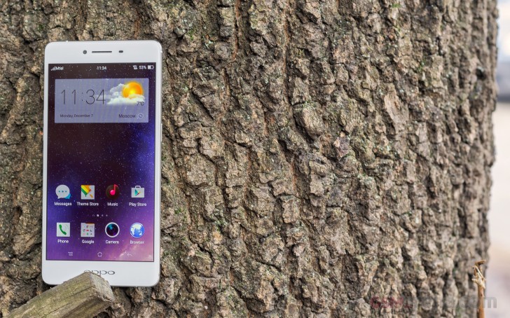
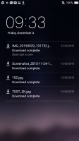
The Color OS default lockscreen uses swipe gesture for unlocking, though it only works with an upward swipe. You can set up pattern, PIN or password unlock protection, but fingerprint unlock is reserved for the Plus member of the R7 family. While side swipes on the R7 Plus brought up lockscreen widgets, there's no such thing on the R7s, and there's no camera shortcut either. Instead, to start the camera instantly from the homescreen, you only need to wake it and pinch on it with several fingers.
You have Lollipop's lockscreen notifications, but with a twist, and one that you'll need to get used to. Swiping a notification to the right will take you to the respective app, where the generally accepted behavior is to dismiss it. To get rid of a notification you need to swipe to the left and tap the X button that appear on the right - not the most straightforward implementation.
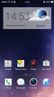
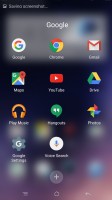
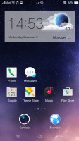
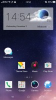
Color OS doesn't have an app drawer, as has become customary for Chinese manufacturers as of late, so all of your app shortcuts are available on the homescreen iOS-style. The dock takes up to four shortcuts, and folders too, although you need to create those in the open space of the homescreen and then drag them to the dock.
The apps above the dock are organized in a grid of 4x5, which works well for the display diagonal. You can't set different grid sizes, though. Group rearrangement is possible, meaning you can select up to 20 apps and move them around the homescreens together. Widgets are available as well, though there isn't a very rich selection of them.
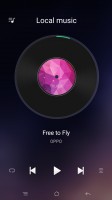
Exclusive space is Oppo's custom homescreen page. Photo has been retired and now there's just Music. In essence, it's an always-available music player, which you can use instead of the standalone app. You can disable it altogether, if you want to keep your homescreen experience to the point.
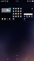
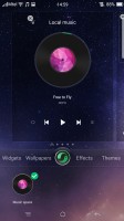
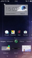
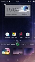
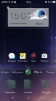
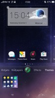
The homescreen's contextual menu lists widgets, wallpapers, effects and themes. You drag widgets upwards to place them on the homescreen.
Oppo's Color OS supports themes, but comes with just the default one on board. However, there are plenty of themes available for free in Oppo's Theme Store, and some are better than others at skinning non-stock app icons.
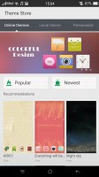
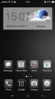
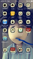
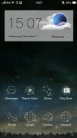

Themes Store • Different themes
By default the notification area will show one row of quick toggles, a brightness slider and a shortcut for enabling auto brightness mode, the current notifications plus a shortcut to go into settings. If you do a drag gesture from the quick toggles row you get two more lines of toggles.
A long press on a toggle will bring up its respective settings entry. By the way, you can access the notification area even if you slide down from any empty part of the homescreen (not just the top), which helps on such large diagonals. You can also set up app-by-app permissions for displaying notifications.
The task switcher is pretty close to the one in iOS in terms of looks. All your apps are shown in a horizontally-scrollable grid of thumbnails, which you either swipe up to close or tap to open. A downward swipe locks one or more apps, so they remain open even when you use the Kill all button to close all the others.
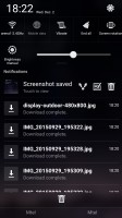
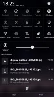
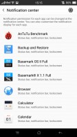
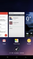
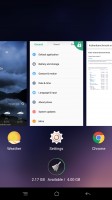
The R7s notification area • Expanded view • Settings • App switcher
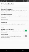
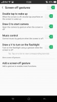
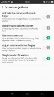
The R7s has some of the most comprehensive gesture controls out there. It picks up gestures with the display off, then others with the display on and it also recognizes motions to answer or mute incoming calls.
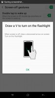
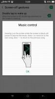
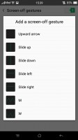
Among the screen-off gestures you get the obvious double-tap-to-wake, but also music control, which lets you play/pause/skip songs with distinct swipes. Drawing a circle launches the camera and you can set up a host of other gestures to launch an app or call a contact.
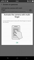
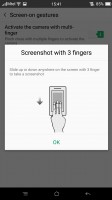
Moving on to screen-on gestures, you can swipe with three fingers across the screen to capture a screenshot or pinch with several (three or more) fingers to launch the camera.
The Smart call options are where motion goes into play and they are very useful, too - flipping the device will mute the ringer, raising the ringing phone to your ear will automatically answer the call and more.
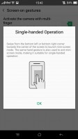
One hand mode is available too, activated by an upward swipe from the bottom left or right corner. When done, this will minimize the UI into a more compact window, for an easier reach with just one hand. It's a lot like Samsung's feature in the Note series, though without the option for resizing. It also doesn't completely turn off the unused pixels to conserve energy, though the effect would probably be negligible.
Reader comments
- AnonD-545233
- 04 Jun 2016
- Ki}
How to I get masarowal 13 can help me please somebody thanks
- AnonD-545233
- 04 Jun 2016
- Ki}
Oppr7sf is super for charge and best of selfe...please quickly get and try
- AZRAILr7sf
- 04 Jun 2016
- Ki}
I use IPhone but suddenly I get oppr7sf that is super use for charge and greet for all the options..please you get quickly and see

