Oppo R819 review: Asian blade
Asian blade
User interface with ups and downs
The Oppo R819 came with Android 4.2.1 out of the box, but if the idea of yet another customized Android does not sound appealing, you'll be glad to hear Oppo has a stock Android option too.
Here's the Oppo R819 flaunting its UI on video:
While we understand the reservations about Android skins, some of them have value added features that are not available in AOSP. Oppo has tweaked the UI to the aesthetic popular with other China-based manufacturers and has thrown in a good deal of dials and toggles too.
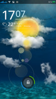
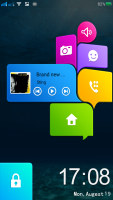
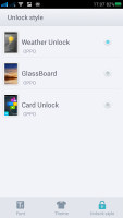
It starts at the lockscreen. The default lockscreen shows the wallpaper, time and weather forecast and offers a camera shortcut. Basically, it's a skinned version of the vanilla lockscreen. There are two more options available out of the box - GlassBoard (a simple swipe to unlock screen like the Oppo Find 5 had) and Card Unlock (which shows music playback info and has more shortcuts). It's great that each lockscreen has its own animated preview, so you can see what it looks like and how it behaves before applying it.
The Oppo R819 supports the double-tap-to-wake-up gesture, which means you can unlock the phone without using the Power/Lock key (which is a lot more convenient if the phone is laying on the table).
There's a feature called Easy Stay (you can say it's a Smart feature), which will keep the screen on while the front-facing camera can see your face.
The homescreen too is a custom job, but keeps very close to the accepted standard. There's a 4 x 4 grid of shortcuts with an extra row at the bottom for a dock. The homescreen has widgets too and Oppo has provided a nice selection.
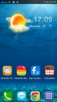
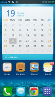
Not a lot of shortcuts fit on the huge screen
You can add up to 9 homescreen panes, when most custom launchers top out at 7. You can re-arrange them and delete the ones you don't need, through the popular overview mode you trigger by a pinch gesture.
By the way, there's a fixed homescreen pane, which handles music playback. It pops up automatically when you plug in a pair of headphones, a lot like Page Buddy on Samsung's TouchWiz.
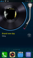
Dedicated music player homescreen pane
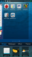
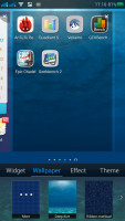
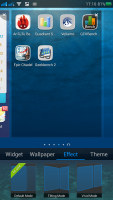
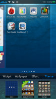
Pressing the Menu button brings out a tabbed tray with customizations for the homescreen. The first one just holds the widgets and the second one is for the wallpaper. The next two are more interesting - one changes the transition effect between the homescreen panes and the other is where you choose the themes.
Oppo has settled on a specific look for the icons: squares with rounded corners. Apps that don't have such an icon will be placed on a grey rounded square in an attempt to unify the look of all shortcuts. Google icons (Play Store, Gmail, etc.) are exempt from that, but there's a curious option called "Beautify icon," which swaps out some those icons with custom ones and places the others on the same grey background.
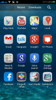
Some custom and some standard icons
We wish Oppo took the time to at least do icons for all of the apps, for example, why does Google+ get a custom icon when Gmail does not? Overall the solution is not as good as some icon packs you can get from the Play Store.
Another thing that was slightly disappointing is that shortcuts and widgets don't move out of the way automatically as you rearrange items on the homescreen, which is an ICS feature and really should have been enabled.
Anyway, if you are a fan of customizations you'll want to check out NearMe Themes and NearMe Wallpapers. This is where you can get more themes and wallpapers that work with the Oppo R819 launcher. Each theme brings a custom set of icons to keep the cohesive look but suffers from the same issue as the default theme - no custom icons for anything but Oppo's apps.
The notification area has a line of quick toggles. A tap on the edit button lets you hide/show and rearrange toggles. If you have more than the screen can hold, the rest go offscreen and you need to scroll to reach them.
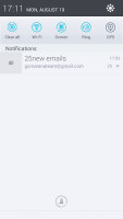

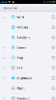
Notification area with toggles • picking which toggles are active
There's a brightness control that toggles low, half, full brightness and auto mode. There's also a Kill all apps button. A long press on some toggles will bring up its respective settings entry. An interesting note on the screen autorotation toggle - it can be on or off, but an extra option from the Settings menu lets you toggle the animation effect too. We prefer to keep the animation off as it's faster, but it looks better with the animation on.
The bottom of the screen is a dock. You can have shortcuts or folders here, you can even move the app drawer shortcut (but not remove it from the dock altogether). The dock has four shortcuts (Dialer, Messaging, Chrome and App drawer) by default, but you can actually fit a fifth one.
The app drawer is pretty simple - it has horizontally scrollable pages, each a 4 x 4 grid of shortcuts or folders. The dock at the bottom of the screen is visible in the drawer too. A small "NEW" tag marks newly installed apps that haven't been launched yet.
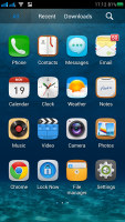
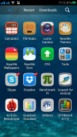
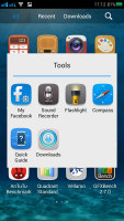
The app drawer • a folder in the drawer
Dragging a shortcut to the homescreen doesn't work the way you're used to - the default action is to rearrange shortcuts, you have to drag it over the "Drag app to homescreen" area that appears at the bottom instead. This just slows down the most commonly used function - dragging shortcuts onto the homescreen.
The task switcher is yet another element of Android that Oppo has customized. This time it is pretty restrained, just a Kill all apps button and a Google Now shortcut with an indicator of how much RAM is used.
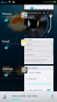
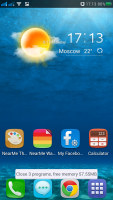
The custom task switcher • hitting the mop button closes all apps
Even the Settings have been tweaked. They got a new paint job to match the rest of the UI and the various settings have been organized into tabs - General, Sound, Display and Security.
One thing we really appreciated was the Boot manager. No, it's not a tool for dual-booting, but it shows a list of all apps that run on startup and lets you disable some of them to speed up the startup process. We wish stock Android had this, heck, we wish Windows did (it does, but it's not quite as accessible).
Another cool tool lets you decide which apps will be allowed to run in the background. There's more - you can lock access to some apps and the phone will require a security pattern (like the one on the lockscreen) to launch the app.
Overall, the Oppo R819 runs smoothly and we found the customization options to be quite good. However, the whole thing has a strong TouchWiz vibe, which may be a turnoff.
Reader comments
- nuaim
- 29 Sep 2015
- g8K
Hi... I have oppo R819 i have been using since one year it is superb, but now it started to hang and suddenly switch off, so i formatted to factory setting now it is full Chinese language, kindly guide me to change it to English
- nuaim
- 29 Sep 2015
- g8K
Hi... I have oppo R819 i have been using since one year it is superb, but now it started to hang and suddenly switch off, so i formatted to factory setting now it is full Chinese language, kindly guide me to change it to English
- doni wirman
- 19 Nov 2013
- 6{6
I bought this phone and have used it for 3 weeks. As long as I use this phone..I felt very comfortable with this phone to take my daily activity. Its very smooth, exe app quickly and runs with multitasking very well. I also have installed this phone ...
