Palm Pre review: A pebble in your hand
A pebble in your hand
The Palm Pre interface: webOS, Cards, gestures, multitasking and all
To begin with, the Palm Pre does the one and only thing that iPhone can't (not without jailbreaking) - multitasking. The Pre is so much into it, the entire user interface is simply a giant task manager.
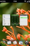
The so called Cards Interface doesn't even involve a classic homescreen with shortcuts or widgets. The only thing you can do around these parts is change the wallpaper.
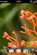
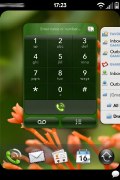
Palm Pre default view
At the bottom of the screen there are five docked icons on a quick-launch taskbar - dialer, contacts, email, calendar and Launcher. The first four of them can be rearranged by tapping and dragging to the preferred location within the taskbar. The Launcher has its position fixed and is essentially the Palm Pre's main menu.
The taskbar hides automatically when you open an app, but you can recall it any time by an upward finger sweep that starts at the gesture area and continues onto the screen.
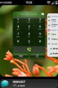
The taskbar emerges, sticking to your thumb and rippling and moving like a wave. It stays on screen as long as you don't lift your thumb and it's side-scrollable too - you can hit any of the shortcuts on it. The fancy wave-like animation is more of a show-off than anything else but it's nice to know a quick launcher is always at hand and you don't have to go all the way back to the homescreen.
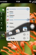
Moving the taskbar
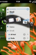
But that's the very essence of the webOS and the Card Interface to begin with. Anything you've opened is available on the homescreen - like thumbs of running apps, or cards as Palm call it. Essentially, the screen is your workplace - the table to deal and shuffle the cards.
Running apps are displayed as cards. They look and even behave like one. Every time you launch an app, it appears in full screen of course. Hitting the center key will collapse (zoom out) the fullscreen app, so it appears as a card (or thumb) on the screen. A tap on a blank screen space will zoom out even further, so you have an even smaller card. When many apps are running at once the small card view makes them easier to manage.
The Card UI
No matter if you have the card view or fullscreen view, running apps can be switched between with finger sweeps - either across the screen or the gesture area. Simple and easy, just like you're switching homescreen panes. In Card view, taping on a card will expand the respective application fullscreen for you to work with. Alternatively, you can flick a card up and off the screen so it's removed from the lineup. In fact, it's the only way to end a task.
You can run as many apps as you want, but you'll eventually run out of RAM. We tried to run all the available stuff all at once. At one point we had a total of 28 cards and the Pre was going good. The next time we tried it we got a low memory warning at the 12th opened tab. So obviously the number of opened apps is not fixed - you can continue opening new ones as long as you have available RAM.
Taking a look further down
Now, this is what's happening onscreen but the Pre has a lot going on at the bottom too. The whole space around the Center key is touch-enabled. Palm calls it the Gesture area. We already told you how to drag the quick launcher on screen over an app that's running fullscreen.
The other navigation gestures include horizontal swipes across the whole Gesture Area: you can swipe left or right to browse the running apps - in Card or Fullscreen view regardless.
A short horizontal swipe left (starting at the Center key) will take you one step back no matter where you are in the interface. A series of these swipes will eventually take you to the homescreen.
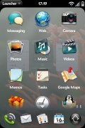
A swipe up doubles the Center key action - it will collapse a fullscreen application and show the card view. A second swipe up will start the main menu, which Palm call the launcher. Another way to do that is using the taskbar of course.
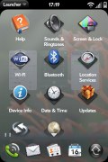
The Launcher (main menu) is semi-transparent with colorful icons. The menu organization is pretty standard. You have three Launcher screens available - you scroll left or right to alternate them but they're vertically scrollable too. The first and second Launcher screens hold all your apps, while the third is dedicated to the phone settings.
Page indicators are available at the bottom as you move through screens.
The Launcher
As any other handset - the status bar at the top of the screen on the Palm Pre displays the usual stuff - network name, digital clock and indicators for wireless and cellular coverage, along with the battery status.
Tapping the Status bar launches a semitransparent menu that can be used to manage Wi-Fi, Bluetooth and Flight Mode, see the current date and battery levels.
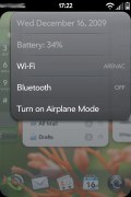
Status menu
Finally let's mention the event notifications. They are shown at the bottom of the screen just bellow the taskbar. Taping on a notification will reveal more additional information. For example if you have a new message a small bubble appears at the bottom and when you tap on it you will see who sent it. Alternatively, you can flick a notification to the side and off the screen when you're done with it.
The notifications
Reader comments
- AnonD-655782
- 25 Mar 2017
- t}V
I want to repair my phone. Touch pad is not working so want to change it. please suggest where can I get a new touch pad for this phone? or suggest another suitable touch pad.
- oky garis
- 15 Mar 2010
- txx
i like the concept of palm..... its a fresh phone with fresh UI
- HELP!
- 22 Jan 2010
- LyH
PLIZ! can someone help me with this decision? which one do you think is better? -Palm pre plus -Nokia N900 -HTC Hero ok, i don't need a lot of settings, i love the keyboards but hate blackberry, and don't like nokia E72 interface, so my ...