Pebble Time review: Kickstarted
Kickstarted
User interface
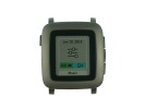
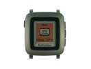
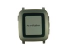
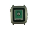
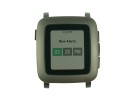
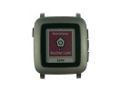
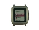
The user interface of the Pebble Time will be instantly familiar to owners of the previous model. There is naturally color in the mix now and some really cool-looking animations.
We've prepared a short video of the Pebble Time in action. See it below.
Native apps
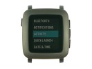
In terms of native apps, the Pebble Time offers the bare minimum. There is a settings menu with various submenus, a music player remote, notifications menu, alarm app, and dedicated menu for watchfaces. Installed apps will appears after the aforementioned few.
The settings menu allows you to tune your Pebble Time, its connectivity and notifications. Two of the buttons on the right can be configured as shortcuts, which activate via long press.
The music remote can be configured to control an app of your choice. You can play, pause, and change tracks and volume.
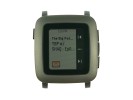
The notifications menu is self-explanatory. It shows all notifications that your watch has received. You can clear them if you wish.
The alarms menu works as expected. The same goes for the dedicated menu for changing watchfaces.
The overall user experience is minimalistic and fuss-free. If you are looking fro animated emoji or gobs of eye candy in the UI, the Pebble Time will not be a smartwatch for you.
Reader comments
- Saniubah
- 22 May 2016
- fuN
I ordered my pebble watch time today 108usd. Nice i love it. 4 to 5 days battery fantastic.
- AnonD-141575
- 02 Jul 2015
- uSS
I have a pebble time black and after a few days i noticed some slight scratching on the outer bezel, i think the matte finish on the metal bezel is a bit prone to scratches. I suggest getting matte decals to protect the bezel. battery life lasts...
- Matt
- 24 Jun 2015
- mng
The bezel surely is big enough to get some solar charging action going
