Poco F4 long-term review

Updates
What probably best illustrates what you should expect from Poco in terms of updates for this phone is the fact that we can't remember when we received the last one. We've spent many weeks with this device, and it definitely didn't arrive recently. That's what you'll be getting, in a nutshell. Yes, there are updates, but they are few and far between. So if you care about receiving the monthly security patches on an actual month-by-month basis, this is definitely not the phone for you - nor, might we add, any other Poco or Redmi or Xiaomi.
Poco and Redmi especially focus on trying to give you the most bang (in terms of specs) for your buck, and that unfortunately comes with a side effect of neglecting the software update side, compared to some of the competition - say, Samsung. Then again, Poco and Redmi devices are generally better specced at similar price points, and they're also usually smoother than the Samsungs they directly compete with, so it's not like you're not getting anything in return here. This situation is just something to keep in mind, as it doesn't seem like Poco is planning on changing anything about it anytime soon.

Hence, our F4 intended for the European market is (and has been for who knows how long) on MIUI 13.0.5, based on Android 12, with the August 2022 security patch level. A new update will probably arrive in the next few weeks, but the one after that? It's impossible to tell. As for big ones, the Poco F4 should get MIUI 14, although nothing has been confirmed on the matter yet. Android 13? Most likely, but don't expect that to arrive soon and keep in mind that MIUI is a very heavy skin, so even if your device gets the next version of the underlying OS, most of the user-facing features that Google announces each year won't look the same. Some won't even be available at all (looking at you, Extra Dim).
We can rationalize the entire update situation more easily for a handset costing as much (or rather, as little) as the Poco F4, but it does get harder the more we climb the price ladder, which is why we give Xiaomi's flagships a much harder time about updates. At those prices, this is unacceptable. At the Poco F4's, it might be slightly more acceptable, although still definitely nothing to praise.
MIUI 13
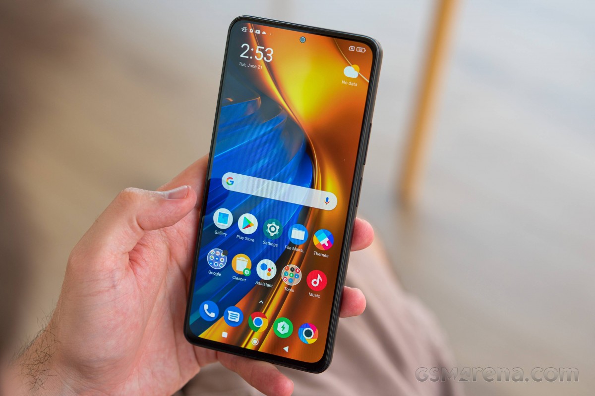
MIUI 13 has been around for a while now, and it feels like it's been around for much longer than that in fact since it shares a lot of its looks with MIUI 12.5 and MIUI 12. With every new device we review long-term that runs MIUI, we mention that the skin might be in need of a new coat of paint, since it has had a very similar vibe for years now. Of course, you might disagree and find it the most beautiful thing ever, it's all subjective when it comes to such things.

We will however say that the entire user experience of handling a phone with MIUI 13, the Poco F4 included, is generally very good. There are still some quirks, but if you don't find the looks to be getting rather stale, you're in for a treat with all the nice animations and pops of color everywhere. It's definitely a joy to use, even if it might take a little bit of adjustment if you're coming to it from a different skin.
Especially the Settings menu can be intimidating to first-time users, since it has an incredibly high number of things packed inside it, in sometimes confusing ways. System apps updater? Sure, that makes sense, until you realize that not all system apps use it - some get updated through the Play Store instead. Let's just say we're thankful that there's a search function, and that it works pretty well.
Launcher, Recents, Control Center
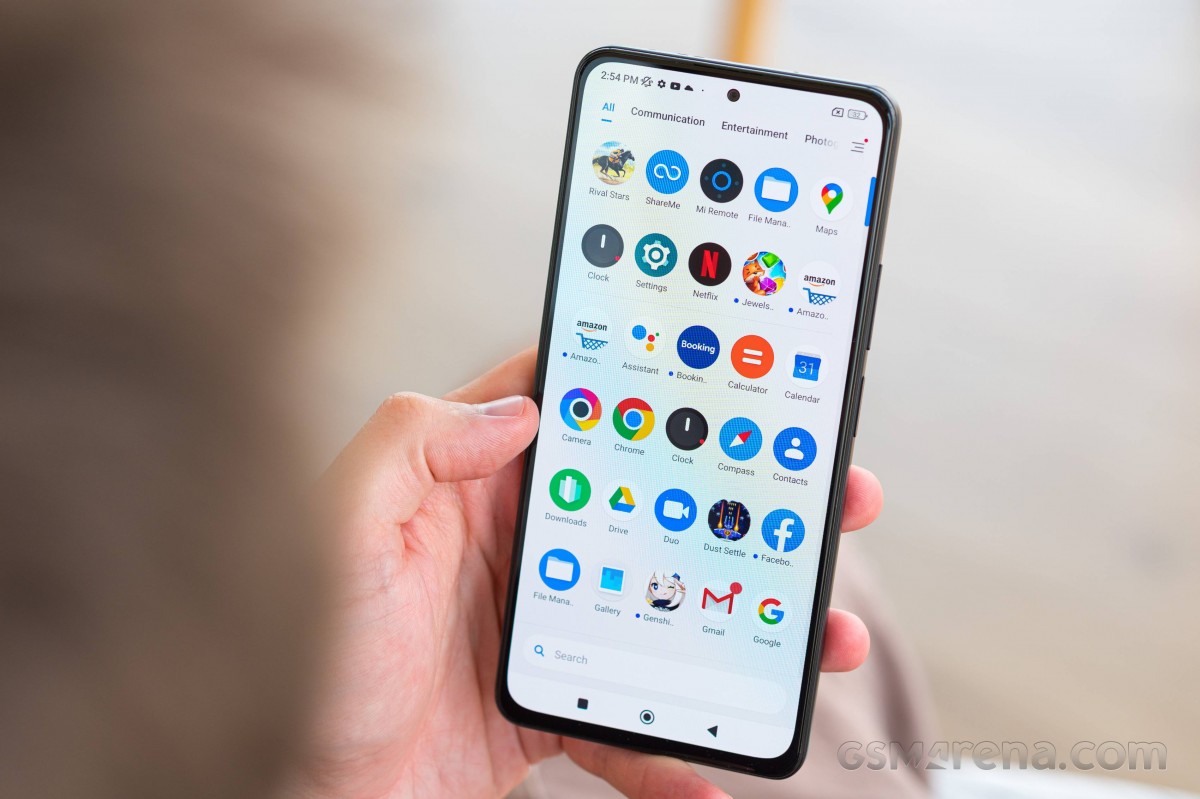
The launcher is the usual Poco fare, with a few customization options but nothing too extreme that would put off more casual users. It's fine to use as is from the box, but if you want to tweak things, you can do that too. It goes without saying that there's an app drawer, and there's an option to have an A to Z scale in place of the scroll bar, which we love. Tapping the first letter of an app's name over there is consistently the fastest way to get to any app, we have found - it beats searching hands down, and this might prove to be very important to you, if, like us, you have over 300 apps installed.
The Recent apps display is still vertical by default, since MIUI loves its quirky two-column layout, but thankfully you can change that and have it horizontally scrolling like every other Android skin out there does it. Of course, if you're among the people who love the vertical layout, you'll enjoy the way things work out of the box.


Recent apps display and setting
Speaking of choosing between old and new ways to do things, let's get to the Control Center, shall we? That's what MIUI is calling its clone of Apple's Control Center, which is the new way to go about it, and the default. However, if you don't enjoy splitting notifications and controls, then you can go back to the old way, with Quick Settings icons above notifications. When the new Control Center came out, we did try it out, but in the end found that we feel Android's way of approaching this makes more sense.
If you have the controls above the notifications, then the notifications are more easily reachable without thumb gymnastics. There's also added ease of use stemming from the fact that you don't have to be careful which side you swipe down from.


Our preferred Control Center style
Finally, we'll note that for right-handed people, having to swipe from the left side for notifications isn't great if you want to do said swiping with your right thumb while your right hand is holding the phone - especially if you have to check out notifications many more times throughout the day than the Control Center. Hopefully we've made a solid case against the new Control Center, but if you like it more, none of our opinions matter, and you can enjoy it without issue.
Dark mode, gestures
As any other modern skin, MIUI 13 comes with a Dark mode, which can be scheduled too, either to come on from sunset to sunrise or according to a custom schedule. You can also force it onto individual apps, and we're happy to report that on the Poco F4 this functionality actually works. We were previously frustrated by the fact that the F4 GT, which we've recently reviewed long-term, while in theory having the same feature, was only able to force Dark mode onto the Amazon Shopping app, and none other.
On the Poco F4, you get a list of your apps, and the most recently used ones are up top for quick access. Although we would have appreciated a way to customize the sort order, this one does actually make a lot of sense - since we're assuming the most often met scenario is you open an app, get annoyed by the fact that it doesn't have a dark theme of its own, then jump into settings to force Dark mode onto it.
In that case, it will be right at the top of the list. We also appreciate that the forcing is off by default - way back in the day when this feature was first starting to appear, we saw some instances of it being on by default for all apps, which led to display issues with a lot of those that have their own dark themes.
So it's all good on this front on the F4, which makes us even more baffled about the state of things on the F4 GT. These phones share a part of their names, and they both run MIUI 13, yet the behavior of this feature is very different. This just tells you that bugs on the F4 GT are aplenty, as we've discussed at length in its long-term review. Thankfully, however, that's not been the case on the F4, as our experience was pretty much bug-free. And that's quite a refreshing change, although the update cadence means if you are unlucky to get a bug at some point, it will stay with you for many months until it's (hopefully) fixed by the next update.
The Poco F4 also has gesture navigation of course, and as usual in MIUI you can turn off the pointless and annoying white 'pill' bar at the bottom once you've enabled it. We found gestures to be working perfectly, although for the few of you who may have loved the 'quick switch to the previous app by holding the Back gesture' function, it's a sad day since that doesn't work on this phone. Swiping across the bottom of the screen does accomplish the same task, however, and arguably does it ever so slightly quicker, so perhaps that's a good replacement.
Reader comments
- Anonymous
- 17 Feb 2024
- nxu
X6
- Anonymous
- 15 Sep 2023
- PRQ
Should i buy this or go for x5 pro
- mat
- 02 Sep 2023
- HUF
i have poco f4 for 1 year it's very good choice for gamers and power user or people wants buy a phone for mor than 4 years


