Razer Phone review
Retail Box contents
Brand recognition has always played a major role in Razer's business model. The gamer-centric company is no stranger to showmanship either. The green three-headed serpent logo is a fan favorite among the younger PC gaming crowd, so it should come as no surprise you can see it stenciled on pretty much any item imaginable.
It's this kind of attitude, the wide and lavish distribution of branded "swag" and the "1337" attitude that has helped Razer target its particular demographic. Naturally, all that has been carried over to the Razer Phone as well. In Min-Liang Tan's own words (he's the company's CEO), everything about the handset is "insane". But more on some of these bold marketing claims in a bit.
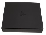
As far as packaging and presentation go, "insane" seems to describe it well. Razer pulled out all the stops. The phone arrives in a big black, soft-touch box with Razer trims all around. It looks and feels premium - and the impression is reinforced by the same level of quality extended to the insides of the box, as well as all the individual accessory boxes. A "WATCH, LISTEN, PLAY" slogan on the inner side of the cover and a semi-transparent introduction letter, signed by Min-Liang Tan tie everything together nicely.
But, like we always say, extravagant packaging ultimately adds to the overall price and you end up with an expensive space-waster to keep in your closet. The stuff that matters, after all, is the contents.
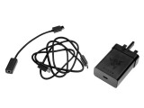
Razer scores top marks in this department as well. The included charger is of the elusive Quick Charge 4+ variety - it's perhaps the first one we see in person. This is great since you can take full advantage of blazing fast top-ups out of the box.
The bundled USB cable is of the premium braded variety. Be advised, however, that it is a Type-C to Type-C unit. Since those are still not really common, be sure to hold on to it, or else you might be losing the benefit of the bundled Razer charger.
Lastly, there is some more swag to enjoy in the box as well, namely a Razer-branded SIM ejector tool and a pair of stickers, Apple-style.
Razer phone 360-degree spin
The Razer Phone is clearly not meant to have universal appeal but rather banks on having a character of its own. As such, it does not really follow the design trends of the day - which is not to say the Razer Phone is inferior in any way to most of the recent flagships of the competition.
It definitely has some heft to it at 158.5 x 77.7 x 8mm and tips the scales at 197.8 grams. So, not compact or lightweight by any stretch of the imagination.
It definitely doesn't follow the modern design trends: there is no bezel-less screen, nothing curvy, no creative use of space and nothing put in places you wouldn't expect. It is not really subtle either - a boxy phone which has the looks of a tool rather than a fashion accessory. And that's actually good and we like it this way.
Its brushed metal unibody design and straight lines would typically be enough to describe its appearance as "utilitarian". However, with a conspicuous pair of speakers mesh at the front and an etched logo on the back, Razer has clearly wanted to avoid creating a plain phone either.
Being distinct is never a bad thing, especially in today's arguably stagnant era of dull "slab" phone design. Instead of resorting to bezel-shaving, curved screens and funky controls, Razer seems to have taken a step back.
But, is that even correct to say for a first generation product? And where do we draw the line between visually outdated and purposefully designed to cater to a specific target group?
Hardware Overview
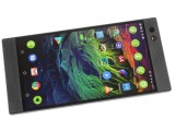
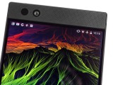
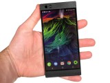
Starting at the front, 5.7 inches is big enough for it to step into phablet territory. Make no mistake, this is a rather large phone. It's also flat on all sides. The traditional 16:9 aspect ratio works great in terms compatibility and performance reasons.
The front has Gorilla Glass 3. This might sound outdated, but our past experience shows that it is still one of the better choices out there as far as scratch protection goes.
As for the top and bottom bezels/speaker grilles, we have mixed feelings. On the one hand, having some extra space for a firm grip is a definite plus for a gaming device. On the other, however, we do feel Razer could have opted for something other than a fine grate pattern. Again, we are sure it's great for acoustics on a pair of fat front-firing speakers, but the fine holes collect dirt and dust all the time. That makes for a really unpleasant, worn-in appearance in a pretty short time, without any real way of cleaning the dust or pocket gunk out.
Okay, that might be a bit of nitpicking, but the inner bezels surrounding the panel are less debatably an eye-sore. You get around 2mm of solid black bars top and bottom of the screen. The side ones are arguably not that hard to swallow, but already big enough forehead and chin could've simply been extended by a couple of millimeters each.
Also, the proximity and light sensors get their own window the exact same size as the 8MP selfie camera. There is also a notification LED.
On to the sides of the Razer Phone and another set of dubious choices, mixed with an appealing overall look and feel. Brushed black metal all around, the Razer Phone almost seems like a natural extension to one of the company's stylish laptops. The metal unibody just looks and feels amazing, no question about it.
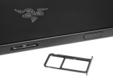
The right-hand side only houses a pair of controls. On top is a tray that can take a microSD card and a nano SIM. No dual-sim variants have been announced as of yet. It manages to sit perfectly flat with the rest of the side, without disturbing its smooth surface.
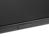
Then again, so does the power button, fingerprint reader combo. Well mostly, that is. Since it only has a slight recess and a perfectly smooth finish, it is really hard to find by feel. Muscle memory or a case can definitely remedy that, so we won't complain too much.
To accommodate the fingerprint sensor, the button has a glass finish. It is slightly glossier than its surroundings, which we actually think works really well as a subtle accent.
We found the reader itself to be very reliable, but not particularly fast. It is not always on, but rather triggered by pressing the button itself. A few milliseconds of a delay here and there and the end result is often an unlock that occurs a whole second or so after the button is pressed. There is plenty of room for improvement.
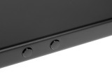
The left side of the Razer Phone is just as empty as the right one, perhaps even more. It only houses a pair of volume buttons. These are very small, round, and have barely any travel, making them quite uncomfortable to press. Finding them is also a challenge since they are positioned near the center of the frame.
This seems really odd until you think back to all the times you accidentally pressed a button while gaming and disrupted your experience. Razer wants none of that and clearly shows where its priorities stand.
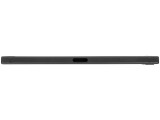
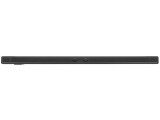
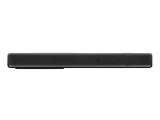
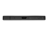
There is little to speak of at the top and bottom of the Razer Phone. One has a solitary microphone, while the other has a microphone and a USB Type-C port.
One interesting thing to note, though, has to do with the antenna lines. On the sides of the phone, you get a total of four symmetrical plastic inlays. It appears Razer wanted to place some along the vertical axis as well but oddly decided that a total of two is enough. So, what we ended up with is a glaring asymmetry with a pair of bands in the right half of the top and bottom bezels. From the front, these inlays almost look like you have chipped the bezels. But it's not such a big deal.
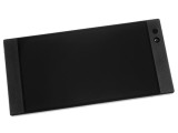
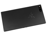
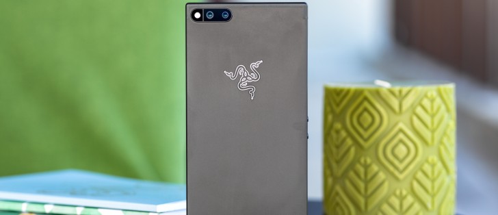
Finally, we come to the back of the Razer Phone - a truly stylish matte black metal surface. Razer did a great job shaping, painting and blending the antenna lines along the top and bottom near seamlessly with the overall design. It looks so good that we are a bit hesitant to point out the lack of a glowing RGB logo - a logical step, given all the Chroma hype.
We thought the special limited edition of the phone would feature integration with Razer's own RGB platform, but that is not the case either. What that model offers is a green finish for the logo and nothing else. No RAM, storage upgrade or special offers. Frankly, we think silver suits it better anyway.
All things considered, the Razer Phone is definitely a standout at the 2017 flagship scene for more than a few reasons. We can't overlook the throwbacks to the Nextbit Robin, though - the cloud-based phone that got some industry attention then kind of slipped into obscurity. Since Nextbit is part of the Razer family, it comes as no surprise to see quite a few design traits carried over.
Even so, Razer managed to put a totally unique spin on its new product. Being different and standing out is one thing and it can only get you so far. Join us in the next section as we start to dissect the Razer Phone to actually see what it's made of.
Reader comments
- Liv
- 09 Sep 2019
- 2pa
I've had this phone for a year and I haven't had a single problem with it. IMO the main reasons to buy this phone (at the time) were the sound quality, GUI responsiveness, stock Android, and the fact it looks different from other phones. These ...
- s-pen pusher
- 18 Jan 2019
- PMT
4 months after purchase and the charger stopped working. 5 months after purchase the screen developed an issue, which i found upon research online that it is common with this phone- half the screen freezes and would not respond until you reboot the p...
- Anonymous
- 20 Sep 2018
- jaG
I love this phone, since having this phone i was only able to update once and only update the apps (which i love). The performance on the phone is awesome!!!
