Realme GT Neo2 review
Design and ergonomics
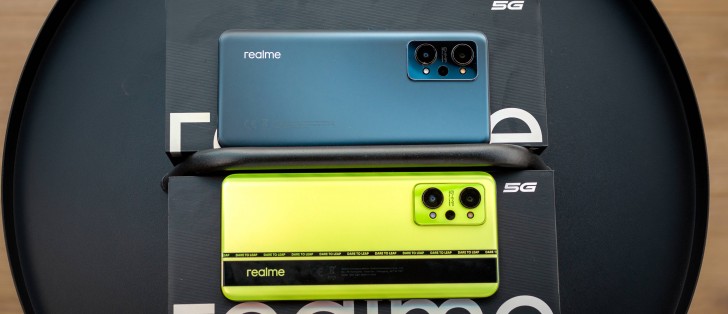
Looking at the Realme GT Neo2 and the original Neo side by side, it's hard to tell the difference. However, there are quite a few subtle changes, and most of them are for the better. Luckily, we got both the Neo Green and Neo Black colors, so we have some impressions from both.
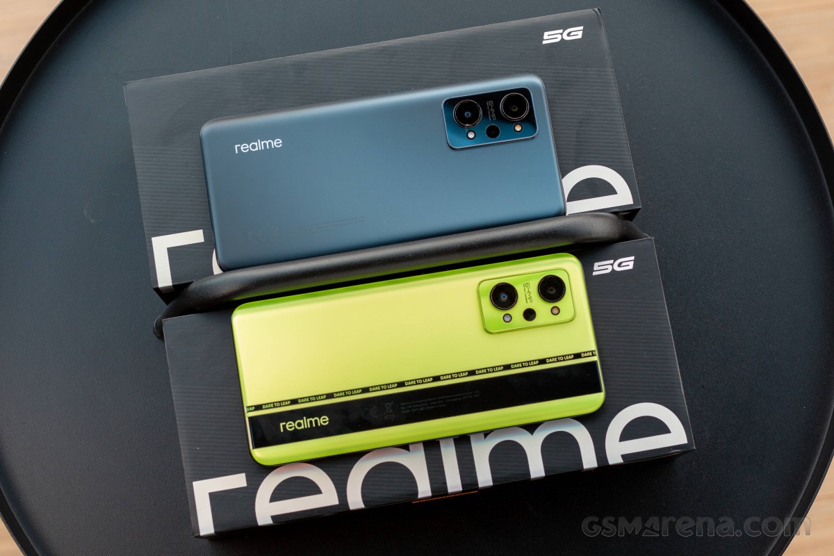
For starters, the display on the front is protected by Gorilla Glass 5. The back panel and the side frame remain plastic, though. Realme says it's a 7 nano-multilayer with AG (anti-glare) coating, which feels a lot like the predecessor. Interestingly enough, we found the Neo Black color to be less of a fingerprint magnet. Sure, there are still some smudges if you look close enough, but they are definitely less apparent. This is true for the Neo Green option as well.
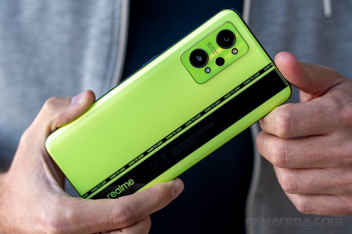
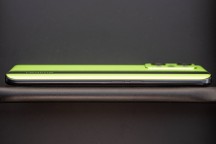
Speaking of, this is the only color option with the rather polarizing stripe design. It might appeal to some, but others may find the "Dare to Leap" slogan a bit too much. The contrasting glossy stripe makes fingerprints a tad more visible, but it also looks kind of fresh, we'd give it that. Either way, the base color options are your logical choice if you are looking for something less flashy. The Neo Black and Neo Blue variants have a medium-sized Realme logo, which is far from annoying.

Sadly, there's still no ingress protection, and the extra screen diagonal, and battery capacity have bumped up the weight to almost 200g while the profile is now 9mm.
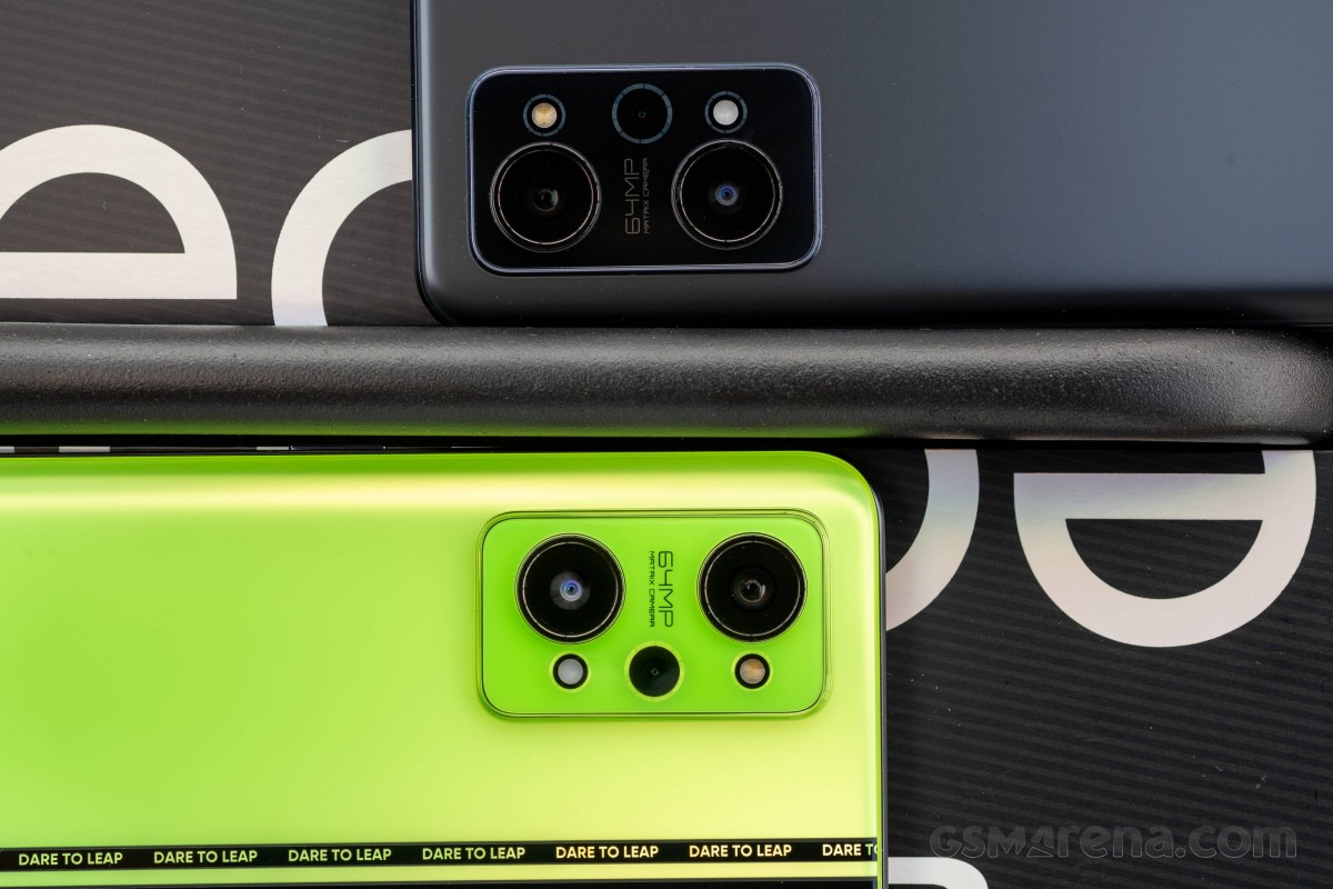
The camera island retains the shape but adopts a familiar design and arrangement. It's looking a lot like OnePlus' 9-series, and the two main lenses protrude by a little. Interestingly, the two-tone flash consists of two separate modules positioned right next to the primary and ultrawide cameras, probably for the sake of symmetry. Although, we find the asymmetrical distance between the two cameras and the edge of the glass piece OCD-inducing.
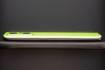
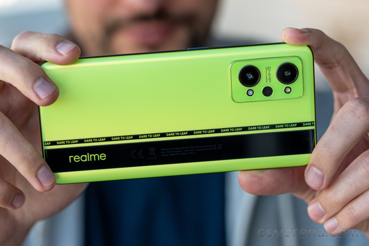
Overall handling is nice, mostly because the side frame is super grippy. It's made of plastic and imitates anodized aluminum. The curved back also helps with the grip, but we were mostly surprised by the back, which doesn't come off as too slippery despite its smooth, frosted finish.
On the left side of the frame, you'd find two separate buttons for the volume and, on the right, a patterned power button. And there's something odd about them; maybe a bit more travel and clickiness wouldn't have hurt. And while we are on the buttons, we can't miss mentioning the fingerprint scanner's positioning. It's a bit too close to the bottom edge requiring some awkward thumb twisting, or you have to hold the phone really close to the bottom edge. That last option isn't ideal too because the handset is top-heavy.
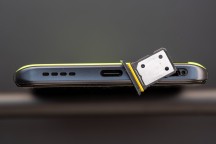
The bottom houses the bottom-firing loudspeaker (the second doubles as an earpiece behind the top bezel) along with the USB-C port and the SIM card tray. The latter offers two SIM slots but no room for microSD.
We are sad to see the 3.5mm jack go despite this updated model being considerably bigger. We wonder why Realme chose to skip it this time around.

Although not perfect, the design appears to be much improved from the previous generation. Most of the issues we outlined in the original GT Neo review are no longer here. The finish isn't a fingerprint magnet; it's less slippery, there's a Gorilla Glass 5 sheet on the front, and Realme offers cleaner-looking paint jobs this time around.
Reader comments
- Galaxy SAMSUNG
- 04 Jun 2024
- nH{
Global models have google dialer, install o dialer. Its available for COMOROS, OxygenOS, Realme UI
- Galaxy SAMSUNG
- 04 Jun 2024
- nH{
GT 2 Series we're released later with android 12, unsure if it stops at 15 or 16
