Relive the evolution of Sony Xperia design in two minutes
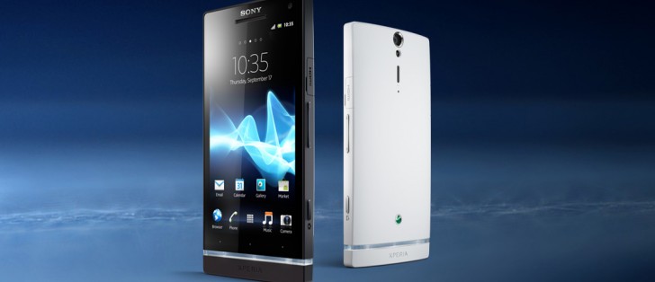
Sony unveiled its latest design language at the MWC, called Ambient Flow. The Xperia XZ2 and XZ2 Compact return to the curvy backs of Sony’s earlier designs. Need a refresher? This video traces Sony’s design language from 2012 to today.
It starts with Iconic Identity – the time of the Xperia S and company with their ergonomic curves and transparent row of buttons. Then, OmniBalance came and ruled Sony design from 2012 to 2015, first introduced with the Xperia Z. OmniBalance shed the curves and went for a very rectangular look. It also cemented some traditional Xperia features like waterproofing and stereo speakers.
This gave way to the short-lived Unified Design of the Xperia X phones. It started smoothing out the hard edges with its Loop Surface and it transformed the round aluminum Power button from the Omni era into a fingerprint reader.
And that catches us up to today and the Ambient Flow language. Do you see the similarities with Iconic Identity? Do you see the differences?
Related
Reader comments
- 3D Memorys
- 08 Mar 2018
- IVV
The Ambient Flow design is to feel the handy and fit to hand, it is all about more ergonomic.
- Celluloid
- 08 Mar 2018
- R16
XZ1 will be my last as well.
- AnonD-290712
- 07 Mar 2018
- 39x
Good luck using it on a flat surface, on the other hand it might make it easier to pick up.. Sick of my mobile flying out of my hand when I try to pick it up.







 Samsung
 Xiaomi
 Samsung
 Sony
Sony OnePlus

