Samsung B7610 OmniaPRO review: Pro toolbox
Pro toolbox
TouchWiz UI gets better, doubles the homescreens
Our Samsung B7610 OmniaPRO runs the latest incarnation of Windows Mobile - version 6.5. We managed to get it updated from the original Windows Mobile 6.1 that it came with. But you'd never guess we're running WinMo here as Samsung have completely redecorated the place. The only giveaway is the Start button, otherwise the stock WinMo interface is almost completely out of sight.
From the Phonebook to the Settings menu, everything is covered by the custom-made interface. Even the settings themselves have been reorganized to resemble those of the Samsung touchscreen feature phones.
Yes, it's TouchWiz all over and it's been upgraded - it has two homescreens, or two user modes if you like, called Life and Work.
The leisure mode, a.k.a. Life, uses the well-known widget-based, three-pane homescreen that was TouchWiz from the very beginning. The Work mode has more subdued styling than the colorful wallpapers of the Life homescreen and while it uses widgets too, they work in a different way and are generally more practical.
The widgets in Work mode are arranged vertically as tabs on the scrollable homescreen and their order is customizable. Each tab is also scrollable sideways if there is more content that needs to be displayed (there's an indicator showing the current view of the widget and the number of extra pages in total).
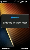
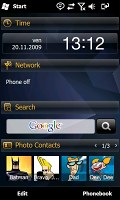
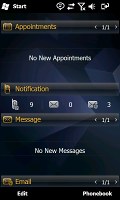
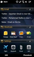
The new work mode of the TouchWiz UI
The Life mode widgets are the usual mini applications that you can arrange freely on the three different homescreen panes. In either mode, if the user needs to place a new widget on screen all they need to do is click the arrow at the bottom left corner of the homescreen and pull the widget tray out. To get rid of an unwanted widget you need to drop it back into the tray.
The TouchWiz approach is quite similar to what we saw on the Samsung I8000 Omnia II.
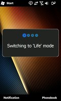
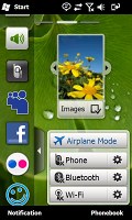
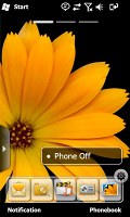
The life mode is far more familiar
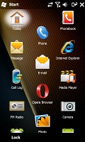
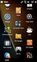
The Samsung-made main menu is similar to the ones found in their feature phones. It can have up to 10 pages with shortcuts and each page has a title.
In general, it's a lot more organized than the new honeycomb Start menu of Windows Mobile 6.5. The Others button in the lower left corner brings up a single scrollable page with all the shortcuts not in the main menu.
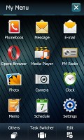
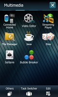
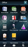
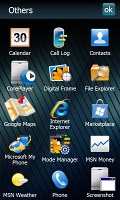
Pretty much all of the interface is customized this time
For multitasking, Samsung have provided two separate tools. The first is the Task switcher, which you can open by long-pressing the center key or by the dedicated button in the main menu.
It is very convenient for switching between apps and has two view modes - grid and a horizontal string of pages with nice transitions. It also offers basic controls for the music player. The one gripe we have with the Task switcher is that the long press required to start it is way too long.
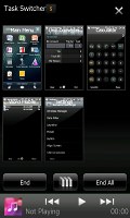
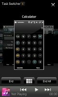
The task switcher has pretty neat looks
There's also a Task manager that displays more information about programs (RAM and CPU footprint) and can also display all the running processes.
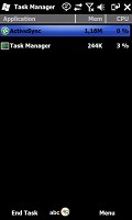
Samsung B7610 OmniaPRO task manager
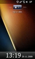
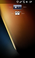
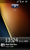
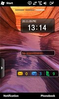
The lock screen has a slider at the top of the display. Sliding it left or right unlocks the phone, but there's another feature of the slider - if you have missed calls, their number is displayed on the slider.
Tapping it, reveals a second slider, which brings you straight to the cal log. Or if you have a new message, the second slider brings up the Inbox.
At the bottom of the lock screen, just bellow the time and date, any scheduled appointments from the calendar will show up.
There are two back buttons. The center key on the front switches between the currently active app and the main menu. There is another one, on the hardware QWERTY, which serves as a confirm button. The difference is that it actually closes the app, instead of just switching to the menu.
There is another convenient feature on the B7610 OmniaPRO. The Composer shortcut gets you straight to business - it launches a screen with shortcuts to get you directly to writing messages, making calendar entries or notes, or running a search.
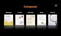
The Composer is very convenient
Overall, we're very pleased with this latest incarnation of TouchWiz and especially the Today plugin used by default for the Work mode. It can be easily fine tuned and presents information in an orderly and easily accessible manner, which is what really counts for business users.
Peeling off the TouchWiz skin
The Samsung B7610 OmniaPRO is a PocketPC and there's no away around it. Sooner or later, you'll bump into the cold reality of Windows Mobile.
It's the latest WinMo available, but as you've probably heard time and again Windows Mobile 6.5 is just a spruced up version of 6.1. Prettier, more touch-friendly UI controls do not remedy the underlying problems with usability.
We will have a quick glance at it here, but if you want a more detailed version of this part you can also check out our Windows Mobile 6.5 review.
The first change introduced by the new OS is the scrollable homescreen. The different items in the list are also scrollable sideways, giving you more functionality per line. For example, scrolling the Getting started item sideways allows you to set the clock, email account, device password, Bluetooth, custom wallpaper, custom ringtone, upload music and finally even remove the Getting started item for good once you're ready setting up the essentials.
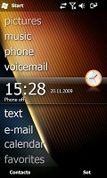
The homescreen is pretty functional now
The next major change is the new Windows Mobile Main menu. It comes in the honeycomb pattern that's supposed to boost touch-friendliness.
In the new main menu you've got all the installed programs plus shortcuts to the settings menu. Unlike the Omnia II, where the settings menu looked just like the main menu, on the OmniaPRO it is always covered by the Samsung TouchWiz and looks exactly like on any of the company's feature phones.
The perfectly flat structure of the Main menu can surely get a bit clumsy in time due to the huge number of icons piling up, but still we'd prefer that over the confusing experience that so many Widows Mobile new adopters have had in the past.
There are also some other minor changes such as larger font that allows for more thumbable operation in most menus and the option to alternate tabs by simple finger sweeps wherever Windows offers you tabbed screens. You no longer need to aim for the tiny titles at the bottom of the screen as on the WinMo 6.1 handsets - you just sweep your finger across the screen and the next tab opens instantaneously.
The ARM 1176-based CPU by Samsung clocks as high as 800MHz and allows the OmniaPRO to offer great performance, even with the high resolution display.
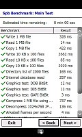
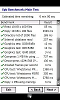
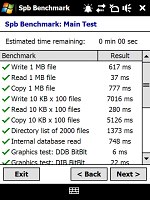
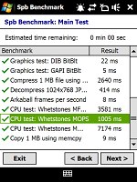
We used the Spb Benchmark software to test the Samsung B7610 OmniaPRO performance. Understandably, compared to the OmniaLITE, it was a bit behind in the graphic part of the test - it has four times as many pixels to draw on screen. Memory speed tests were mostly a draw, but strangely, the OmniaPRO lost in the CPU benchmarks. We ran the tests several times and ended up with the same results over and over again.
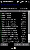
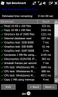
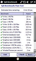
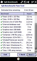
Samsung B7610 OmniaPRO results • Samsung B7300 OmniaLITE results
Reader comments
- Nadeeke
- 14 Sep 2013
- s%{
one thin is wrong mentioned here that micro SD card is under bettery which is in disadvantage of b 7610 mobile bcz SD card is behind the main bettery actually
- The Game 321
- 30 Mar 2012
- sSK
Hey I read this a couple of times now that the phone has excellent audio format support...but somehow i am unable to play a lot of formats...Does it have something to do with the DivX player registration?? if so how do I register it?? the people at...
- Anonymous
- 29 Mar 2011
- fue
I owned this phone few months ago. First of all am not impressed how keypad back-lit goes off in seconds. Also am not impressed about cursor return backwards whereby you have to press return key repeatedly. Now, I want to bring battery level icon on ...
