Samsung E950 review: Еccentric slider
Еccentric slider
Taking your time with the keypad
With the Samsung E950 the borderline between keypad and display is a bit blurred, as the keypad itself uses a display to navigate you through the menus. This extraordinary solution demands some special attention without a doubt. The touchscreen D-pad visualizes different context icons based on where you are within the menu.

The touchpad display shows different context icons
We’ve got several screenshots of this intriguing navigation solution to show you how it adapts according to the currently running application. The standard home screen layout prompts that pressing the Up direction will open the proprietary Samsung MyMenu (a list of user-configurable shortcuts). Launching the music player turns the touchpad into music controls. The layout changes once more when you turn on the Calculator for example. And finally, the touchpad display lights up with an image of a charging battery when you plug in the charger. It should be noted that these shortcuts are valid throughout the whole range of Samsung handsets – the only difference is that here they get visualized on the touchpad itself.


Different touchpad layouts: home screen • music player • calculator • charging
Having said all that, we should point out that we are pretty disappointed with the touchpad user-friendliness. The touch-sensitive keys surrounding it have a rather uneven backlighting and their performance is unreliable at best. Touching any of those sometimes produced an effect, while other times nothing happened at all. The situation with the touchpad sensitivity was pretty much the same. Topped with the somewhat slow interface response when you operate the touchpad, this new navigation solution from Samsung turns into a disaster. We really hope that these bugs will be tweaked up in the final version, because problems of this kind are a real deal-breaker.
The alpha-numeric keypad of the Samsung E950 doesn’t suffer from any of these drawbacks and using it was a nice experience. It provides great tactile feedback together with large keys to conveniently rest your thumb on. It’s again backlit in white, with the backlighting being just a tad uneven. The 262K color TFT display proved great too and we are more than happy with its performance. It doesn’t do that well under bright sunlight, but the software Sunlight mode that boosts brightness and contrast manages to alleviate the situation.


The numeric keypad is wonderful and the display is great, too
Colorful dial pad
The speaker of the Samsung E950 is good and really loud. At the highest levels you will never miss your call even in a noisy street. You can make or receive calls even with the slider closed. Dialing a number has always been fun with Samsung and this time they’ve again included a bunch of dialing animations.
The main menu is alive
The Samsung E950 home screen is fully user-configurable. Service icons provide information on signal strength, battery, as well as info about the inserted memory card. Several clock styles are available. You can set a photo or other image as a background, and even use two or more alternating images. The proprietary Samsung uGo feature automatically updates the home screen background to display landmarks of the city or country you’re in. The scenery even changes when night falls. In standby the upwards direction of the navigation pad activates the proprietary Samsung My Menu. It features several user-configurable shortcuts for your convenience. As it has always been with Samsung handsets, pressing the confirming key on the pad in standby launches the web browser – a truly inconvenient solution but eventually one gets used to that. The handset also has an Offline mode that disconnects all wireless transmissions so that you can still use it as a camera or as a music player in places where the use of mobile phones is prohibited.
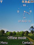
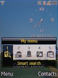
Stand-by display • Samsung’s My menu
The Samsung E950 features a new style of main menu called Espresso user interface, which we haven’t seen before in previous models of the Korean manufacturer. The menu itself is no longer black, but dark red. The icons have gotten really small in order to make room for a new animated visualization of the currently selected icon. The animated visualization appears in the lower portion of the screen, while the icons are set above it. Overall, the effect is nice and we would have appreciated this new eye-candy style if it wasn’t for the choppy animation, which spoiled the fun for us. The number of the icons displayed is a total of twelve and as with most past models the menu features a white color scheme. It proves good when used in bright sunlight. The white theme however is applied only to the listed submenus and not to the main menu itself. The handset does feature a Sunlight mode which boosts the display brightness and contrast in order to allow better legibility under direct sunlight.
| This extraordinary solution demands some special attention without a doubt. The touchscreen D-pad visualizes different context icons based on where you are within the menu. | <#AdRectangle#> |
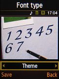
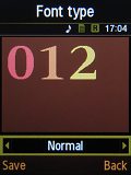
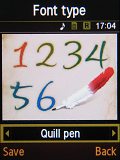
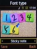
A nice upgrade over previous models is the change of the system font used. It’s sleeker and the characters are more compact which means that almost all of the listed submenus fit on the screen with no need for side scrolling, as seen in models such as Samsung D900 for example.
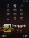
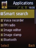
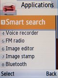
Main menu • listed sub-menu • white menu theme
As with almost all of the past Samsung handsets, no ringing profiles are available. All you have at your disposal is the Silent and Normal ringing modes.
Spacious phonebook
The phonebook of the Samsung E950 can store up to 1000 contacts with multiple fields. It can display the names from the phone memory only or all names from both the phone memory and the SIM card at once. Searching employs gradual typing. Samsung E950 does not search in both the contact’s name and last name. That option though was available back in Samsung D900.
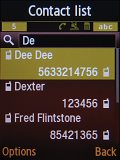
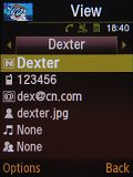
Contacts list: searching a contact • opening a contact details
A total of 12 fields of information are available for each contact. You can store up to 5 numbers for each contact plus an email address and a note. Each contact can also be assigned a specific ringtone and picture; contacts can be organized into groups, but calls cannot be filtered on the base of created groups. Contact details or your whole contacts list can be sent via Bluetooth. The only thing that’s missing here is a field for a contact’s birthday.
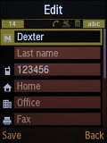
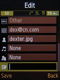
Editing Dexter’s details and viewing various fields
Call management
There aren’t any innovations in the call management department. The Dial key on the touchpad opens a list of the recent contacts, while opening the Call log from the main menu will provide additional details. A small innovation is the addition of a message counter, which monitors the received and sent messages – we missed that feature in the first Samsung Ultra lineup.
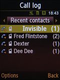
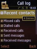
Recent contacts • the Calls log menu offers more information
Reader comments
- Anonymous
- 24 Aug 2007
- ixG
Looks like a nice phone, though im worried about the lifespan of the touch-menu.
- HoT ShOt Joy
- 23 Aug 2007
- PEn
i love all samsung cell. i have samsung e900 and it is da greatest phone i have realy im not bluffing . i only thaught that that it should have 3 mp cam abd there it is even better itz is great . i say every 1 should ive it a try .
- Str1d3R
- 22 Aug 2007
- UDN
look similar with mine...C130
