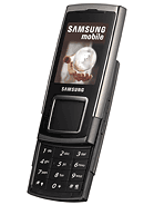
Samsung E950
- R
- Ramon
- T3x
- 20 Jun 2007
This phone is very ugly. Where are the two call buttons???? There is only a black part on it. The camera with his 3 MP is the only good thing on this mobile phone. Samsung, make something else than this please.
- a
- adil
- 4mr
- 20 Jun 2007
i don't like it... I like my old e900 better
- ?
- Anonymous
- 0we
- 20 Jun 2007
nice fone
hihi the first
- a
- arjunmalhotra
- 2@e
- 20 Jun 2007
hi everybody this phone is a very good phone and a good looking tooooooooooo this phone is better then any phone and this is good to handle also............... bye
- S
- Simon
- m9F
- 20 Jun 2007
Soft keys really suck, and now they've made things worse with a touch pad!! Samsung whats gone wrong!!!!
- ?
- Anonymous
- Tk0
- 20 Jun 2007
this is a stupid idea.sorry, but this has no potential - if its going to compete, at least make it 3G like the upcoming u700...
- a
- asaf hermann
- pq8
- 20 Jun 2007
Yey!..im first! Asaf Hermann the king!
- D
- DaveTheTekkie
- SeJ
- 20 Jun 2007
OK, I'll be the first to admit that I saw the E900 when it arrived and thought 'wow'. In the looks department I rate the E900 higher than this, BUT... I reckon that the bigger D-Pad is more likely to be able to do slightly more iPod-esque functions... the pictures show that the central pad is quite matte, like a laptop touchpad, while the buttons around it are shiny... suggests another possible level of interaction...
- ?
- ?
- mtk
- 20 Jun 2007
Very freeky, samsung change the model is the same one like anouther but, whit 3 MP ...
- h
- hum drum
- n$g
- 20 Jun 2007
The keypad is out of proportion!
Its almost the same size as the screen!! This is bad designing!
Overall, I do like the design of the E900, but what prevented me from buying it was the touch sensitive buttons.
AGAIN! They have used this technology on another phone.
I am a samsung fan, but if they keep with the touch sentive I'll move elesewhere!
- A
- Ayashifx55
- 4X%
- 20 Jun 2007
Samsung is disapointing me , they are basing all theyre new phone on the Samsung D500 , if you saw that phone , you've seen it all. Come on samsung , think of something else instead of continuing the D & E legacy.
- h
- huh?
- xJe
- 20 Jun 2007
I dont really understand why samsung comes out with this phone? Samsung u600 has the almost same features as this one and u600 design is definitely nicer than this one.
- S
- SeF
- 2A3
- 20 Jun 2007
Samsung is very low profile, they even didn't announce their phones in public imho did they?
- C
- Charlie
- Yai
- 20 Jun 2007
the big square on the front looks really stupid.
- ?
- Anonymous
- TIE
- 20 Jun 2007
A bit dull on the black color.
- A
- AGC
- kMf
- 20 Jun 2007
looks VERY nice
and i'm first again
