Samsung F480 review: Touchdown!
Touchdown!
Excellent image quality and poor sunlight legibility
The main feature of Samsung F480 is undoubtedly its display. The 2.8" QVGA screen is capable of showing up to 262K colors. As we found out, the widescreen resolution of the Samsung F490 is by no means that hip as it sounds. Obviously the 16:9 aspect ratio did bring more compatibility issues than great benefits with some applications. Therefore we feel happy that Samsung returned to the good old QVGA for Samsung F480.
As far as image quality is concerned, we have no complaints with Samsung F480. It has great contrast and nice saturated colors. The brightness is also good enough to convince us that this is one of the best Samsung displays we have seen.

Samsung F480 has remarkable picture quality indoors
Still, even the best Samsung screens suffer reduced legibility when exposed to direct sunlight. This line has become an unfailing part of every Samsung review we've done and we think it's about time the manufacturer did something about it. It can't be normal for such a high-end device to be practically useless outdoors on a sunny day.
On the positive side, the touchscreen sensitivity is great. The phone is very responsive and provides excellent haptic feedback. In addition, the vibrations intensity can be modified to best suit the user's taste.
Telephony and speakerphone performance
Samsung F480 is very good at its main job - making calls. Voice quality is very high on both ends and no interferences are to be heard. This time however there are no animations as with the non-touchscreen Samsung devices. In fact, dialing with Samsung F480 is almost as plain as it can get (save for the fact that the 12-key alphanumeric pad is on the screen).
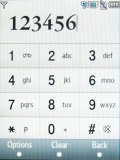

Calling Dexter on Samsung F480
It is now time for our speakerphone loudness test. Here is how Samsung F480 ranks alongside some of its main market rivals. You can find more details about the test itself, as well as the full list of tested devices here.
| Speakerphone test | Voice, dB | Ringing | Overal score | |
| Samsung F480 | 66.3 | 66.6 | 75.7 | Good |
| Apple iPhone (firmware 1.1.1) | 67.2 | 60.2 | 66.6 | |
| LG KU990 Viewty | 72.0 | 68.8 | 77.8 | Good |
| Samsung Armani | 69.7 | 64.6 | 71.0 | Average |
| Samsung F490 | 73.5 | 69.7 | 74.7 | Good |
| Samsung U900 Soul | 69.7 | 66.3 | 71.1 | Average |
User interface alive with color
The user interface of Samsung F480 is a good job. It's not the award-winning Croix UI we found on the recent touch-operated Samsung handsets we reviewed. However we are willing to give this one an award of ours It's lively, it's colorful and frankly, we were getting tired of flash phones insistently using only a couple of colors for the entire user interface. Furthermore, the addition of widgets allows a whole lot wider customization and improves user-friendliness.
The Widgets are basically a very convenient way for customizing your home screen. The Widget bar toggles on and off the home screen by pressing the arrow in the lower left corner.

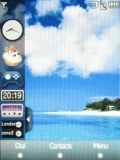
The Home screen and the Widget sidebar
The Widget bar itself includes a number of icons, which can be dragged onto the display and ordered to the user liking. If any is to be removed, all you need to do is drag it back to the bar.
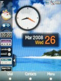
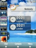
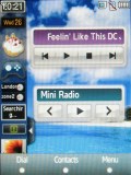
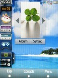
Some of the available Widgets at work
Apart from the whole touch thing the Samsung F480 menu structure is not that different from other Samsung handsets. The only major difference is the added tab at the bottom of the display, which holds three keys with varying functionality. The icons are however more colorful and better looking than we are used to. There are also great animations used for the transitions and the other actions around the menu (selecting, scrolling).
| "...As we found out, the widescreen resolution of the Samsung F490 is by no means that hip as it sounds. Obviously the 16:9 aspect ratio did bring more compatibility issues than great benefits with some applications. Therefore we feel happy that Samsung returned to the good old QVGA for Samsung F480..." | <#AdRectangle#> |
The main menu displays as a 4 x 3 grid of icons. Sub-menus appear as lists. The much contested feature of all recent Samsung phones, whereby the last used items are highlighted by default when you open a submenu, is also present here. However due to the fact that the handset is touch-operated there is almost no difference what exactly is highlighted by default. Still, on some rare occasions when accessing longer lists this might save you some scrolling.
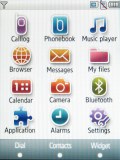
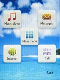
Main menu • task switcher menu
We are very pleased with the speed and responsiveness of the handset. Its whole interface is really snappy with no noticeable lags anywhere. The main menu is accessible from the stand-by display by pressing the right key on the tab at the bottom of the screen. You can also access it by pressing the confirmation key below the screen and then clicking the center icon on the screen.
The left and center key of the bottom tab are reserved for dialing a number and accessing the phonebook respectively. This of course is only true when the home screen or the main menu are displayed. The functionality of the three keys changes across different submenus.
The stand-by display of the F480 offers the typical Samsung layout. The top bar is reserved for standard readings like signal strength, battery status, network connectivity, ringing profile etc. As far as the rest of the display is concerned, it is entirely up to the user to decide which elements should be there and which should not.
A clock or a birthday reminder may be placed anywhere on the home screen. The operator logo and the small tabs controlling the music player and the FM radio can also be added or removed if needed. The available options are plenty but you should have got the idea by now. You can also have a quick look at the video demonstration about how the whole widgetry works.
Widgets at work
Customization yes, themes no
There still aren't as many customization options for the Samsung F480 as some would have liked. In fact the owner of Samsung F480 is only capable of changing the active wallpaper and rearranging the standby screen, thanks to the widgets.
There is virtually no way of changing the icon appearance or the menu view mode. Anyway, the youthful interface looks interesting enough so you probably won't need changing it that much.
Reader comments
- saif
- 26 Feb 2019
- XTN
Dose't support wifi ?
- AnonD-347220
- 01 Jan 2015
- fuf
i v feiled to download whatsapp on my phone.
- Anonymous
- 10 Feb 2014
- fuf
why does it not show youtube videos