Samsung Focus Flash review: Flashing around
Flashing around
The People Hub is impressive
The People hub takes on the responsibilities of the phonebook, but calling it a “phonebook” is not very accurate. Instead of contacts, you have people with profiles – a term borrowed right out of Social Networking 101.
The first screen of the People hub shows you a list of all your contacts (phone contacts, social network friends, email pen friends – everything), with a search shortcut and an add contact button.
Contacts are ordered alphabetically, indexed with colored squares with a letter. You can tap any one of those letters boxes and the screen shows you the whole alphabet highlighting the letters actually in use. You can tap a letter to scroll to that part of the list.
Groups, a handy way to organize your contacts, with "text everyone" and "email everyone" features. All the status updates from the grouped contacts are pulled in from their various social networks, and you get access to their online photo albums too.
Groups can also be pinned to the homescreen for easier access.
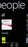
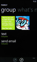
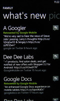
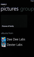
Groups handle everything from mass messaging to SNS updates
Deeper social networking support makes things even better. When viewing a contact's profile, you get everything from call, text, send email, write on wall, mention on Twitter and so on. The contact photo, along with the latest status update, is visible on top.
The “What's New” tab works like its namesake in the People hub, but only shows updates from the specific contact.
“Pictures” is where the contact's Facebook albums are.
The “History” tab gives you a complete history of exchange with a contact is in one place listed by day. Everything but status updates is listed here - calls, texts (actually threads from the Messaging hub) and emails.
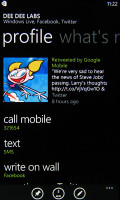
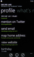
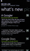
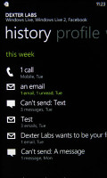
Looking at the profile of a single contact
The “Me” card is your own profile. From here you can post status updates, set chat status, check into locations (there's more location goodness coming on later). You can also change your profile picture (only for Facebook and Live though, not Twitter).
Another tab in the “Me” card lets you view notifications (e.g. Twitter mentions) and, finally, “What's New” lets you view your own status updates.
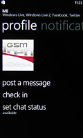
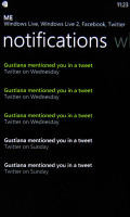
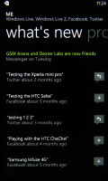
The “Me” card manages your social networks
Telephony lacks smart dialing
The phone application shows you the call history, with shortcuts to voice mail, dialer and phonebook. The phone live tile will show the number of missed calls as will the lock screen.
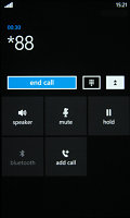
The dialer itself is as simple as it gets – a phone keypad with a Call and a Save button. The lack of smart dialing is an annoyance, but the People hub is good at finding contacts.
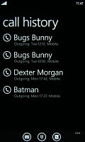
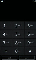
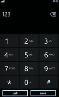
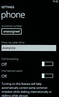
Call log • dialer lacks smart dialing • call settings
An interesting option is the International assist – it comes in handy for dialing while abroad or calling someone outside the country. What’s missing is the ability to set any song from your collection as a ringtone – a feature some of you might miss. You can download new ringtones from the Marketplace though (possibly at some cost though).
When there’s an incoming call, the contact’s photo will appear full screen and you can slide up to reveal the answer and reject call buttons. This will prevent any accidentally answered or rejected calls.
A quick note – status indicators are hidden by default (except the clock) but you can bring them up with a quick tap on the very top of the screen.
We had no issues with the in-call quality or the reception of the Samsung Focus Flash. The device is right on par with the usually well performing Samsung offerings.
A capable and intuitive messaging
The messaging department of Windows Phone 7.5 uses threaded view to organize your messages. When you start the app, you’ll see a list of conversations – each conversation consists of multiple messages visualized as speech bubbles, which are ordered by the time they were sent/received.
An empty speech bubble will hang at the bottom waiting for you to type a response. A message can have multiple recipients too by using the + button next to the recipient field. Just the first few letters of the contact’s name are needed – the search feature will find it for you.
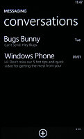
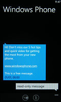
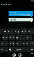
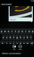
Threaded view style messaging • turning an SMS into an MMS
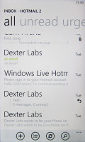
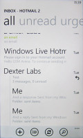
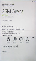
Conversation view lists emails between you and a contact chronologically, grouping them by subject. It’s the display style that Gmail popularized and is the best way to keep track of a conversation over email.
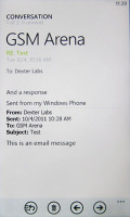
Each email conversation is listed with a subject and number of messages, plus how many of those are new. A tap on a conversation expands it to show the messages plus a line from each message.
You can tap on an individual message to read it, as well as skip messages back and forward to navigate the conversation. We expected to be able to swipe between the messages, but that wasn’t the case.
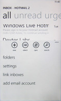
You can now link multiple inboxes (and unlink them individually later), so that you have a single place to check for new messages.
Linking several inboxes will also automatically combine their live tiles. You can browse individual folders for each account, which lets you view messages from only one email account even if it's linked.
The keyboard is a traditional virtual QWERTY with not too many surprises. It can suggest words as you type and correct spelling and also auto-capitalize letters after a full stop.
The responsiveness was great and the spell correction turned out to be very accurate – we were able to type very fast with very little practice. The overall experience was very positive and even heavy texters will be satisfied.
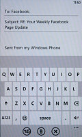
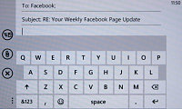
The on-screen QWERTY is pretty good • there’s a landscape mode too
Reader comments
- ssss
- 25 Jul 2013
- S0u
the phone is more good when it have bluetooth.
- Onur
- 04 Aug 2012
- QB7
Wow! That's a really neat anwser!
- Nunung
- 04 Aug 2012
- 35t
I recently puacrhsed this phone the only negative things i can say about it is the camera ( does not zoom while taking a picture), dim light and that its like one of the most heaviest phones ( i think) and yeaa.. also using the analog touch pads for ...

