Samsung G810 review: Zoom on Symbian
Zoom on Symbian
Display is good… when the weather isn't
The display of Samsung G810 can hardly be called anything but typical Samsung. It has great picture quality indoors with good contrast and brightness levels.

The display has very good picture quality
However in brightly sunlit environments the legibility is severely reduced. It is still better than Samsung G800 with its glossy front panel but not by a large margin. It's very hard to find a proper angle for working with the phone in those conditions.
Keypad is a disaster (at this point)
The keypad is probably the most disappointing element in Samsung G810. It looks good at first, with large keys and distinguishable borders. However every nice impression is gone the very moment you start typing.
The keys are overly rigid, the problem being most obvious with the two keys inside the metal frame - 5 and 8. Almost impossible to press and offering absolutely inadequate feedback, using them is quite a pain. The totally flat keypad has poor overall tactility, making typos very probable.


The keypad was a real downer in our unit
The four controls around the D-pad are another story. The key under the left softkey is the menu key but the customary Symbian symbol is nowhere to be seen. The key on the opposite side is used for accessing the audio and video players and the FM radio. We can't help missing pictograms on those keys, even if it would have somewhat spoiled the looks.
The red and green receiver keys are well hidden: they were dismissed to the lower deck and share beds with the alphanumeric keys. That's an understandable solution, which however doesn't prove that convenient. In fact, we couldn't help getting annoyed with it during the time we had with the device.
The only ray of light in the otherwise dismal picture is the D-pad. Its ample size and commendable tactility greatly benefit usability. In addition, the confirming center is also large enough and quite responsive.
The backlighting is strong, although not the most even we've seen. It is still usable enough in the dark, causing no problems whatsoever.

Backlighting is strong enough, but not perfectly even
We should once again warn you here that ours was a beta unit so the keypad might be altered in the retail version. The keypads of the units we tested at the MWC in Barcelona were different, so we sincerely hope a much needed change will be made to get a usable result.
Telephony
Symbian muscle and multimedia riches aside, the top end G810 will still be used for calling. As you may have guessed Samsung G810 didn't let us down. Signal strength is good and voice quality is fine on both ends of a call.
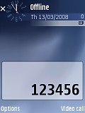
Dialed digits are large and easy to see
User interface
Samsung G810 is running on the Symbian 9.2 OS and uses the well known S60 3rd edition graphic user interface. The Feature Pack 1 also comes pre-installed. In fact, the OS is probably the most obvious difference from Samsung G800.
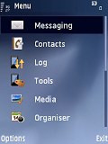
It's worked out well here - Samsung G810 is really quick and responsive. The icons are also quite nice. They are the same as in Samsung i450 and we happen to like them a bit better than those of Nokia phones using the same UI. However, the Feature Pack 2 that we saw in the newly announced Nokia handsets in Barcelona was really promising.
As a Symbian device, Samsung G810 naturally features an active stand-by mode. You have a bar of shortcut icons for instant access to pre-selected functions at the top of the display, and scheduled events from the calendar together with the currently playing track or radio station (if there is any) underneath.
When choosing items for the Active Standby, you can choose any application or even a website. The functionality of the two soft keys is configurable too. Another standby screen feature that we really like is the Google search bar which gives you instant access to the search engine.
| "...The display of Samsung G810 can hardly be called anything but typical Samsung. It has great picture quality indoors with good contrast and brightness levels. However in brightly sunlit environments the legibility is severely reduced..." | <#AdRectangle#> |
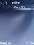
The phone has 5 profiles plus an offline mode that switches off all transceivers. It is also the default profile if you start the handset without a SIM card. The offline mode allows full access to the functions of the phone that do not require cellular network coverage. The other profiles can easily be edited to best suite your needs.
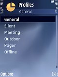
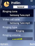
The five profiles and the offline mode can be fully customized
As with any other S60 smartphone, the task manager of Samsung G810 pops up upon a press-and-hold on the Menu key. It allows switching between applications or turning off any running application by pressing the Clear key. That leads us to another peculiar design decision: the C key is keeping company to the Call and End keys under the slider.
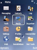
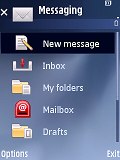
There are only two different menu views for the G810 but they are practically what the majority is using. Whether the icons will appear as a 4 x 3 grid of icons, or as a list, is completely up to the user.
Finally, Samsung G810 has a voice recognition feature to supposedly allow using almost every phone feature handsfree. This is however easier said than done as, despite being speaker independent, the systems doesn't even come close to recognizing every user command. It's still at a decent level though and, given the beta status of our unit, this may as well be not its last word.
Customization
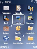
If you get bored with the phone looks, you can always change the theme. There isn't a great variety of preinstalled themes on Samsung G810 but all three we found are good enough.
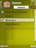
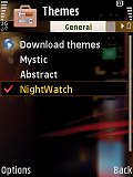
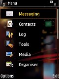
The other two available themes
What's best about the customization options is that there is nothing easier than downloading additional themes. There is hardly anything in greater number on the internet than themes for S60 3rd edition phones of QVGA resolution displays.
Reader comments
- Anonymous
- 29 Mar 2010
- ibg
dont make a joke la please...n85 will never be able to compete against g810...besides the horrible looks on the nokia,the time taken to zoom into a photo takes years... And the built quality sucks... The camera is not as good as this samsung phone......
- Anonymous
- 15 Feb 2010
- 0FI
Craaaaap phone. Hate it. horrible.
- Anonymous
- 27 Nov 2009
- 0FJ
i dunno about games in facebook,really.i have a g810 but i never used n82 to compare the cameras,so i cant tell..but the camera is great,with a huge amount of effects and options available.the xenon unit on my phone is strong really.battery life is g...
