Samsung Galaxy A3 and A3 Duos review: A-ddictive
A-ddictive
User interface
The Samsung Galaxy A3 runs on the latest available Android 4.4.4 KitKat enhanced with the TouchWiz UI. It's almost the same version that powers the Galaxy Alpha but with the fresh twist of supporting themes for the first time in the Galaxy lineup.
Here's a video we've prepared to give you a taste of what it's like.
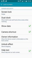
Starting with the lockscreen, it's the regular Samsung affair, complete with the bubbly sounds on the lockscreen. You can check the date and time as well as quickly access the camera via the shortcut on the bottom right.
The homescreen is also basic TouchWiz, with a 4 icon dock on the bottom and no Briefing/My Magazine pane. You can have up to 5 homescreens, panes can reordered and one is set as default.


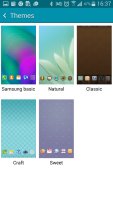
The regular homescreens • Choosing a theme
The notification area is again, like what you may have seen on any other Galaxy smartphone in the past, but it too has seen some of its functionality missing. The Quick Connect and S Finder shortcuts won't be missed but there's no shortcut to open all toggles, even a two-finger swipe doesn't work. This means you have to swipe the row of toggles until you find the one you need. At least there's still a way to reorder the toggles.
Anyway, below the quick toggles is a brightness slider and below that the notifications. The brightness slider can be disabled.
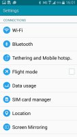
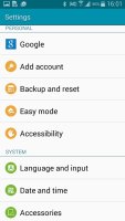
The settings menu is a vertical list of apps divided into categories. The handy search function is gone, which can slow down inexperienced users until they learn where each setting goes.
In the app drawer, icons are presented as a customizable or alphabetized grid. You can also view only the ones you've downloaded yourself or just hide the ones you don't need. You can also disable some of the pre-installed apps so they won't take any RAM.
The Galaxy A3 has an App Switcher button that calls up a custom switcher UI. As usual, you can go into the task manager for more advanced controls or just hit the Close all button.
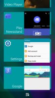
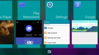
The app switcher and task manager
TouchWiz had become a leviathan through years of feature bloat, full of clever-sounding features of questionable usefulness. Recently Samsung took a hatchet to its Android skin and really trimmed down the cruft. The Galaxy Note 4 and Edge are running some of the best mobile software, even if we still have some complaints about cosmetics.
The Samsung Galaxy A3 software is even more simplified and we actually miss some of the functionality - things like the customizable quick toggles or the motion gestures were handy tools. After going through the pre-installed apps, we found that plenty have been cut in favor of AOSP/Google alternatives.
Reader comments
- Jinjin
- 08 Mar 2025
- mE0
His please sou my post for last wiki
- Chealh
- 18 Feb 2025
- NgS
Thanks
- Anonymous
- 21 Aug 2022
- NgR
Can you put it in under water the galaxy a3 2015

