Samsung Galaxy Ace Plus review: Aces wild
Aces wild
Android topped with TouchWiz 4.0 UI
The Samsung Galaxy Ace Plus runs Gingerbread 2.3.6 with the most recent TouchWiz 4.0 launcher. The visually rich experience and added functionality should be no news for loyal Samsung users. Of course, the company's high-end phones are moving on to Ice Cream Sandwich but the Ace Plus has nothing to be ashamed of in terms of speed and reponse.
Take a look at our video of the device in action.
The redesigned lockscreen of the Ace Plus has the usual integration of missed events with shortcuts to the relevant apps.

The lockscreen can be removed by swiping in any direction
The homescreen accommodates tons of widgets with lots of functionality. You can have up to 7 homescreens. A pinch on any homescreen zooms out to an aggregate view of all homescreen panes, which can be rearranged, deleted or added.
Widgets, shortcuts or folders are pulled onto the homescreen from a taskbar at the bottom of the screen once you enter edit mode (press and hold on an empty spot or do Menu > Add).


The Galaxy Ace Plus's homescreen • Editing the homescreen
The numbered dots that identify the homescreen panes serve as a scroll bar too. A press and hold on the dots lets you scroll sideways through the resized images of the available homescreen panes in one short go rather than with several swipes.

Scrolling between homescreens looks great
The app launcher is very similar to the homescreen - you can create folders to go with your shortcuts and you can add, remove and rearrange pages just like you would homescreens.
If you prefer, you can choose List view instead of the default Grid view.


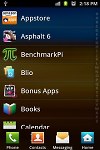
The app launcher • Creating a new folder • Rearranging pages in the app launcher • List view
In typical TouchWiz fashion, there are four shortcuts docked at the bottom of the screen that are visible both on the homescreen and in the app launcher. You can swap the first three with different ones (by default the shortcuts are Phone, Contacts, Messaging). The rightmost is the app drawer/home shortcut used to toggle between the apps menu and the homescreen, so it makes sense to always keep it in the same place.
With the Samsung Galaxy Ace Plus you get a standard Android task switcher but with one modification - it has a button to launch a task manager.
The custom task manager which Samsung have preinstalled offers a lot of functionality. It also comes with a handy widget which shows you the number of active applications right on your homescreen.


The task manager and its widget
Most of the time, Android does really well when it comes to managing apps by itself (in fact, some claim that using a task manager is detrimental to the performance of a phone), so you would only need the task manager to occasionally kill a buggy app.
Performance
The Samsung Galaxy Ace Plus runs on a single-core 1 GHz Snapdragon S1 processor with the older Adreno 200 GPU and has 512 MB worth of RAM.
Impressed with the speedy response of the phone, we ran a couple of benchmarks.
Most of them reflect the low-to-mid-range position of the Galaxy S Plus, but we'll say it again - the handset was a nice surprise in terms of general speed.

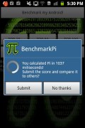
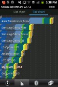
Samsung Galaxy Ace Plus benchmarks
The Samsung Galaxy Ace Plus is very responsive and runs the OS glitch-free. HD video is too much to ask of course and the poor codec support is another downside of the Qualcomm chipset.
Social phonebook
The phonebook has a wide range of features and practically unlimited storage capacity.
There are options to filter contacts that have phone numbers, show/hide some of the groups you've created (including groups from social networks) and change the sorting (by first or last name).
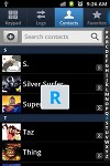
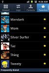
The phonebook offers the Quick contacts feature, which lets you tap the contact photo for a popup menu with shortcuts to call, text, or email. The TouchWiz-specific swiping gesture is here too - swipe a contact right to make a call and left to compose a message.


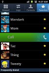
Quick contacts • Swiping is a neat gesture for calling and texting
There are many info fields that you can assign to each contact, but it still remains perfectly organized. You have all types listed (numbers, email addresses, etc) and there's a plus sign on the right to add another item of that type. Pressing the minus sign under it deletes the unneeded field.
Of course, the real flexibility of the phonebook becomes apparent when you sign into your Facebook or LinkedIn account. After syncing, the phonebook will automatically merge your contacts (you can do it manually too).
The contact info screen is tabbed. The first two tabs are pretty standard - one displays the person's contact information, while the other stores call and message history. The third and fourth tabs handle the social stuff - status updates and the contact's online galleries.


Viewing a contact's details • check out the SNS integration
Weirdly, only Facebook and LinkedIn contacts can be synced with the phonebook - we usually see Twitter contacts in here too.
Reader comments
- SANTM
- 19 Aug 2015
- iAT
This is worst phone I ever had. Phone hangs many times, you cant cut a call or sometimes receive. IT doesnt break by falling but what to do with a phone that hangs and you cant recieve or cut a call because it is hung. Sometimes you have to wait a lo...
- Becky
- 30 Jul 2015
- H3R
I've had my Ace Plus since it first came out - best phone i've had, sturdy, its been dropped, thrown, trampled and still hasn't had a cracked screen or broken, recently updated to the Core Prime, so now my partner is using the Ace Plus, because he ha...
- Anonymous
- 31 Aug 2014
- U2V
I hate this phone so much! I had a power button error two time and lost my data both times! EXTREMELY LAGGY! HORRIBLE BUILD! USELESS TOUCH SCREEN! and the list goes on and on and on and on and well you get the point

