Samsung Galaxy C7 Pro preview: A closer look
A closer look
Design
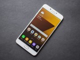
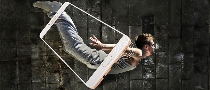
The C7 Pro is almost completely identical in appearance to the C9 Pro. This means that it is still a good looking device (especially in that superb new blue color) while also being exceptionally thin and very well built.
The front of the phone is classic Samsung. On the top is the earpiece with a metal grille, flanked by the front facing camera on the left and the notification LED and sensors on the right.
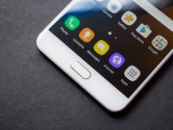
Below the display is the physical home button with integrated fingerprint sensor. On its left is the multitasking key and on the right is the back button. Both capacitive keys are backlit, and without the backlighting the keys become invisible.
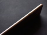
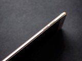
On the right side of the phone is the power button. Below the button is the only real visual difference between the C9 pro and C7 Pro, apart from their size. While the C9 Pro had two separate trays for two SIM cards and a microSD card, the C7 Pro has a single tray with one SIM slot and another hybrid slot for a second SIM or a microSD. This means that while the C9 Pro would let you have two SIMs along with a microSD - something we lauded in our preview - the C7 Pro makes you choose between a second SIM and a microSD.
On the other side of the phone are the volume buttons. It is still fairly easy to unintentionally press the buttons on the opposite side of the phone because you tend to squeeze the device while pressing. It would be great if Samsung just put all the buttons on the same side like most other Android manufacturers.
And while we are on the subject of buttons, Samsung still requires you to press the power and Home buttons to take screenshots, which unnecessarily requires two hands, when the default Android configuration of power and volume down can be used with one hand. This has now been changed to the standard Android behavior on the Galaxy S8, as there is no physical Home button.
Moving on, at the bottom is a headphone jack, a USB-C port, a microphone, and a loudspeaker. The bottom speaker acts as the right speaker along with the earpiece, but we will talk about the speakers in detail later on. On the top is another microphone.
The back of the phone features some of the neatest antenna lines on any phone. The split triple bands running across the top and bottom take up less visual space and also look a lot cooler than a single thick band.
Near the top is the camera (with an ever so slight bump) along with a two-tone dual LED flash.
Overall, the C7 Pro is a beautiful device. The unibody metal construction is absolutely rock solid with no flex or creaking- the phone feels like a tank. Even deliberately attempting to bend the phone with a small amount of force didn't cause it to give in. Although it's unlikely that the glass will survive a drop considering it goes all the way to the edge, the phone should handle everyday use with absolute ease.
The C7 Pro scores higher points on the usability scale due to its smaller design. Having said that, it is only smaller compared to the C9 Pro and is still a fairly large device in its own right. However, it does fall on the edge of what is an acceptable size these days, and shouldn't be too much of a stretch if you are okay with 5.5-inch display smartphones.
Display
The Galaxy C7 Pro has a 5.7-inch, 1920x1080 resolution Super AMOLED display. The display is perfectly sharp to the naked eye, and a tiny bit sharper than the C9 Pro with its 6.0-inch 1080p display. However, being a PenTile display, VR performance will likely suffer due to the combination of pixel density and sub-pixel arrangement.
Out of the box, the colors are oversaturated and the white point temperature is set too high. This means that some whites and grays can appear bluish if you have no reference color to compare them to. However, Samsung offers handy controls in the Settings menu, and switching to Basic mode allows the screen to render colors as they were intended. You do lose some of the contrast and punchiness, however, so we found AMOLED Photo to strike a nice balance between accurate and pleasantly saturated. If you care about color accuracy, you can always switch back to Basic mode when you need it.
As for other aspects, the display gets sufficiently bright and is perfectly visible even under direct sunlight. Under auto brightness, the display can boost brightness and saturation to extreme levels beyond what can be set manually. This kicks in even if auto brightness is disabled, but only if you are already at maximum manual brightness.
The viewing angles are good, for the most part. However, at extreme angles, the colors distort and a rainbow pattern appears on screen, which is common for AMOLED displays. It's not a problem at reasonable viewing angles.
Reader comments
- Madhawa
- 06 Dec 2020
- f}I
Worst camera ever
- Anonymous
- 11 Nov 2020
- 5@n
I need
- Anonymous
- 16 Aug 2019
- PUM
Good but not upgrable to Android 9 pie
