Samsung Galaxy C9 Pro preview: Big screen entertainment
Big screen entertainment
Design
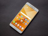
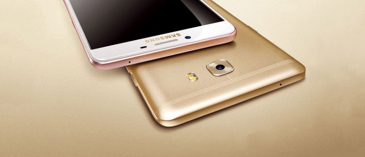
At first glance, the C9 Pro looks pretty much like any other Samsung phone. But hold it in your hand and you realize it is easily one of the biggest phones the company has ever made.
There is no getting around the fact that the C9 Pro is a big phone. However, due to some clever packaging, the phone isn't all that much bigger than the iPhone 7 Plus, which has a smaller 5.5-inch display.
The front of the phone is classic Samsung. On the top is the earpiece with a metal grille, flanked by the front facing camera on the left and the notification LED and sensors on the right.
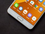
Below the display is the physical home button with integrated fingerprint sensor. On its left is the multitasking key and on the right is the back button. Android purists might bemoan the reversed order of keys compared to what Google likes to do by default, however, right handed users will definitely appreciate having the more commonly used back button closer to their hand on the right. Both capacitive keys are backlit and without the backlighting the keys become invisible.
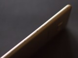
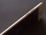
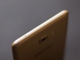
On the right side of the phone is the power button. Below the button is a tray for the microSD and below that is another tray for two nano SIM card slots. Unlike most phones these days, the C9 Pro does not make you choose between a second SIM and a microSD and is a true dual SIM phone.
On the other side of the phone are the volume buttons. The volume buttons are placed slightly higher than the power button so when you grip the phone to use the power button you don't end up pressing the volume buttons on the other side but the same cannot be said about using the volume buttons. In the end, there is still some amount of unintentional button pressing happening and it would be nice if Samsung just switched to having all the buttons on the same side.
And while we are on the subject of buttons, Samsung still requires you to press the power and Home buttons to take screenshots, which unnecessarily requires two hands when the default Android configuration of power and volume down can be used with one hand. But that's nitpicking.
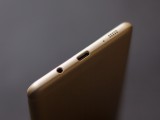
Moving on, on the bottom is a headphone jack, a USB-C port, a microphone, and a loudspeaker. The bottom speaker acts as the right speaker along with the earpiece, but we will talk about the speakers in detail later on. On the top is another microphone.
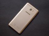
The back of the phone features some of the neatest antenna lines on any phone. The split triple bands running across the top and bottom take up less visual space and also look a lot cooler than a single thick band.
Near the top is the camera (with an ever so slight bump) along with a two-tone dual LED flash.
Overall, the C9 Pro is a beautiful device. The unibody metal construction is absolutely rock solid with no flex or creaking. Even deliberately attempting to bend the phone with a small amount of force didn't cause it to give in. The phone feels like a tank in hand and although it's unlikely the glass will survive a drop considering it goes all the way to the edge, the phone should handle everyday use with absolute ease.
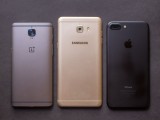
Size comparison with OnePlus 3T and iPhone 7 Plus
As for usability, it is a big phone and it won't be ideal for those with small hands. However, it is remarkably thin and reasonably heavy so if you can get used to the width and the height, it would be fairly easy to live with it.
Display
The Galaxy C9 Pro has a 6.0-inch, 1920x1080 Super AMOLED display. First things first, pixel density really isn't a concern at all. Even at 6.0-inch, the pixel density is sufficiently high and images and text look sharp. This is not true for VR applications, however, and if you care about VR performance then you should be looking elsewhere.
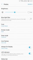
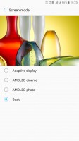
In terms of image quality, out of the box the colors are oversaturated and the white point temperature is set too high meaning some whites and grays can appear bluish if you have reference color to compare them to. However, Samsung offers handy controls in the Settings menu and switching to Basic mode allows the screen to render colors as they were intended. You do use some of the contrast and punchiness, however, so we found Amoled Photo to strike a nice balance between accurate and pleasantly saturated. If you care about color accuracy, you can always switch back to Basic mode when you need it.
As for other aspects, the display gets sufficiently bright and is perfectly visible even under direct sunlight. Under auto brightness the display will boost brightness and saturation to extreme levels beyond what can be manually set to increase visibility. This kicks in even if auto brightness is disabled but only if you are already at maximum manual brightness.
The viewing angles are good for the most part, however, at extreme angles the colors distort and a rainbow patterns appears on screen, which is common for AMOLED displays. It's not a problem at the viewing angles you will probably use it at.
Reader comments
- Anonymous
- 25 Feb 2021
- Kxf
If you got more money why don't you buy a secondhand flagship series, like S8 S9 or Note which already use UFS rather than old eMMC? And also newer software plus full screen display? This phone is good for second phone if you want classic standa...
- Hok
- 24 Aug 2020
- Kxc
NFC iS not sensitive for read and write to E Toll Card
