Samsung Galaxy M20 review
Design and 360-degree view
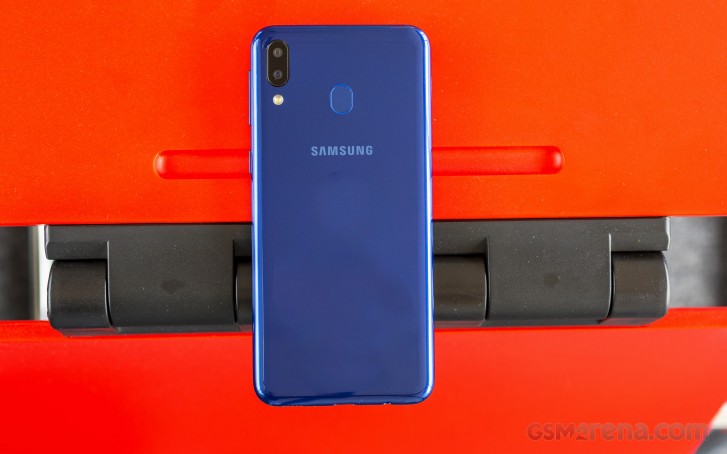
The Samsung Galaxy M20, much like the smaller M10, has an all plastic construction which doesn't look or feel all too premium. But then the M-series make no claim for upmarket build - on the contrary, affordability is key here. With that in mind, the M20 is well put together and we didn't experience any creaks or squeaks or the like.
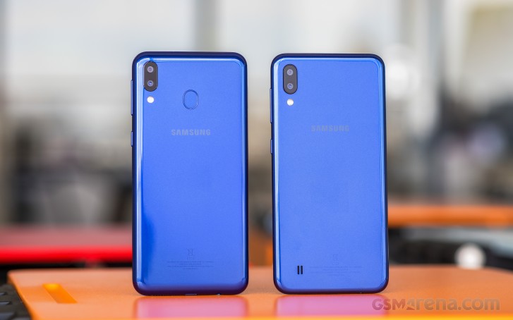
On the other hand, the smooth glossy finish of the back welcomes fingerprints and keeps them there. A texture of some sort could have helped, but there's none. There's also not much choice in terms of colors - it's either the Ocean Blue of our review unit or the Charcoal Black that's about as attractive as what it's named after.
For all its relative durability in the event of a drop when compared to glass, the plastic back of the Galaxy M20 is prone to scratching. We did try to baby these units we have on loan, but when we packed the M20 to send it back there were some fine scratches on the rear - nothing major, but still there if you look closely.
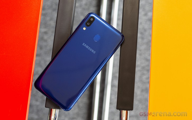
No need to look closely to spot the cameras - the two modules are behind a shared window in the top left corner. The main shooter is on the bottom, the ultra wide up top, accompanied by a flash under them.
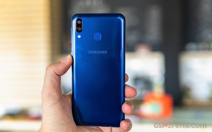
One of the major advantages of the Galaxy M20 over the Galaxy M10 is the fingerprint reader, right here on the back too. It's oval-shaped as opposed to circular, but while the shape isn't all that important, the relatively high placement could be an issue for those with average or shorter fingers. We found ourselves not quite reaching it when holding the phone naturally. Perhaps you'll get used to the needed stretch after enough use, but a slightly lower position certainly would have helped. Maybe the battery just got in the way?
Whether it's the battery to thank or not, we're certainly appreciating the fact that the speaker isn't ported on the back like it is on the M10 - the bottom-firing speaker of the Samsung Galaxy M20 can't be blocked when the phone is left on a table.
Other improvements to note on the Galaxy M20's bottom when comparing to the M10 is the USB-C port - the M10 is stuck in the past, the M20 is keeping up. Of course, the 3.5mm jack remains, and the primary mic completes the list of things to be found around here.
Continuing the tour, we find the hardware buttons on the right - the power button a little above the midpoint, the volume rocker above it. We found no issues with the ergonomics of these, all is well.
On the opposite side is the card slot and the very long tray that pulls out from it can take two nano SIMs and a microSD - points to the Galaxy M20 for having a dedicated memory slot. The M10 has the same tri-slot setup, but the Galaxy M30 actually employs a shared slot for the microSD and the second SIM - though that one comes with 64GB of storage by default.
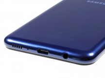
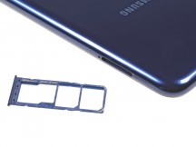
Controls on the right • USB-C port on the bottom • Triple card slot on the left
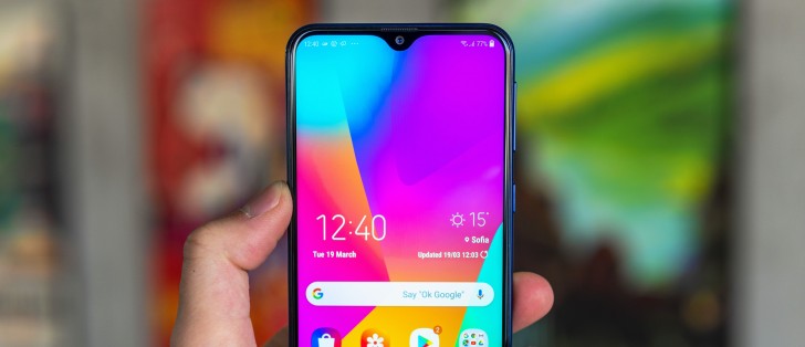
Which finally brings us to the front. The Infinity V display dominates here - it's Samsung's name for a waterdrop-notched display. It's not to be confused with the Infinity U of the Galaxy M30 or the Infinity O of the S10 - the letters are all about the precise shape of the selfie camera cutout.
The 'Infinity' bit goes to say that there are minimal bezels around the display. Of course, we're not talking Galaxy S10 sort of minimal, but still a very nice screen to body ratio for the class.
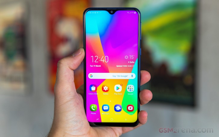
Unfortunately, some features have been sacrificed, whether it's for lack of space or simply to cut costs. A notification LED is nowhere to be found, which is far from ideal, but the lack of an ambient light sensor is what really bothers us. There's just a proximity sensor to the left of the selfie camera and that's it.
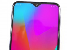
6.3" Infinity V display • No ambient light sensor and no status LED • M20 in the hand
The Samsung Galaxy M20 measures 156.4x74.5x8.8mm - a full 1.1mm thicker than the M10. We don't really mind it though, knowing where it comes from - the 5,000mAh power pack is more than welcome. The Galaxy M30 is 0.7mm thinner with the same battery capacity, but AMOLED screens are known to be thinner.
The Redmi Note 7 is a few millimeters taller, but is 0.7mm thinner, though keep in mind it is also packing a smaller 4,000mAh battery. It's precisely as heavy as the Galaxy M20, weighing in at 186g. The Moto G7 Power is a negligible 7g heavier, but it's also the thickest of the bunch with its 9.3mm waistline.
Reader comments
- Anonymous
- 25 Jan 2024
- inp
This phone is very nice... but i broke up display
- EMON YT
- 28 Aug 2023
- PIm
this phone is vary nace
- Murtaza Zakaria
- 17 Feb 2022
- XDV
Download Android 11 update please