Samsung Galaxy Mega 5.8 review: Medium extra large
Medium extra large
New TouchWiz with lots of options
The Samsung Galaxy Mega 5.8 comes with Android 4.2.2 Jelly Bean, the latest release of the Google platform available and the same build introduced by the S4 flagship, also available on the Mega 6.3. The most recent version of TouchWiz tries to stay relatively close to stock Android, but adds many options for customization and a wide range of new features.
With that in mind, the Mega 5.8 lacks a few of the more advanced extras - such as Smart Scroll and Air Gestures - found on the S4.
Here's a quick user interface video showing off the Android Jelly Bean user interface:
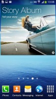
The lockscreen features the new widgets introduced with Android 4.2, though Samsung fiddled with them a bit. The default lockscreen shows the time along with a personal message overlaid on beautiful photos pulled from TripAdvisor, which can be set to change every 3, 6, 12, or 24 hours.
The water ripples have been replaced by a lens flare effect, but you can switch back to the old one if you prefer, or disable it altogether.
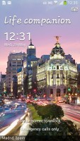
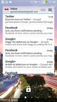
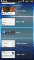
The lockscreen shows beautiful photos and cool widgets
The lockscreen has multiple panes, each containing one widget. The page to the right of the default one is special and can either be a list of favorite apps (the default TouchWiz setting) or a shortcut for the camera (as in pure Android).
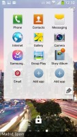
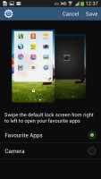
Favorite Apps are the default for the Galaxy Mega 5.8 • the camera alternative
The pages to the left contain different widgets - email, Google Now, Messaging, music player, Yahoo! Finance and News, Smart Remote and you can download apps from the Play Store that add new widgets.
There are no app shortcuts at the bottom of the screen by default - the Favorite Apps widget to the right has taken over that role, but you can enable them and have up to five easily accessible shortcuts.
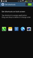
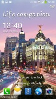
The lockscreen shortcuts are not enabled by default but are still here
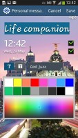
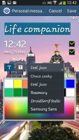
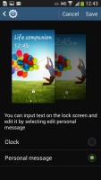
The greeting on the lockscreen can be changed - you can type something else, set a different font and color. You can also disable the personal message altogether and remove the time and date.
The notification area features five toggles (eight in landscape mode) that allow you to quickly turn certain features on and off. There are more than five toggles, of course, you can swipe horizontally to get to the others. Or you can tap the rightmost button that reveals a grid of all the shortcuts, 14 in total. Alternately, you can a swipe down the notification area with two fingers to reveal the grid directly.
From grid view, you can access the notification panel settings, which allow you to rearrange this grid (the top row toggles are always visible), or enable/disable the screen brightness slider to make more room for notifications.

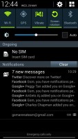
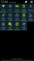
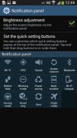
The new notification area is better than the one in stock Android 4.2
Another neat trick is to long press on a toggle to go to the related settings (e.g. Wi-Fi settings).
The notifications themselves have not changed - they can be expanded to reveal more info via two-finger swipe or dismissed with a sideways swipe. Sometimes they also have helpful buttons on them like "Call back" and "Send SMS" on a missed call notification.
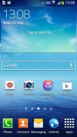
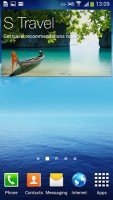
The homescreen looks mostly the same. Samsung has provided many of its own custom widgets like Samsung Hub, S Travel, etc. There's a wraparound feature, which lets you scroll homescreens infinitely by going from the last to the first one, and vice-versa.
The Mega 5.8 homescreen auto-rotates, just like on tablets, enabling landscape use of the entire interface. Auto-rotation is more than welcome - the Note phablets just don't have it. We like that the Galaxy Mega doesn't stubbornly insist on being just a phone. The homescreen is a lot more comfortable to use in landscape, especially the dock icons, which are easily within range of a quick thumb tap.
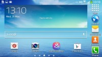
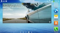
The Mega 5.8 rotates the homescreen like a tablet
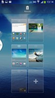
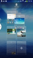
You can pinch zoom to get into the overview mode of all homescreen panes. There can be up to 7 and you can easily add, remove and rearrange panes from here. One pane is marked as "home", that's the one you go to when you press the Home button - any of the available homescreen panes can be set as default quite easily.
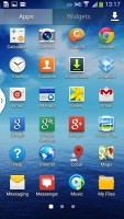
The app drawer hasn't really changed since the early days of Nature UX. The app shortcuts are presented as a customizable grid, alphabetized grid or list and you can hide shortcuts (good for bloatware you can't uninstall), view only downloaded apps, uninstall apps and add folders.
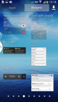
As before, widgets are in a separate tab in the drawer.
Pinch to zoom in the app drawer works the same as on a homescreen, giving you an overview of all panes as thumbnails. You can choose to have your app drawer ordering to custom, alphabetical grid or alphabetical list. There's a dedicated downloaded pane too, where all your downloaded apps go.
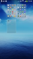
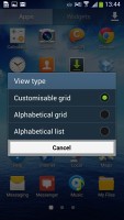
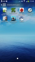
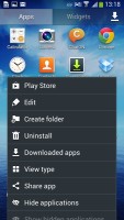
App drawer at a glance • options
When you drag out shortcuts and widgets to the homescreen you get a list of small thumbnails of all the homescreen panes with the silhouettes of the widgets there so you can check how much space is available on each pane.
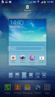
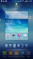
The small thumbnails of homescreen panes make finding room for a new widget a breeze
The App switcher interface is accessed by holding down the home button. It provides a list of thumbnails of all your open apps which can be swiped to the sides to dismiss and there are three buttons at the bottom: Task manager, Google Now, and Kill all apps.
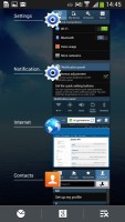
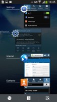
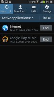
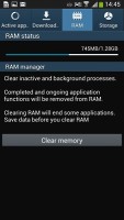
The app switcher • Task manager
The Galaxy Mega 5.8 comes with Multi-window, which lets you run two apps side by side on the screen. You can adjust the dividing line giving one app more space. Only compatible apps can be used with Multi-window, for now that means mostly the ones that come preinstalled on the phone.
You can move the small arrow that brings up the drawer with the Multi-window apps to make it easier to reach with your thumb. You can also move the whole drawer to the other side of the screen. This improves ergonomics a bit.
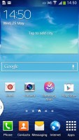
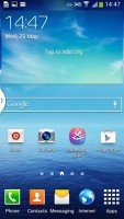
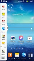
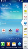
The multi-view arrow can be relocated
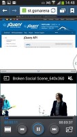
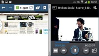
Multi-window mode on the Galaxy Mega 5.8
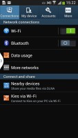
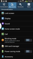
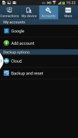
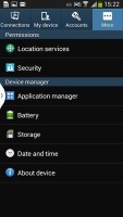
Samsung tweaked the Settings screen to use a tabbed interface. There's four of them - Connection, My device, Accounts and More. You can find the relevant features in their corresponding place - display, for instance, is in the My device tab.
The new arrangement makes navigating the settings menu much faster and more intuitive.
We like what Samsung has done with the latest iteration of TouchWiz. The company has amassed an intimidating pile of features and options, but that's not a bad thing - the default setup is good enough for regular users, while power users get to have it their way without the need for third party apps.
Reader comments
- Anonymous
- 27 Apr 2024
- ki$
These were better times. Big, wide phones fit for content consumption instead doom scrolling. So many unique and interesting devices were made in these years.
- rizwan
- 22 Jun 2016
- XPj
can i connect otg from samsung mega 5.8
- Yeoja
- 02 Jan 2016
- t7X
The only problem I had with this phone is that the side button,the metallic silver colors are starting to fade and upto now their's no news whether they will update this phone or not, samsung is not even responding, I guest I have to pay for my phone...
