Samsung Galaxy Note5 review: The 5blet
The 5blet
User interface
Samsung Galaxy Note5 boots the latest Android 5.1.1 Lollipop, dressed in the Korean manufacturer's TouchWiz UX. The company has been polishing and perfecting its user interface for quite some time now, and the latest iteration is one of the most capable custom takes on Android available around.
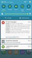
The lockscreen shows two notifications - additional ones get collapsed and you only see their icons. You can tap the down arrow to see the full list. If an app gets too pushy, you can hide its notifications from the lockscreen. There is also weather information for your location and pedometer stats.
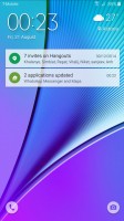

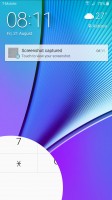
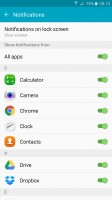
The lockscreen shows notifications • tweaking the settings
Dialer and camera shortcuts are available, but we prefer the other camera shortcut - double-tap the Home key from anywhere in the UI and the camera launches within a second.
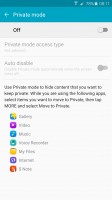
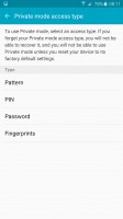
Private mode returns and it utilizes the excellent fingerprint reader. After you've trained it, you only need to place your finger for half a second for it to recognize your finger. It's also quite lax when it comes to finger orientation too, no more struggling to swipe just the right way as it was on the Note 4.
Private mode creates a secure folder that disappears when the mode is disabled. You can have Private mode automatically disabled every time you lock the phone.
The lockscreen can also use the fingerprint reader as a locking mechanism. It's quicker and more convenient than swiping and more secure than simple patterns or PIN.
A nice feature allows you to hide the content of the lockscreen notifications or disable them altogether, so people can't snoop on your received messages and emails.
Smart Lock disables the secure locking options when a trusted device is connected (Bluetooth smartwatch or car stereo or an NFC sticker) or when the phone is in a trusted location. Unfortunately, that's determined by geo-positioning only, you can't add a trusted Wi-Fi network.
Just like Samsung Galaxy S6, the Note5 offers support for themes. We got three preinstalled on the Galaxy Note5, but you can download more in the Galaxy Apps store, including an Avengers theme (Samsung is the chief supplier of lots of Avengers tech movie props). Themes can change the wallpaper and icons, core apps such as dialer, contacts, and messages, as well as the notification area.

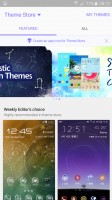
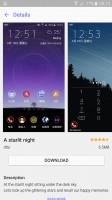
Themes are a great addition to the UI
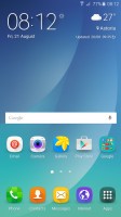
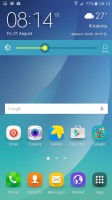
The homescreen itself is quite familiar. You get the optional FlipBoard Briefing pane on the left, which pulls info from a selection of news sources on topics you find interesting. There's an option to change the screen grid between 4x4, 4x5 and 5x5, the smallest one is the default.
The wallpaper now has a subtle motion effect that we didn't notice at first.You can disable it in the wallpaper settings if you wish.
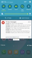
The notification area has one side-scrollable row of quick toggles. Some have text underneath, showing you the name of the Wi-Fi network you are connected to for example.
The brightness slider is below that and then the S Finder and Quick connect buttons. One cool feature is that while adjusting the slider, the notification area fades away so you can see the app you were using before.
You can rearrange the quick toggles by tapping the Edit button. The S Finder and the Quick Connect shortcuts can also be removed if desired.
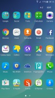
The Samsung Galaxy Note5 comes with a page and a half of icons in its app drawer, but several folders conceal the actual number of pre-installed apps. Some of the latter are organized in folders.
Multi Window is part of the app switcher. TouchWiz uses Lollipop-style 3D rolodex of apps, but next to the X button is a button that opens the app across half the screen. The other half is filled in with a similar rolodex with only apps that support Multi Window.
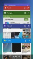


App switcher and multi-window view
Another way to launch Multi Window is to long press the App switcher key. If the current app supports Multi Window it will shrink to half the screen, the other half will be taken up by the icons of supported apps. If not, you just get the list of apps.
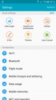
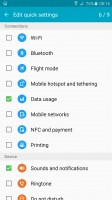
The Settings menu features customizable Quick settings - a selection of the most used options you can use. Below that is the full list, though we prefer using the search function as the extensive features that Samsung has provided can be hard to track down among menus and submenus.
S Pen
As expected, Samsung Galaxy Note5 features improved S Pen software over last year's model. Users can now take notes with the screen off as soon as the take the stylus out of the Note5.
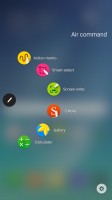
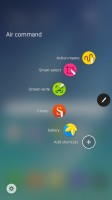
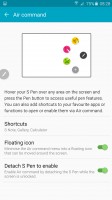
Air command has been greatly improved too - it can optionally float anywhere you want on the screen. Users can also add custom shortcuts of three apps of their choice.
Action Memo, Smart select, Screen write, and S Note are at your service as always. Their functionality is a great as it always has been .

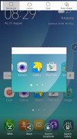


Action Memo • Smart select • Screen write • S Note
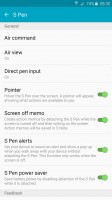
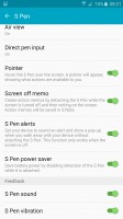
The S Pen has a dedicated menu in the settings. It allows users to control all aspects of the experience that the stylus delivers.
To sum things up, Samsung Galaxy Note5 delivers superb UI and S Pen experience. Performing tasks on the smartphone is fluid and intuitive, while the available themes allow users to have the appearance of the UI their way.
Reader comments
- Idon
- 23 Mar 2024
- xjH
it's rely that is quality than iphone 12
- Jamie
- 25 Nov 2020
- ks%
Sound quality (24 bit) on this 5 year old phone is STILL better than iphone 12. LOL!
- jarral
- 23 Jan 2020
- ITJ
i want to replace it s LCD its broken how i get its original one
