Samsung Galaxy Note8 hands-on review: First impressions
First impressions
Hardware overview and display
A trailblazer in a whole new market segment, the original Galaxy Note showed us that big screens aren't half bad. Six years later, the smartphone world has changed dramatically, and the Galaxy Note8 has grown further. Or has it?
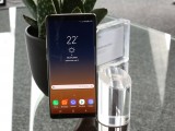
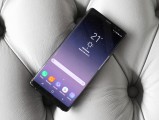
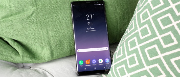
Measuring 162.5 x 74.8 x 8.6mm, the Note8 is 15.6mm taller than the Note of 2011, but also 9mm taller than last year's model. The latest Note is, however, 8.4mm narrower than the original, and just 0.7mm wider than the Note7, all the while packing a 6.3-inch display versus the Note's 5.3-inch and the Note7's 5.7-inch screens. So six years have brought an inch more in display diagonal in an arguably more usable (in width) body.
You have to bear in mind, of course, that the Note8 has the trendy elongated screen (18.5:9 aspect in Samsung's case) that makes for striking diagonal numbers - which don't actually translate into that much more screen area when compared to older 16:9 units. On top of that, the Note8's display is only marginally larger than the Galaxy S8+ - it's a smaller difference than last year's Note7 vs. S7 edge, but still some difference. Remember the S6 edge+ and Note5, both of them at 5.7 inches?
The 6.3-inch Super AMOLED 'Infinity Display' with 2,960x1,440px has a pixel density of 521ppi - about as fine as most recent Samsung top-shelf phablets. The Galaxy S7 and S8 pixel densities are in the 570s, but at this level, we're splitting hairs.
The display is bright when it needs to be, lively and colorful by default, but also color accurate in the different display modes, and it doesn't get washed out under direct light - it's simply a stunning piece of kit.
It's also curved, of course - for better or for worse, Samsung isn't making flat-screen flagships any longer. That said, we're not talking Galaxy Note Edge type of curves, naturally. The concept has evolved over the past few years, and it's a more natural look and feel today. Plus, palm rejection makes sure your palm doesn't activate any UI elements along the screen by accident.
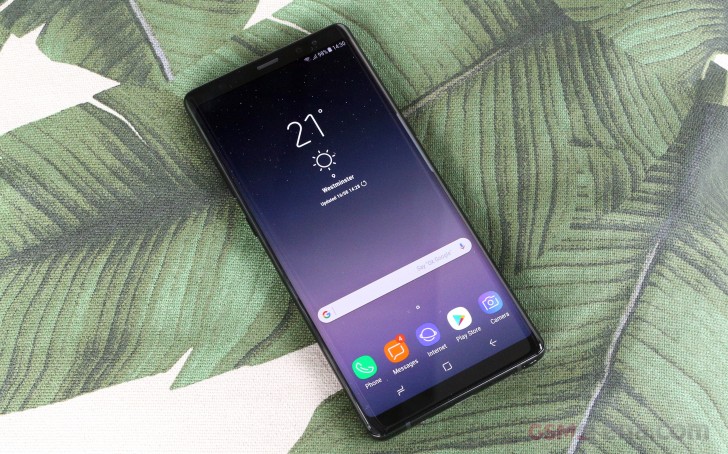
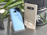
The Galaxy Note8's corners are sharper than those of the S8+, and that applies to the physical corners of the device and the corners of the display. It makes the Note8 look a bit more serious and industrial next to the slightly more playful and fashion-oriented S8+.
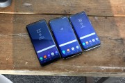
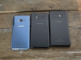
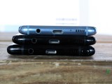
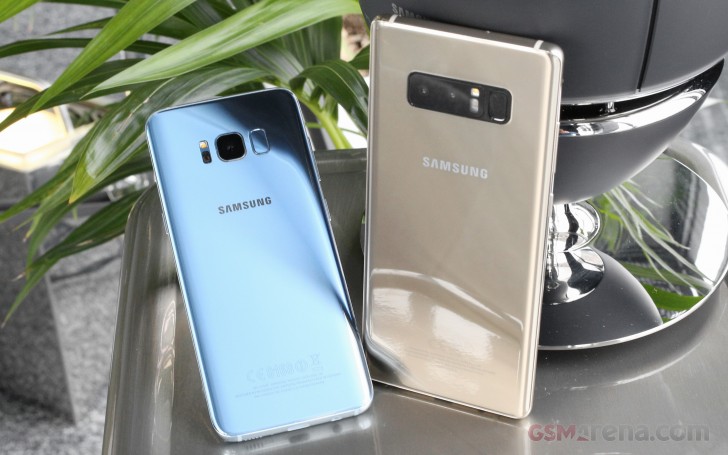
The Galaxy Note8 next to the S8+ and the S8
Funny choice of word there, 'industrial' could be used to describe the Note8's weight. At 195g, it's easily the heaviest Note, tablets excluded. Only the Note II with its 183g comes close, but all the other generations have all been in the 168-178g range. More interestingly, the Note8 is 22g heavier than the S8+ despite a smaller battery and only marginally larger display. Apparently, the S-Pen and the second camera have added to the tally.
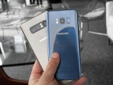
The Galaxy Note8 compared to the S8
Despite the tangible (well, at least initially) weight difference between the two ruling Samsung phablets, the Note8 is arguably easier to handle. Slightly less curved display, sharper corners - it's probably a combination of these two.
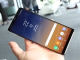
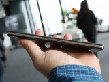
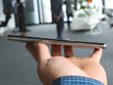
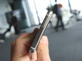
Now narrower, the Galaxy Note8 is really top notch to handle
The dual camera is the highlight new feature; there's no doubt about that. Looking at the camera/sensor/flash assembly from a design standpoint, however, it's not easy to love.
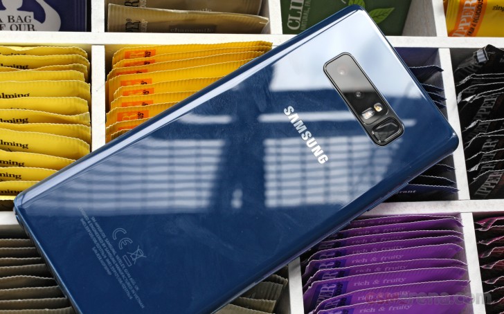
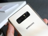
There's a lot going on there, with the two camera modules, the flash, the heart rate sensor, and the fingerprint sensor, so Samsung figured they should try and mask it all up in a black window, with the fingerprint sensor getting its section. The problem is, rather obviously, that it only works on the black color version. On the other paint jobs, it makes for a stark contrast, and it's not the most elegant solution. Or it is, in fact, the most elegant possible, it's just not particularly so.
Another point to make is that the fingerprint sensor is in an even more inaccessible position than on the S8+ - it's a slightly larger phone, and the pad is slightly more offset from the central axis. On a positive note, the flash/heart rate sensor combo is now between the fingerprint sensor and the camera, making it a little less likely for you to smear the lens. A little.
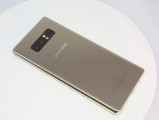
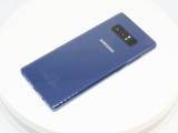
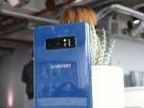
The rear control deck is now different
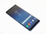
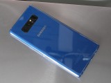
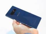
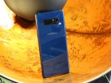
Speaking of color schemes, the Note8's hero color is Deepsea Blue, not to be mistaken with the Coral Blue of the Galaxy S7 and S8. It's a darker shade, and one that doesn't play with light quite as much as the old hue. But, we do tend to have a thing for blue smartphones, so we'll take it as it is.
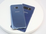
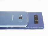
The new Deepsea Blue compared to Coral Blue on the S8
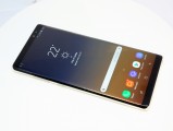
There's the classic and incognito Midnight Black option and Maple Gold for those that want a little more bling. Orchid Grey, like on the S8, will also be available, but we didn't get to handle one. Bummer.
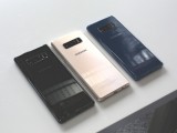
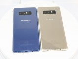
The Galaxy Note8 will be available in Midnight Black, Maple Gold and Deepsea Blue and Orchid Gray
If you've ever seen a Galaxy S8 or an S8+, you'll be familiar with the button placement on the Note8. The power button is in its proper spot on the right side of the phone, while directly opposite it on the left side is the gap between the Bixby button and the volume rocker. The usefulness of the Bixby assistant and whether it calls for a dedicated button is a polarizing subject that we'll steer clear from, at least for now.
Power button on the right • Bixby button on the left
Up top, there's a mic pinhole for some noise canceling action. The card tray is up top, and it takes a nano SIM and microSD card, though a dual SIM Note8 will also be available.
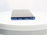
On the bottom, you'll find the customary Samsung arrangement with the USB port in the center, Type-C these days. The 3.5mm jack is here to stay, hopefully, and the mic and single speaker are in this vicinity.
Oh, and there's the S-Pen, of course. More on that on the next page.
Reader comments
- boy iman scammer
- 12 Sep 2017
- Gyq
stop using phone while driving sir. its can harm yourself. love your family's.
- Anonymous
- 02 Sep 2017
- 0VP
I can't believe they didn't include IR port, it's very usefull to me. Fingerprint on back? So, no using it in my car, and no quick tapping while working... Terrible. Curved screen for stylus? Not sure samsung knows the best anymore, so I must see...
- Anonymous
- 02 Sep 2017
- 0VP
You mean Note 4?
