Samsung Galaxy Note I717 review: Pushing the envelope
Pushing the envelope
User interface
The Samsung Galaxy Note comes with the phone version of Android 2.3.6 Gingerbread and the home-baked TouchWiz 4.0 launcher out of the box. Its changed look is down to the fact that the WXGA resolution can accommodate more stuff on some screens but, for the most part, it's identical to what you get on a Galaxy S II.
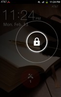
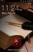
The Galaxy Note comes with a somewhat different design for the lockscreen from the rest of the Samsung lineup, but it works in just the same way - you can go past it by placing your finger anywhere and swiping in any direction. The lock symbol appears under your finger, placed within two circles. Your swipe has to get out of the outer circle for the screen to unlock.
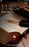
Missed events get their own notifications on the lockscreen with dedicated icons. If you start your unlocking gesture there you are taken straight to the respective app (call log, messaging center, etc).
The homescreen is unchanged. Adding widgets to it has the same nice transition effects too, so there's nothing missing.
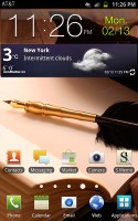
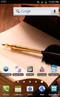
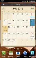
The homescreen has more room now
There are some Galaxy Note exclusive widgets, which let you launch the S Pen applications. We'll be looking at them in a second.
Just like the Galaxy S II, the Galaxy Note comes with two cool live wallpapers, developed in cooperation with Accuweather, which display the current weather conditions on the whole screen.
Think Sense UI weather widget, but on a larger scale. The two different wallpapers in fact only differ by the background - one has a few wind-power propellers, while the other uses a beach.

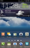
Two of the live wallpapers change according to the weather in your area
Editing the homescreen panes is business as usual - you pinch zoom-out to display an aggregate view of all panes, which you can then easily rearrange, delete or add.
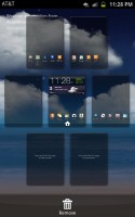
Rearranging the homescreen panes
The numbered dots that identify the homescreen panes serve as a scroll bar too. A press and hold on the dots lets you scroll sideways through the resized images of the available homescreen panes in one short go rather than with several swipes.
There was some work done on the app toolbar at the bottom. For one, you can now create folders inside it (though given you can have folders on the homescreen, we don't see much use for that here).
Still, creating folders on the shortcut toolbar is pretty easy stuff - in edit mode you drag the icons you want over to a blank folder icon at the bottom of the screen. Then you drag the folder to the screen on which you want it to be placed and pick a name for it.
You can create new menu pages in much the same way - browsing your existing ones and picking the icons that you want to have placed on the new page.
Needless to say, the app launcher panes can be rearranged exactly like you would the homescreen - pinch zoom and some swiping around does the trick quickly and intuitively.
The added bonus here is that each app drawer pane holds five rows of five icons each instead of the 4x4 grid of the Galaxy S II. The docked icons at the bottom are also five now - both possible thanks to the larger higher-res screen.
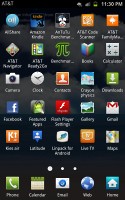
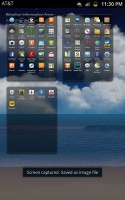
The WXGA resolution allows for more icons on each screen
The notification area has been slightly redesigned in TouchWiz 4, but there aren't any major changes to functionality there.

The notification area hasn't changed much
On the other hand, the task manager, which Samsung has preinstalled, has seen some functional updates. The RAM screen has been modified and there is only one clear memory button now, instead of the two in the previous version. Now, with 1GB or RAM and with the new Gingerbread policy of keeping resource-hungry background processes in check, we are not sure you will need to enter the task manager all that often, but it doesn't hurt having it on board.
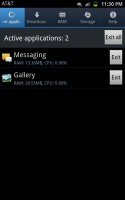
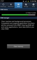
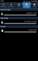
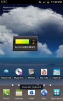
The preinstalled task manager and its homescreen widget
Just like its smaller Galaxy S II siblings, the Galaxy Note supports gesture controls across the interface. Those include the usual stuff like turn-to-mute or snooze the alarm, as well as tilting your phone to zoom in and out in the gallery or the web browser. You can also turn it sideways to move widgets around the homescreen or icons around the app drawer. To be fair though, we only found the turn to mute really helpful and rarely used any of the others.
A number of preinstalled AT&T applications come preloaded on the I717. Thankfully however, you can remove most of them manually. On this occasion we must give our thanks to AT&T for allowing this.
S Pen
The S Pen is easily the most dramatic feature in the user interface of the Galaxy Not. We know many of you are skeptical about using styli on a capacitive screen, but there's a reason why this one deserved a name.
The stylus of the Galaxy Note has been developed by Samsung with the help of Wacom. The company is the premier manufacturer of interactive pen displays, pen tablets, and digital interface solutions, thus giving this unusual accessory some serious credentials.
The S Pen is a passive device (as in, it has no battery), but it still offers some extra functionality thanks to the button that's built into the little stick. You can simply use it to replace your finger of course, but that's hardly the point here.
The real fun starts when the S Pen button comes into play. For starters, if you hold the key and hold the S Pen over any screen of the Note UI, it will make a screenshot and go straight to edit mode, so you can put down notes over that same screenshot.

Here is a quick idea of what you can do with a screenshot
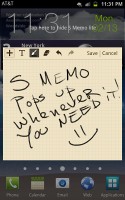
Alternatively, you can hold the key and double tap on the screen (again it works in any part of the interface) to launch the S Memo Lite pad. That's merely a blank page for you to take notes, draw and whatnot.
A press of the S Pen key and swipe to the left means back, so you can also navigate the interface with it. If you do the same thing but swipe upwards instead, the context menu will appear, as if you have pressed the left capacitive key. That means that the S Pen allows you to operate your phoneblet without pressing any hardware keys, making Gingerbread an all-touch platform.
We have prepared a video to give you an idea of the responsiveness and precision of the S Pen.
The S Pen isn't exactly instant, but the kind of precision it offers does the job quite well. There is room for improvement, of course, but even as it is, the fancy stylus opens quite a lot of doors to the Galaxy Note.
The SDK for the S Pen is already out, so we can reasonably expect specific apps to come out for it in the nearest future. The device already comes with a physics based game, developed specifically for the S Pen, called Crayon Physics. The popular Sketchbook Mobile also supports the S Pen. The app lets you get seriously creative. Here's a quick example.
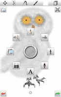

Sketchbook Mobile partners very nicely with the S Pen
We are now going to take a look at the performance of the Snapdragon S3 chipset, and check if it is a worthy replacement of the powerful Exynos silicon, which the N7000 packs.
Reader comments
- ABDUL JAKUL
- 21 Jul 2016
- SdX
very nice phone sgh 1717...only the problem is battery...easy to drained...even the phone is not using...battery drained continiously.. but i told you this is the best phone....i hope you help me to how to save battery life.
- arta
- 13 Dec 2014
- vfx
why no update os for note lt GT N7005? ICS too slow for this smarthone.. Note 1 have already so when for note 1 lte?
- galaxy queen
- 05 May 2014
- kZJ
Omg this phone is amazing! I had a galaxy s2 then wanted to get a new one but didn't know which one since all the other ones so much more expensive and this one least expensive so I was worried it wouldn't be as great since it was cheaper but I'm so ...

