Samsung Galaxy Premier review: A droid of stature
A droid of stature
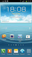
The latest Android interface
As far as Android Jelly Bean goes, Samsung's TouchWiz offers one of the most feature rich experiences around, and the Samsung Galaxy Premier is no exception - the Android 4.1.1 Jelly Bean build it sports is one of the best around.
For a look at the interface in action, check out our brief video here:
The interface is very much like what you'll see on the Galaxy S III, after the Jelly Bean update.
The lockscreen is the standard one we've become used to from Samsung since the introduction of the Nature UX on the Galaxy S III, and can be tapped and dragged in any direction to unlock, with ripples accompanied by a water-drop sound as you drag your finger.
Five customizable shortcuts are available at the bottom of the screen - drag one up to launch the app without going through the homescreen.
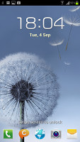
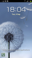
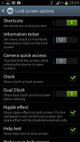
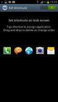
The lockscreen packs a ton of new functionality
There are several options for the unlock screen. You can enable a news ticker at the bottom of the lockscreen, which is a great way to stay up to date on current events. The ticker can be expanded to view all news items.
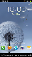
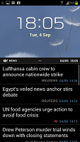
The news ticker keeps you up to date with current events
There are alternative unlock routines as well - Face and voice unlock, unlock by touching the screen and tilting the phone and starting the camera from the lockscreen by touching the screen and rotating the phone horizontally.
There are voice-based wakeup commands that can start S Voice or launch a preselected app. You can also enable a second clock on the lockscreen which shows up when you're roaming.
Quick glance is a new feature that presents at-a-glance info on the basics - while the phone is locked, you can cover the top of the Galaxy Premier (just trigger the proximity sensor, really) and the screen will light up and display the status bar, counters for missed calls and new messages, a battery percentage, music track info and upcoming alarms. In our unit, this would trigger even if the smartphone is face down, so it might prove to be a battery draining feature.
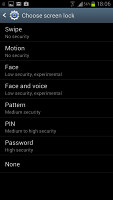
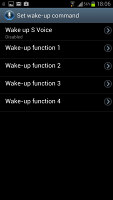
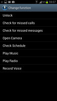
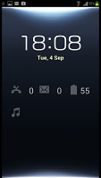
Different lock screen types • Voice wake-up commands • Quick glance in action
Once you make it past the lockscreen, you'll notice that the dock at the bottom of the screen now fits five shortcuts or folders. The rightmost one opens the app drawer as usual, but you can change the other four to any shortcut you like or even folders if you want.
The notification area looks familiar, but there are a few new things that make good use of the screen size. On top is a clock with the date and a Settings shortcut. Below that are the usual toggles - Wi-Fi, GPS, Silent mode, Screen rotation and Power saving. There are five more toggles just off screen - Blocking mode (we'll get to that later) Mobile data, Bluetooth, AllShare Cast and Sync.
Further down we get the Brightness slider with an Auto checkbox. It allows you to adjust the brightness even in auto mode - the backlight strength is still adjusted according to ambient lighting conditions, but you can tweak it to your liking.
The notifications are one of the big changes in Jelly Bean. Notifications can now take more than a single row to display more information and they can also have more advanced controls on them (e.g. a reply button). The top notification is expanded by default and you can expand/collapse notifications with a two finger swipe up or down (not all notifications can be expanded though - only those that support it).
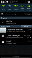
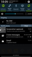
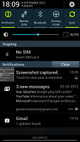
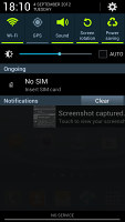
The notification area has more toggles • An expanded notification • Dismissing a notification
Finally, at the very bottom of the screen you get a line for the carrier ID, which turns into "No service" if there's no mobile network available and "No internet connection" when there's no Wi-Fi.
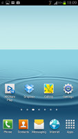
Even though the dock at the bottom fits five icons, the homescreen fits only four on a row. However, the app drawer is a 5 x 5 grid, so you still get more shortcuts per page.
Following convention from stock Android, the app drawer has a tab that lets you easily pull out widgets to the homescreen. Unlike the stock app drawer, you cannot move between tabs by swiping through the pages - you have to explicitly hit the tab. There's a download shortcut on the right, which brings you to a screen with only the downloaded apps.
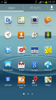
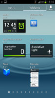
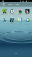
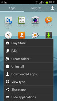
The app drawer houses both app shortcuts and widgets
The app drawer has three view modes - Customizable grid (where you can freely rearrange icons), Alphabetical grid (if you think you can find apps quicker if they're alphabetized) and Alphabetical list (this one makes shortcuts easy to hit, but isn't very space efficient).
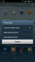
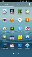
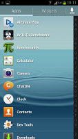
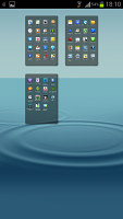
The available view modes for the app drawer • A zoomed out look at the app drawer pages
The app drawer has a zoomed-out overview that lets you rearrange pages, but you can't create blanks. Hitting the menu key reveals some more options, including hiding apps or enabling tap-to-uninstall mode.
Once you get several apps running, you can use the task switcher to go back and forth between them. It's a vertical list with a screenshot and a name for each app. Swiping an app sideways removes it from the list.
There are a few Samsung-made tweaks here - a button at the bottom of the list to bring out the home-brewed task manager, a button to end all apps at once and a shortcut to Google Now. By the way, you can also bring up Now by pressing and holding the Menu key.
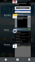
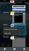
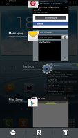
The task switcher has two custom buttons courtesy of Samsung
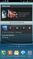
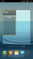
Let's go back to the homescreen and widgets. Jelly Bean comes with plenty of them and Samsung has added more still. With Android 4.1, the widgets will move out of the way if you try and put something over them, which makes reorganizing the homescreen so much easier. Some widgets are resizable too.
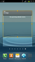
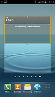
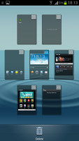
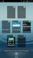
As usual, you can pinch to zoom out and easily manage homescreen panes - you can add, delete or just reorder them. You can have 7 panes at most, which are enough to fit plenty of content even if you use full-screen widgets. One of these panes is marked "default" and that will be the one you're taken to when you press the Home button.
Live wallpapers are a great way to not only prettify your homescreen, but also make it useful too. The News wall creates an attractive slideshow of headlines, while Stock wall does the same for quotes. Photo wall creates a collage of photos from your Gallery.

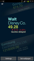
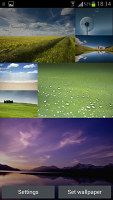
Three of the new live wallpapers in action
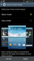
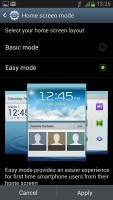
There is a setting called Mode change - basically, it gives you two separate homescreen setups, Basic and Easy. Samsung's idea is to give you big, easy to use widgets that cover most of the functionality with Easy mode.
There's nothing stopping you from adding back the regular widgets in Easy mode, so you can use Mode change to toggle between personal and work widget setups. You can't rename the modes or have more than two, but it's a potentially useful feature if your precious few homescreens are usually cluttered with a widget for your work email, work calendar and so on, and you want your personal email and photo widget instead.
One of the features that debuted on the Galaxy S III is Smart Stay - it uses the front-facing camera to detect the user looking at the screen, so that it never dims or locks while you're reading. This makes reading web pages and ebooks very comfortable, even if you've set the screen timeout low to preserve the battery.
With the latest TouchWiz comes another clever camera trick - Smart rotation. When enabled, the Galaxy Premier will try to orient its screen in relation to your eyes, not the accelerometer. So, if you're lying on your side and holding the phone vertically (in relation to the ground), Smart rotation will keep the screen in landscape mode. Note that for these last two features to work, the front-facing camera needs to see your face, so too dark environments might turn out to be a problem.
Reader comments
- lucbertz
- 27 Aug 2018
- 2mV
Is MHL support granted? Only in this review I found this phone supports MHL. Should a cheap Galaxy Nexus i9250 USB cable work?
- chixx
- 10 Feb 2013
- vIw
wat so ever its not bad.,.,.,.,.,.,
- AnonD-94711
- 30 Dec 2012
- fuD
gud phone
