Samsung Galaxy S20 Ultra review

One You Eye Two Point Won
Update, Dec 30: One UI 3 update is out for many Galaxy phones. Here's what's new there.
It's One UI 2.1, really, but just because writing it this way makes more sense than the above gibberish, doesn't mean it doesn't sound funny when you say it out loud. Samsung's latest iteration of its in-house Android overlay comes with barely noticeable tweaks over the One UI 2.0 we've already seen with the Android 10 updates on multiple phones as well as out of the box on recent new releases. That, in turn, is hardly different from One UI... One. Okay, that's the last one.

The latest trends in the user interface can now all be found on this Galaxy. For one, that means a system-wide dark mode that not only skins the UI but also triggers the apps' respective dark themes (if they have them) - thanks to Android 10. What's new in v2.1 is that the setting is at the very top of the display menu, with a visual cue too.
The latest OS brought in proper gesture navigation, and the S20 Ultra has a couple of different takes on that - we opted for the newer method where a swipe-in from the sides acts as 'Back' and a swipe-up from the bottom takes you Home. It's probably worth mentioning we found the bundled case's bottom lip to get a little in the way of the upward swipes, and so did the silicone sides when attempting to go Back. We still appreciate the protection, though. Oh, if you're old-school like that, the classic nav bar remains an option.


System-wide dark mode • Gesture navigation
Biometric security on the S20 Ultra comes in one of two shapes - fingerprint authentication and facial recognition. We mentioned our varied experience with the ultrasonic fingerprint reader in the design section on the previous page, but let's just say that it if doesn't work for you, the face recognition will offer a more convenient (if not as secure) access to your homescreen.
The basics of the UI are the same as on any other Samsung rocking One UI 2 and very similar to One UI One ones. We couldn't help but notice the recent relocation of the all-important option of having the brightness slider visible on the first pull of the notification shade to the 'Quick panel layout' menu inside the toggle settings. The brighthness settings screen remains unused as seen on the last screenshot below.


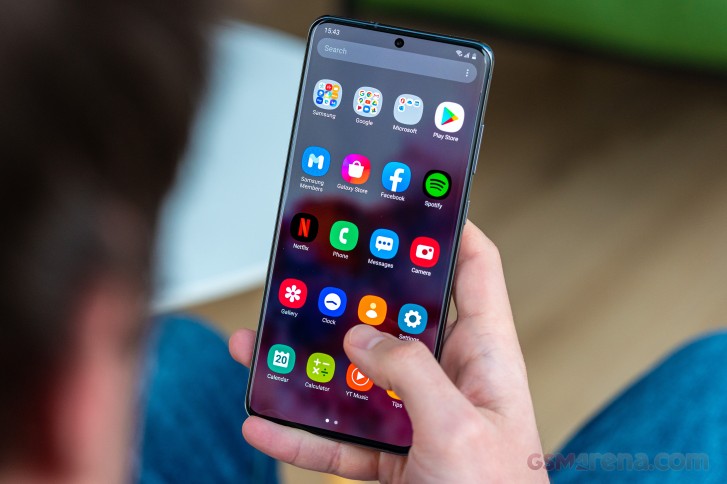
Homescreen • Folder view • App drawer • Notification shade • Quick toggles • 'Show on top' setting moved
Gone are the days of good multi window UI with Android Pie ruining it for everybody by requiring extra taps for something that used to take a long press on the task switcher button. Anyway, Samsung's trying to find a working solution and between v2.0 and v2.1 has relocated the menu next to the app icon you need to tap anyway - it's on the bottom of the screen in the previous version of the UI. Neither is great.


Task switcher • Multi window • Resizing is possible • Pop-up view
'Edge panels' is a well-known, long-standing feature that's gotten a minor redesign for the S20s, getting more rounded corners, but it still offers the same functionality. It gives you quick access to apps, actions, tools, etc. with a single swipe from the side. You can choose which side the handle is located on, as well as adjust its position along the edge of the phone. In the Edge screen sub-menu, you will also find Edge lighting - a feature that can light up the outline of the UI in an ever-growing selection of glow types to gently alert you of any new notifications.
Some small changes in software include the addition of Google Duo to the Phone app, letting you initiate video calls straight from the dialler. Quick Share is Samsung's latest name for the company's sharing solution based around Bluetooth for device discovery and Wi-Fi direct for actual data transfer that works with Samsungs only (all the way to the Note 3 we had on hand, where it's called Quick Connect).
One of the more intriguing 'sharing' options brought by the S20 Ultra is Music share. Enabled by Bluetooth 5, it lets you connect the S20 to a BT speaker and use the phone as a hub for other phones to connect to the speaker.


Google Duo baked in • Quick Share • Music Share
Synthetic benchmarks
As is normally the case with Samsung's top-of-the-line models, the Galaxy S20 Ultra exists in two main variants when it comes to chipset, and each market gets only one of the two. Option one packs a Snapdragon 865 SoC, while option two uses Samsung's own Exynos 990 - ours is the latter.
Both chipsets are manufactured on a 7nm+ process, and both feature an external modem (not really a feature, is it?), with theoretically detrimental effects on efficiency - our practical tests appear to corroborate that theory, at least for the Exynos version.

Then there's the matter of the 5G vs. non-5G flavors of the Ultra (once again, ours says 5G on the box), but we can't imagine that will make a world of a difference when it comes to performance. More tangible differences are possible between the two chipsets, but with only one of them around here at this time, we'll need to wait before we can compare.
GeekBench 4.4 (multi-core)
Higher is better
-
Apple iPhone 11 Pro Max
13870 -
Samsung Galaxy S20 Ultra 5G
12191 -
Huawei Mate 30 Pro (Perf mode)
11936 -
OnePlus 7T Pro
11246 -
Samsung Galaxy Z Flip
11066 -
LG V50 ThinQ 5G
10928 -
Samsung Galaxy Note10+
10403 -
Realme X2 Pro
10373 -
Google Pixel 4 XL
10171
GeekBench 4.4 (single-core)
Higher is better
-
Apple iPhone 11 Pro Max
5476 -
Samsung Galaxy S20 Ultra 5G
5005 -
Samsung Galaxy Note10+
4541 -
Huawei Mate 30 Pro (Perf mode)
3864 -
Samsung Galaxy Z Flip
3538 -
Realme X2 Pro
3527 -
OnePlus 7T Pro
3502 -
LG V50 ThinQ 5G
3484 -
Google Pixel 4 XL
2970
GeekBench 5.1 (multi-core)
Higher is better
-
Apple iPhone 11 Pro Max
3503 -
Huawei Mate 30 Pro (Perf mode)
3038 -
OnePlus 7T Pro
2803 -
Samsung Galaxy S20 Ultra 5G
2697 -
LG V50 ThinQ 5G
2672 -
Samsung Galaxy Z Flip
2619 -
Google Pixel 4 XL
2267 -
Samsung Galaxy Note10+
2154
GeekBench 5.1 (single-core)
Higher is better
-
Apple iPhone 11 Pro Max
1332 -
Samsung Galaxy S20 Ultra 5G
904 -
Huawei Mate 30 Pro (Perf mode)
779 -
Samsung Galaxy Note10+
776 -
OnePlus 7T Pro
773 -
Samsung Galaxy Z Flip
750 -
LG V50 ThinQ 5G
739 -
Google Pixel 4 XL
591
AnTuTu 7
Higher is better
-
Apple iPhone 11 Pro Max
459713 -
Samsung Galaxy S20 Ultra 5G
415976 -
Realme X2 Pro
396827 -
OnePlus 7T Pro
395868 -
Samsung Galaxy Z Flip
382617 -
Huawei Mate 30 Pro (Perf mode)
378950 -
LG V50 ThinQ 5G
343758 -
Samsung Galaxy Note10+
342208 -
Google Pixel 4 XL
323305
AnTuTu 8
Higher is better
-
Apple iPhone 11 Pro Max
536883 -
Samsung Galaxy S20 Ultra 5G
514485 -
OnePlus 7T Pro
493901 -
Samsung Galaxy Z Flip
487908 -
Huawei Mate 30 Pro (Perf mode)
484529 -
Realme X2 Pro
467653 -
Samsung Galaxy Note10+
438622 -
LG V50 ThinQ 5G
421934 -
Google Pixel 4 XL
403267
3DMark SSE OpenGL ES 3.1 1440p
Higher is better
-
Samsung Galaxy S20 Ultra 5G
6713 -
OnePlus 7T Pro
6238 -
Samsung Galaxy Z Flip
6032 -
Huawei Mate 30 Pro (Perf mode)
5988 -
LG V50 ThinQ 5G
5707 -
Google Pixel 4 XL
5538 -
Samsung Galaxy Note10+
4984 -
Realme X2 Pro
4726
3DMark SSE Vulkan 1440p
Higher is better
-
Samsung Galaxy S20 Ultra 5G
6308 -
OnePlus 7T Pro
5514 -
Huawei Mate 30 Pro (Perf mode)
5489 -
Realme X2 Pro
5337 -
Samsung Galaxy Z Flip
5298 -
Google Pixel 4 XL
4955 -
LG V50 ThinQ 5G
4789 -
Samsung Galaxy Note10+
4763
The Galaxy S20 Ultra puts out about 10-17% better numbers in single-core CPU performance when compared to the Note10+ (Exynos vs. Exynos), depending on which version of GeekBench you ask. That stretches to 17-25% in multi-core GeekBench, and that's about the ballpark of the generational improvement shown in the overall Antutu numbers. Meanwhile, 3DMark reports a substantial improvement around 33-35% under both Vulkan and OpenGL based loads.
The thing is though, the Ultra is quick to throttle even after just one benchmark run and subsequent runs bring those results to less impressive values. It heats up substantially under load too.
Reader comments
- Anonymous
- 14 Feb 2025
- XBF
Reduce the brightness up and down often times like to the lowest and to the highest levels of the screen often times. Just keep doing it for long time it will get to the accurate screen
- Anonymous
- 04 Feb 2025
- UFL
Real, my phone is the A8+ (2018) and its about, 6-7 years old. It still works pretty good but its obviously an old man now (charges slowly, heats up, can barely handle apps, the charger port is probably damaged) So i wanted this phone but better...
- Original-Jamaican
- 16 Nov 2024
- 4ra
I have a Samsung Galaxy S20 Ultra 5G SM-G988U1 and I always see shadows/grains/artifacts in dark areas of the screen especially when the brigthness is very low. It was purchased in September of this year (2024) labelled as a new model. Grains: ...


